


Anniversary stamps National Museum of Antiquities
It’s a mini-design, but the honor is huge. Like any graphic designer art director Jaap Biemans of Volkskrant Magazine dreamed of designing a stamp. No wonder his breath stuck in his throat when PostNL called him with the request to design stamps for the anniversary of the National Museum of Antiquities (RMO) in Leiden. ‘Top-bucket-list thingy’, as he himself says. ‘This is how your name ends up beautifully in a list with designers like Wim Crouwel, Jan van Krimpen, Piet Zwart and Joost Swarte.’
‘I first thought: how hard can it be; I’ll just design a small cover’, says Biemans, who also manages the website coverjunkie.com. Well, he appeared to be mistaken. ‘A stamp has its own energy, its own dynamics, its own requirements. And not just because it is a lot smaller than a magazine cover.
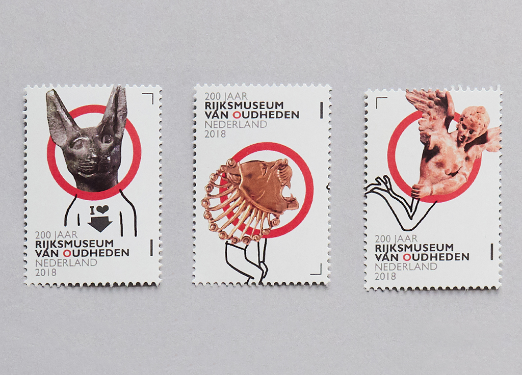
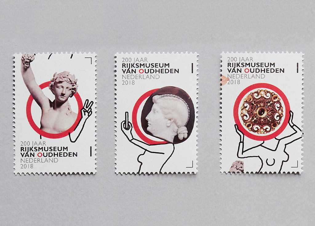
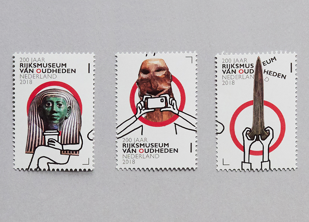
Biemans designed a ‘small tribe’ of ten creatures, inspired by the rich mask collection of the National Museum of Antiquities. Illustrator Paul Faassen perfected the line drawings by connecting the ‘small tribe’ together in a seemingly nonchalant way. ‘It is Paul’s strength that he has a limitless look’, says Biemans. Do we see the artefacts from the museum or do we see visitors? Little masked people who drink coffee and make selfies. The red O, the logo of the RMO, features as a framework. ‘I wanted lightness, freshness, staying away from dusty associations that people might have when they’re thinking of an archeological museum’. To emphasize this Biemans also developed together with copywriter Robin Kemme the new slogan: ‘The National Museum of Antiquities, already 200 years from now’.
‘It’s a great tradition that there has been so much design attention in the Netherlands for everyday things like stamps and money. With this we manage to distinguish ourselves from other countries abroad and create an identity. Look at the Euro notes if you want to see what happens when you aren’t designing your own money any more. We used to have that gorgeous lighthouse, and now we have, yes, what do we actually have?’
For art director Biemans designing the RMO seal was ‘an exercise on the square millimeter’. I really do try to leave out all superfluous stuff. Every square millimeter is well thought out.’ In that respect it does indeed seem however like making a cover: ‘I will not allow anything on it that is not necessary.’ Biemans found it more important than the brightness of the design that the sheet of ten should form a total concept. ‘You don’t design loose stamps, but an entirety. The sheet of ten stamps has one atmosphere, a story: characters who talk with each other, who mesh together and form a people together, the people of the National Museum of Antiquities.”
Illustrator Paul Faassen www.paulfaassen.nl
Rijksmuseum van Oudheden www.rmo.nl
www.postnl.nl