


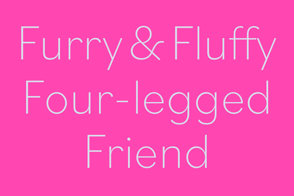
Bilo by Bold Monday
One Week About Typography by curator Henk Gianotten
The design bureau Bold Monday was founded in 2008 by designers Paul van der Laan and Pieter van Rosmalen. Both followed the training ‘Type & Media’ at the KABK (Royal Academy of Art The Hague) where Van der Laan has been teaching for years. Besides designing fonts commissioned by companies such as Audi, General Electric, NPO, Rijksmuseum and VPRO, they distribute fonts of their own design and fonts designed by external designers.
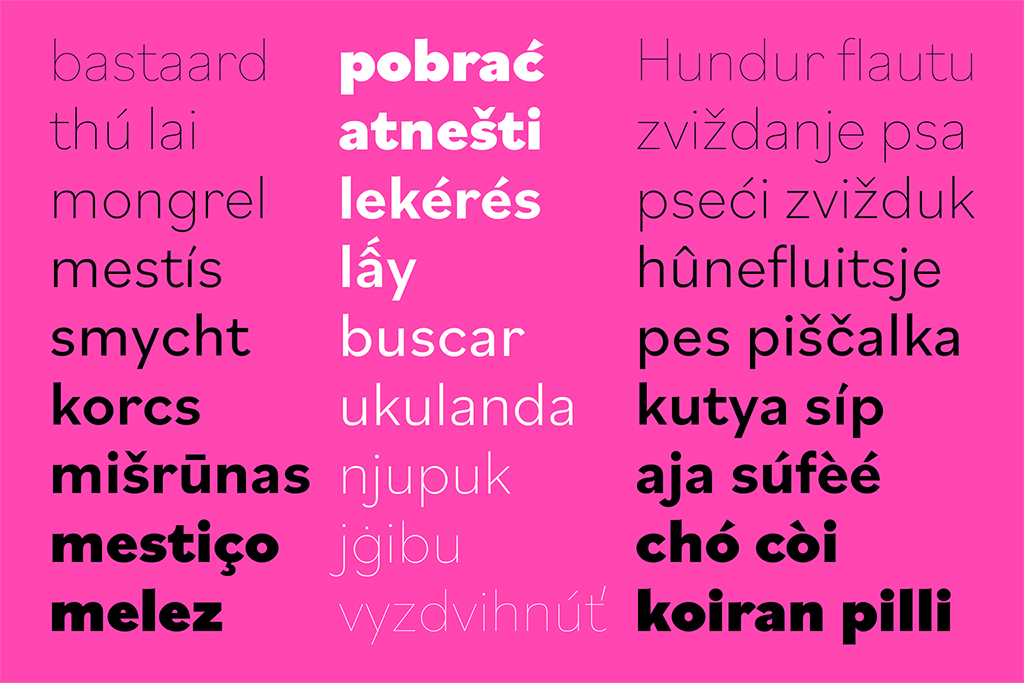
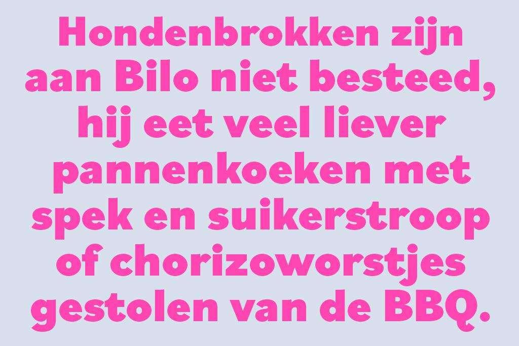
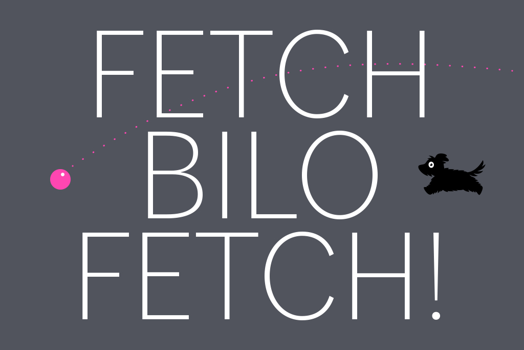
The latest font by Pieter van Rosmalen is Bilo, a sans-serif with 9 upright weights, which has its origin in the idea of designing a low-contrast grotesque font based on design features of the bold Bodoni. This idea didn’t hold out very long but details still refer to this font. The extreme form is highly dependent on the degree of boldness and, based on OpenType facilities, there is a wide selection of variants available of the lower case letters a, f, t and y.