


D&AD
D&AD represents creative, design, and advertising communities around the world. In spite of the pandemic, creatives continue to excel and innovate: meeting new challenges, solving new problems, and inspiring audiences across the globe. We devised the positioning and identity for 2021.
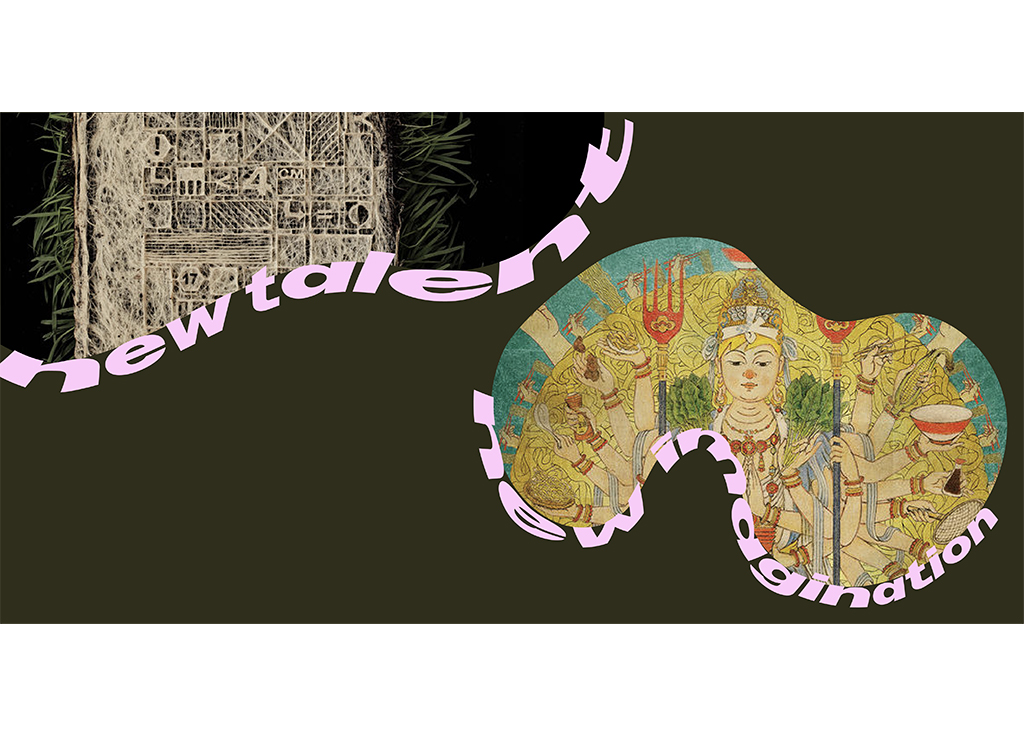
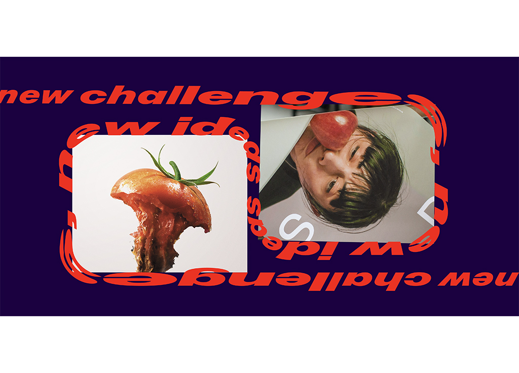
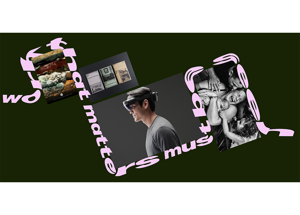
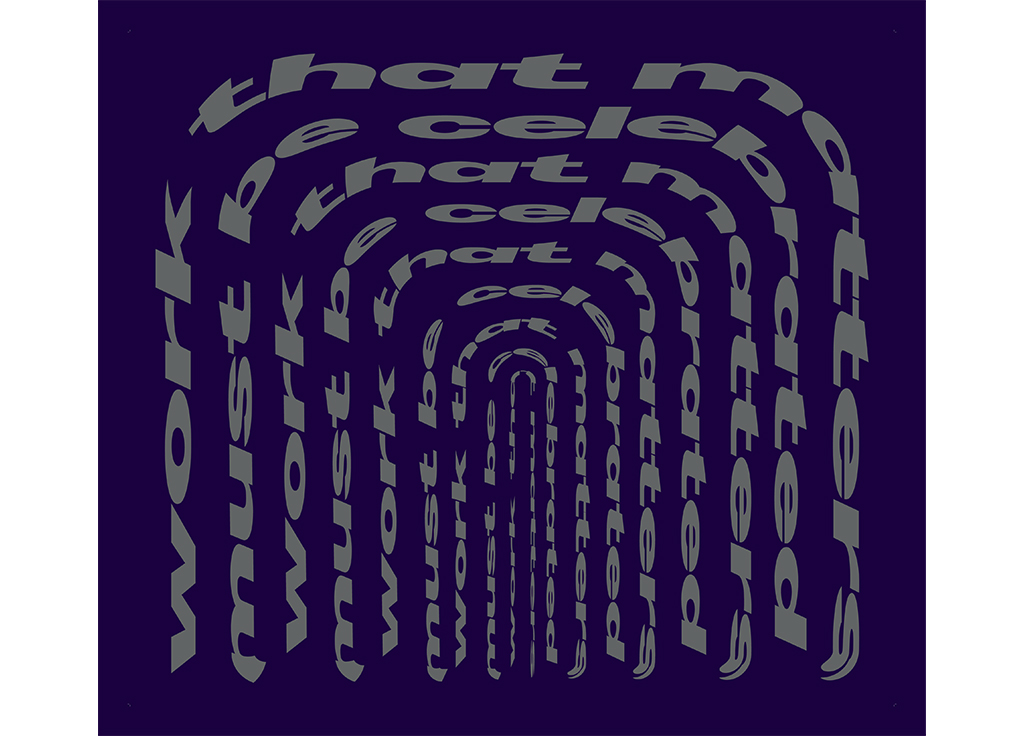
Our concept and positioning were driven by one word: continuity. The shadow of the pandemic has touched all corners of the globe, and yet the creative industries prevailed. Like no other year in D&AD’s history, 2021 presented an opportunity to celebrate excellence in the face of great adversity. Continuity became the guiding principle for the visual identity and promotional campaign. The copy played a vital role in the campaign, with slogans such as “new ideas, new challenges” animated into continuous streams of type. These copy lines traveled in motion from scene to scene to arouse curiosity about what’s next, all in line with the overall 2021 concept: Continuity.
We used the custom Marfa variable, developed in collaboration with type foundry Dinamo commissioned by D&AD, which can extend till infinity. Streams of animated type were deployed as framing devices, surrounding and elevating images of nominated work. The color palette features striking, often jarring combinations, with dark background hues and bright highlights, ensuring a stand-out quality for the campaign, particularly online. In addition, we animated the typography so that it could bend and turn into all possible directions, corners and edges. By doing this, the typography became a storytelling tool to deploy as framing devices surroundings and has been used to elevate images of nominated work.