


Early development of a digital GUI at Océ
Dutch Design Heritage
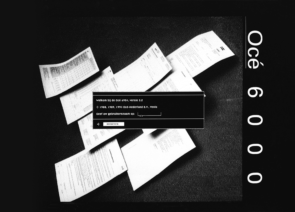
In 1987, the Océ 6750 high-end laser printer had undergone a name change and was henceforth called the Océ 6750 document printer. It was used to print black and white documents at a print quality that was quite close to the quality of traditional black and white printing. The printer was also used to improve the information management process. Because from now on, documents could be produced in-house in a fairly simple way. That was very innovative at the time. However, many of Océ’s future customers had their own house style and wanted to use it when printing their documents.
But to do that you need a professional document layout system with a GUI top-layer. GUI stands for Graphical User Interface. It consists of graphical widgets such as windows, menus and icons. It can be compared to an analog desktop. It also uses similar objects such as folders, documents and operations such as: select, cut, copy, paste, drag and drop. Within Océ Research & Development, consideration was given to linking a GUI to the Océ 6750.
At that time, there were a few systems on the market tied to specific hardware from Xerox, Apple, Microsoft and IBM. Because new product development within Océ was very slow, the company was soon forced to look at Original Equipment Manufacturers (OEMs). Some offered GUI software packages that were fairly platform independent such as: Open Look (UNIX, Sun Microsystems), Motif (UNIX), FrameMaker (Sun OS, Apple), Interleaf (Sun, Apollo, DEC, HP, IBM and SGI), Sunview (SunOS) and PageMaker (Apple, IBM, HP). The computer industry suddenly recognised the need for a GUI that they could use to promote their own look and feel. Words like WYSIWYG (What You See Is What You Get) and DTP (DeskTop Publishing) date from that time.
But the development of the Océ GUI went in a surprisingly unexpected way for the Typographic Group. In early 1987, we were asked to create a screen-font for the OS-91. We didn‘t know what the OS-91 was at the time. The specifications for the font were provided by the OS-91 project. Most importantly, it had to be legible. And secondly, it had to make the most of the screen resolution. So it had to be a very functional type design. Now the ‘leeway’ is limited with a functionally legible and efficient screen font. After some testing, we came up with a font of fourteen pixels high. For the character-width we took the minimum number of pixels needed per character. I made a first draft version and Martin Majoor and Jeanne de Bont came up with critical comments that I incorporated in the final version.
Then we wanted to see what the OS-91 project was going to do with it. What we got to see was FrameMaker‘s GUI containing the screen font we had designed. That was the moment when we felt that we should talk with the OS-91 project leader, Martin Waaijer. What had to be made clear is that changing the font in FrameMaker does not produce a different product. If this GUI was to become an Océ GUI, it also had to use the Océ identity. As a consequence, a completely new Océ GUI had to be designed. That changed things because we could now also use our (typo)graphic and layout technical knowledge in the GUI. At that time we were not aware of the fact that there were no GUI designers in the Netherlands. There was no training for it yet. That’s why we decided to do it ourselves.
In order to design a GUI, my job description had to be changed. The new description was as follows: The purpose of the function is to specify and realise the user interface for typographic functionality and quality in such a way that the requirements with regard to functionality, user-friendliness and corporate identity are met. Quite a mouthful, but what it came down to is that you ensure that the Océ GUI house style is implemented on every medium in all cases. And that had quite a few consequences because there was hardly an Océ GUI house style. Apart from the low resolution displays in the Océ copiers and printers.
All the engineers who worked for the OS-91 project were in a different building than Industrial Design where we worked. About a thousand people worked on the Océ R&D campus, mostly men with a scientific and technical background. As a designer, you didn‘t often get into the project spaces, unless you had to check something or attend a meeting. To design a GUI it was preferable to work directly with the other project members. So we moved to the OS-91 project space. That was a completely different world where people were hardly or not at all sensitive to design. Let alone the functional use of black, white or grayscale.
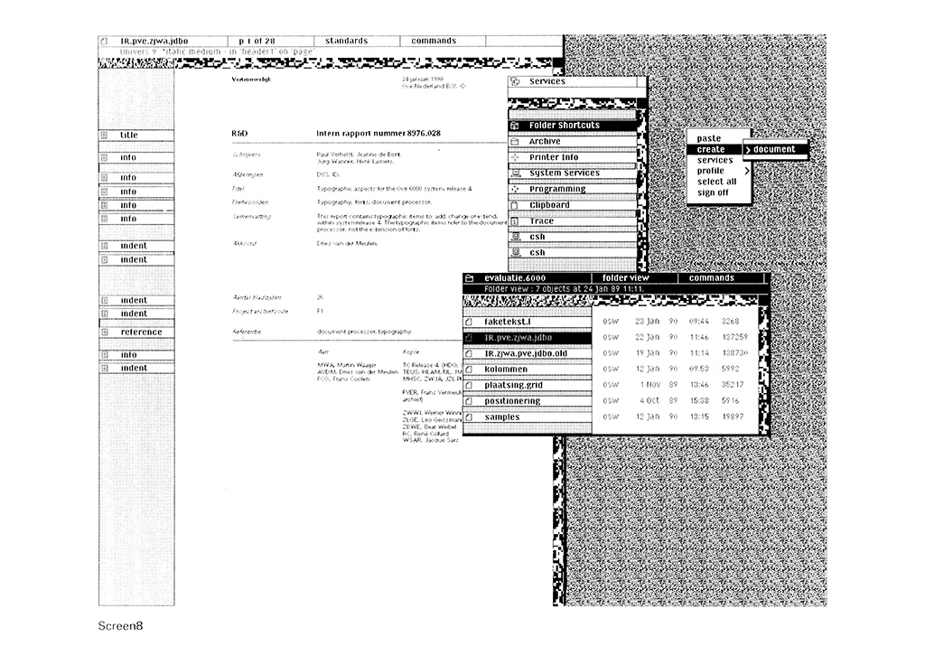
It requires the necessary flexibility from a designer to have an open discussion with scientifically trained technicians about your designs. That‘s why we started with an analysis of FrameMaker. The software package that ran on a SUN 3/50 at the time. We studied all the details of the GUI. We then looked for similarities that could make an Océ GUI possible. What are the elements that can support an identity? Is that the use of black, white and grayscale? Is the font essential? We found out that it was much more than that. For example, the tone of the language you use. The icons in the menus. The patterns in the background. The way windows behave and are laid out. Suddenly a completely new digital dimension arose that could be added to the Océ house style.
We didn‘t delve into the users so much because we only vaguely knew who the users of the system would be. We made sure that as much knowledge and functionality that we had in the field of document design was entered into the system. This naturally caused (solvable) problems with the project members and was a topic for discussion because the elements we suggested were, in their eyes, purely cosmetic. Then you have to be able to transfer everything you have learned as a graphic designer to the rest of the project members. That worked very slowly over time. You have to build trust within the project. There was a moment when I sat next to Cris Hinssen and he immediately implemented parts of the Océ GUI in the software. Form is one thing, but we also wanted to make a substantive contribution.
I was asked to sit on the TC (Technical Committee) of the OS-91. The TC met once every fortnight to discuss all (bug) reports produced by the project. I became responsible for the design of the Océ GUI. That brought with it an avalanche of theoretical ballast. Because I had to go through all the reports written in the project by all the colleagues in the OS-91 project. You don‘t have to understand everything (it was said) but you do have to show your input if it touches your field. And because I didn‘t know whether the content of a report touched my area of expertise, I had to read everything and try to understand it.
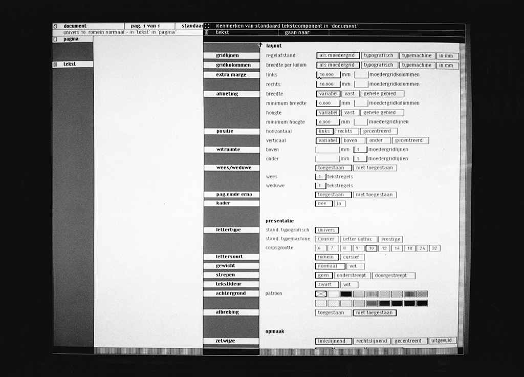
Designing the Océ GUI was partly about defining the shape. How is the user interface designed? What does the desktop look like? What do the rulers, icons and selections look like? What shape do we use for the pop-up and pull-down menus? What do the forced dialogues, the standard and local property sheets look like? How are the scrollbars, selections and the startup screen designed? What do error messages look like? Basically it‘s all about everything that happens and what you see on the screen. Including the behaviour.
Another part of the Océ GUI is the functionality you need to design documents and implement customer house styles. For this we made a flowchart in which all windows were displayed within the Océ GUI. This also included things like the use of a grid. And how do you design the layout of a document. What tools do you need for that. You have to think about the basic design elements on which the profession of graphic design is based. What is the first thing you do, as a designer, when you design a layout? We wanted to make the knowledge that you have as a graphic designer available to the user by offering them simple technical options.
In mid-December 1988 I had prepared a document that extensively discussed what the format and content of the Océ GUI could be. The Océ GUI was also fully specified in pixels. In 1989 there had been another name change. From OS-91 project to Océ 6000 system. We also selected our own workstation with Teus Hagen (owner of the total platform for software development). A Sun SPARCstation with a seventeen inch monitor and two hundred megabytes of internal disk-space. Cost? 24,000 Guilders. I worked closely with Fred Langelaan, who made the switch to Océ‘s marketing department shortly afterwards. He was going to put the Océ 6000 system on the market.
In the meantime I worked together with Jeanne de Bont in the Océ 6000 project because it was a lot of work. At a certain point, Fred Langelaan came to us with the question whether we could design documents that were specially tailored to a client: the Province of Noord-Brabant. The marketing department wanted to show them these documents to demonstrate the capabilities of the Océ 6000 system. To start with, we proposed to make a collection of the most important parts of the house style of the Province of Brabant. Such as a letterhead, follow-up sheet and an annual report. We would re-design those documents via the Océ 6000 system.
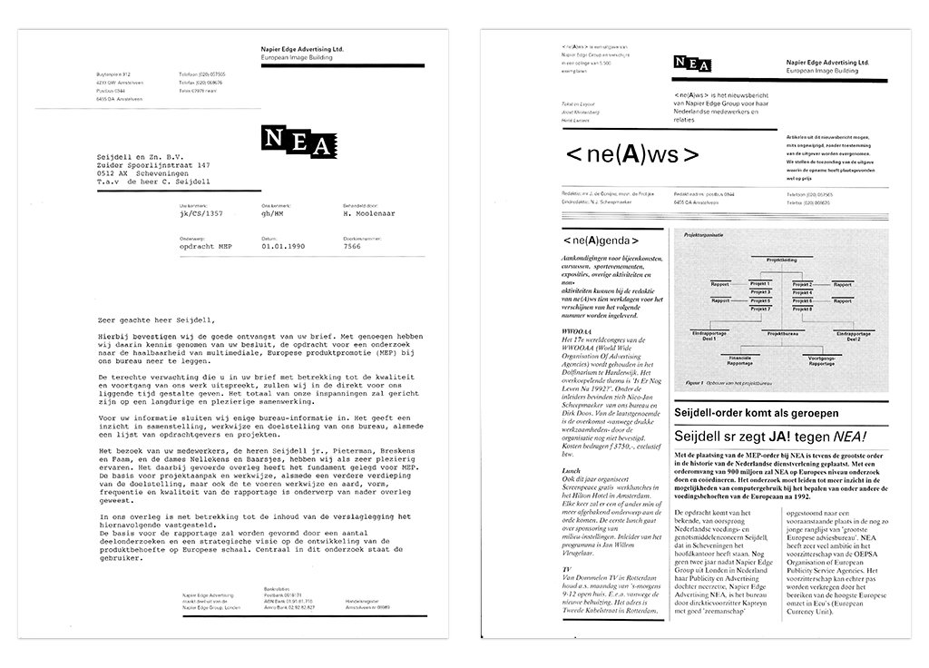
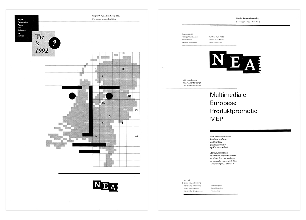
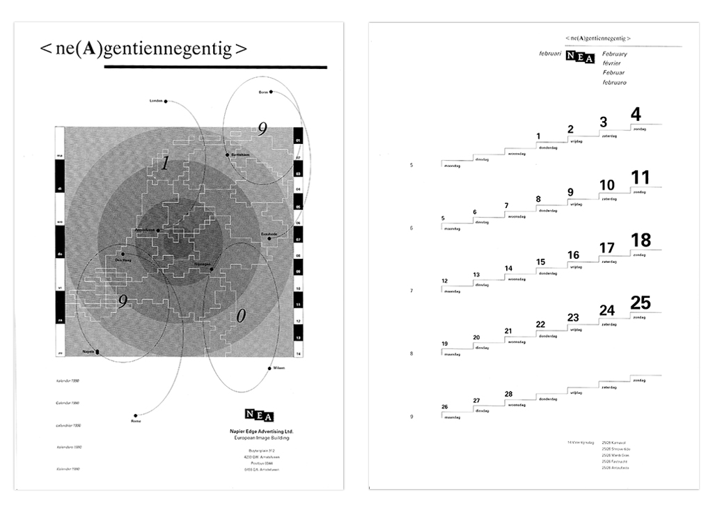
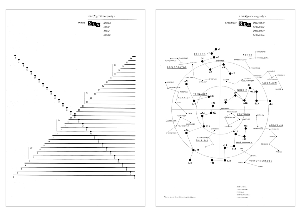
But the marketing department felt that they couldn‘t go on the market with just the house style of the Province Noord-Brabant. So we suggested to create a series of sample documents. It became a house style for a fictitious institution: Napier Edge Advertising (NEA). Together with Joost Klinkenberg (former Total Design colleague) we made designs and wrote the texts for the NEA stationery, an invoice, a newsletter, a calendar, a symposium and an annual report. We implemented the NEA house style in the Océ 6000 system. In the long run it became so easy that I no longer sketched on paper but made designs directly via the Océ 6000 system.
Joost Klinkenberg also realised that he entered documents, designs and texts directly on the Océ 6000 system in Venlo. And that without a course, explanation or manual. As he describes: ‘Henk picked me up at the reception on the first day in the morning, pushed me behind a system with a screen and said: ‘Well, good luck!’ I thought: that‘s because Henk wants to see how I‘m doing; it‘s a test! The Marketing department is behind this! Surprisingly, I did not encounter any problem in realising the documents. The interface was recognisable to me as a designer. I had experience with the terminology of the Aesthedes Design System and the Apple Macintosh II, including the Pagemaker and FreeHand packages from Aldus. And of course document layout knowledge. I expected that after receiving the job (the test!) I would be asked substantially about the experiences, a debriefing, aftercare. But that didn‘t happen. So I was wondering: who are the users of this system? Skilled graphic artists with design experience and knowledge of terminology? Secretaries with graphic fingers? Policymakers with typographical love?’
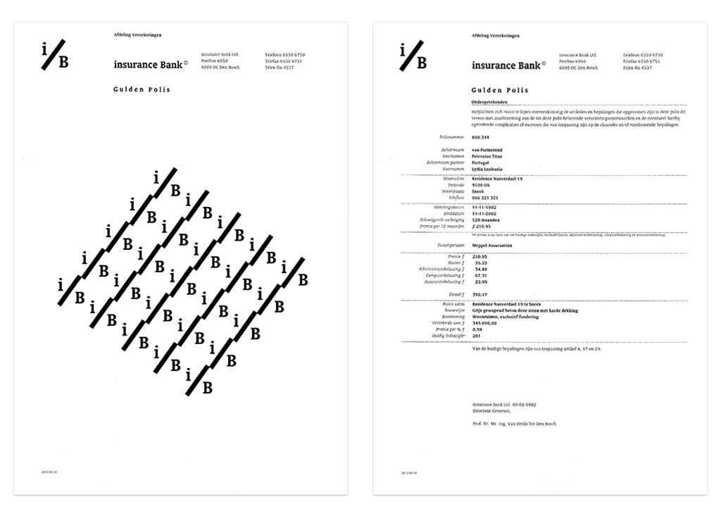
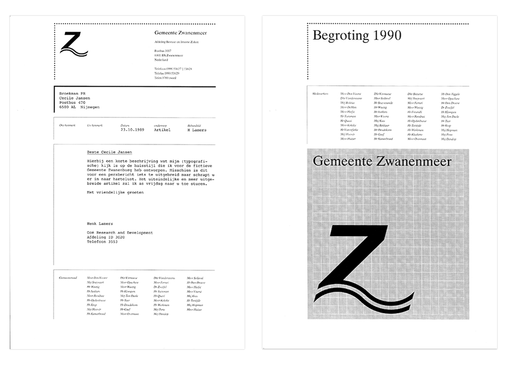
It was, of course, a unique situation this designing of sample documents. As a designer you have complete freedom. You can think of the content and the form because the institution you work for does not exist. And that is necessary because the documents may not refer to a real company. You should only be able to see at the documents what the Océ 6000 system is (typo)graphically capable of. The marketing department thought that was a perfect idea and so we had plenty of time to develop it further. I have designed two more fictitious house styles. For a bank: i/B Insurance Bank. And a municipality: Gemeente Zwanenmeer.