


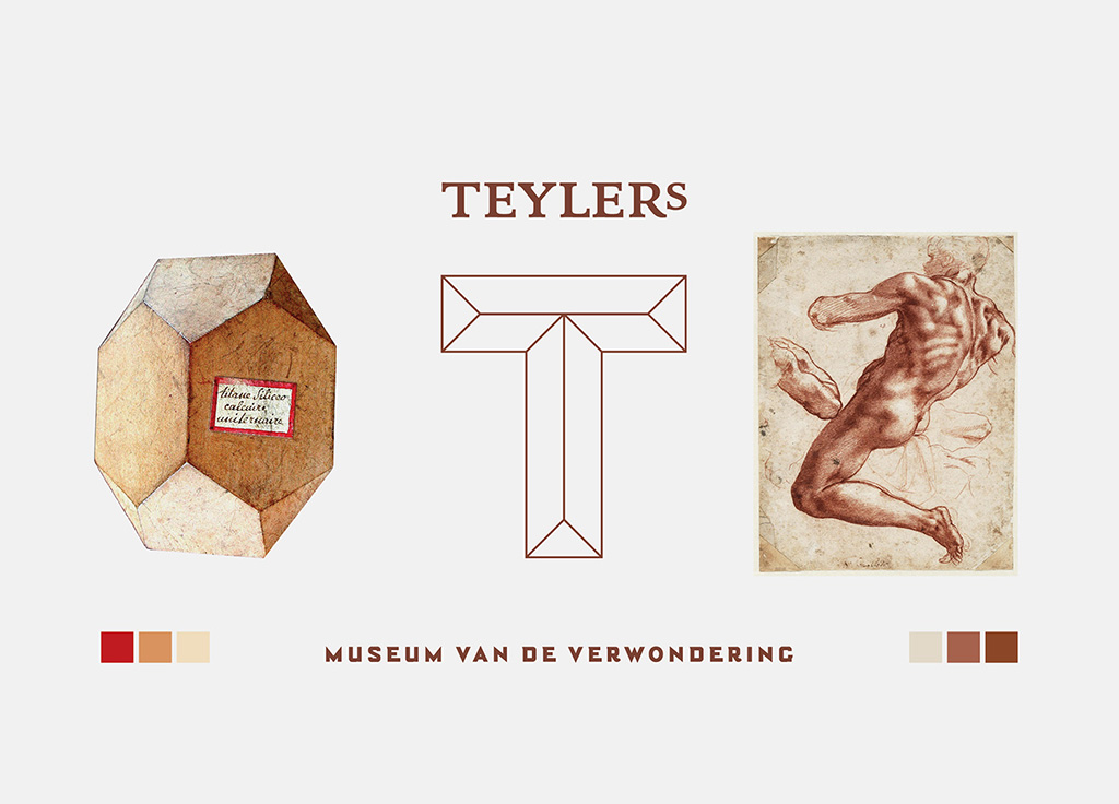
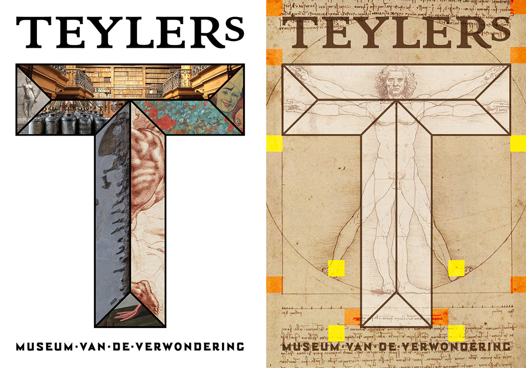
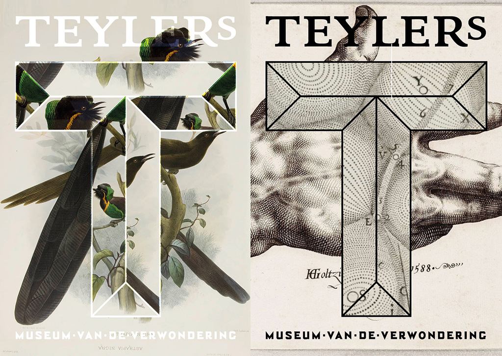
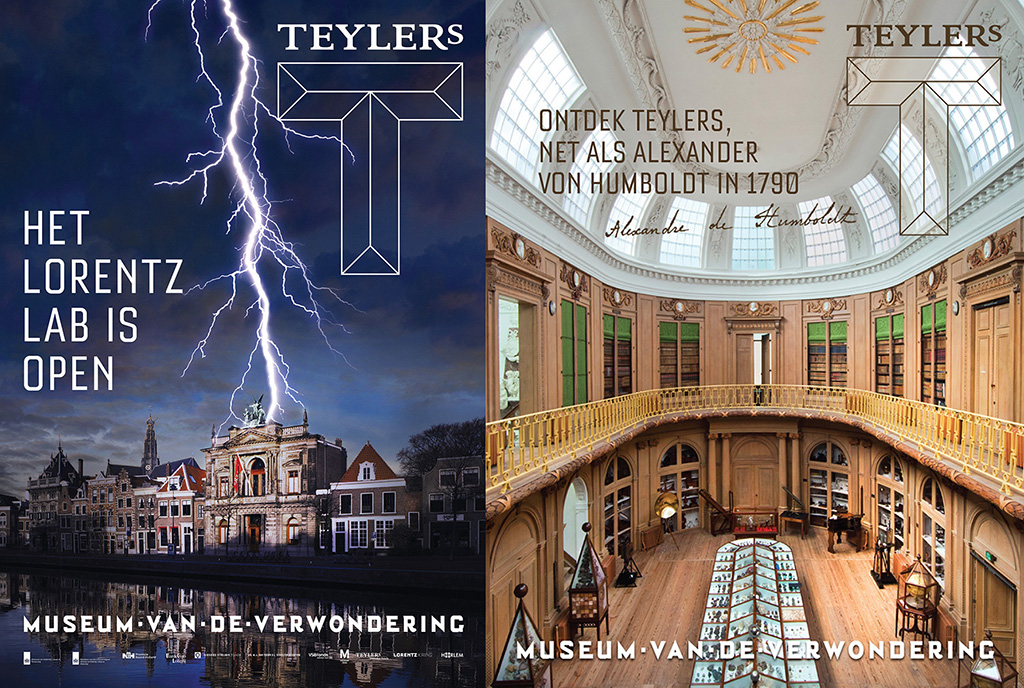
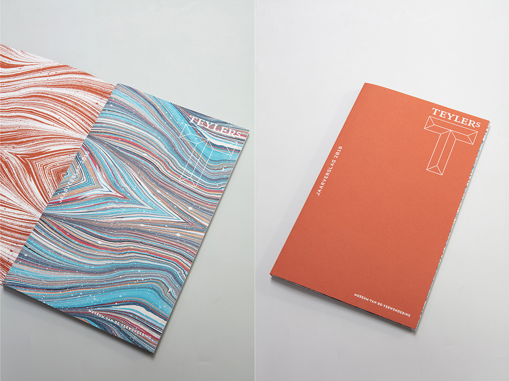
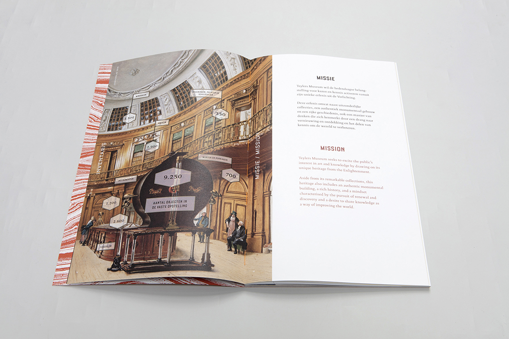
New house style Teylers Museum
End 2016, Studio Wesseling was approached to design a new house style for the oldest museum in the Netherlands: the Teylers Museum in Haarlem.
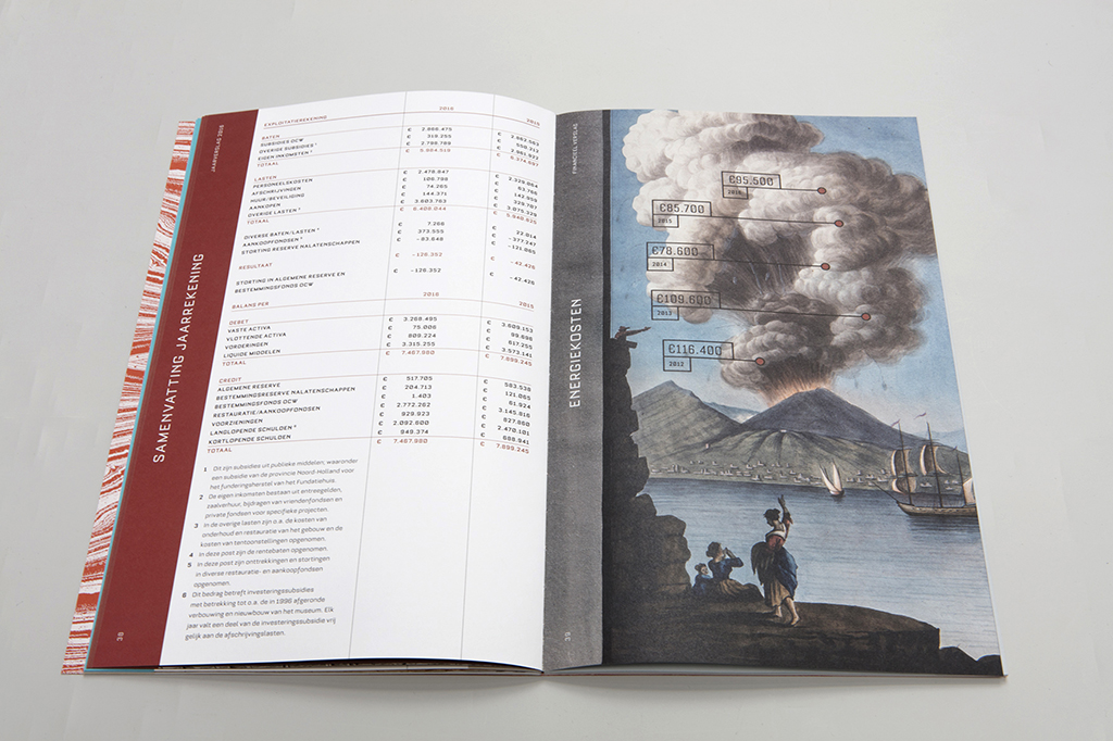
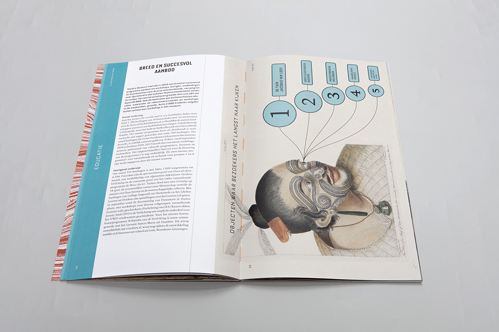
“We proposed a simple form: the T of Teylers, which in perspective and facets can show the different aspects of Teylers. To be able to create the spatial letter T, we studied the shape of the crystal models in the collection as well as the display cases in which they are shown. Also the golden ratio has contributed to the final form. Particularly when drawing up the Jaarverslag 2016 (Annual Report 2016) we have applied it very strictly.
“We selected the Bourgeois family font, an extended font family that represents the scientific uniqueness of the museum. The basic colors of the house style are black and white. All the added colors depend on the works from the collection or the campaign.”
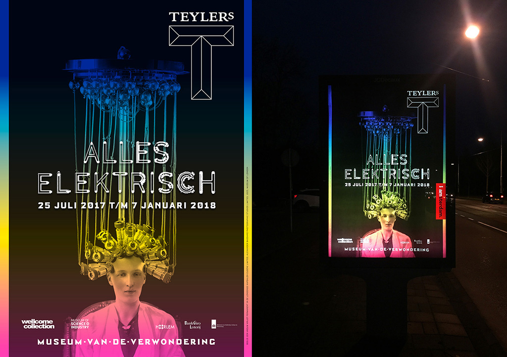
“We know from experience that it takes a while for a house style to ‘fit like a T’. So far, we have done three outdoor campaigns. The new Lorentz Lab was the introduction of the T. Then came ‘Alles elektrisch’ (All electric), a project in which we could work with fluorescent colors and in which the house style showed up increasingly better. In the upcoming campaign, ‘Monsterdieren’ (Monster animals), everything falls into place: the flyer, leaflet, poster etc. are transformed into a unique campaign image with additional permanent house style elements. In the exhibition also the new typography is used, which completes the use of the corporate identity.”