


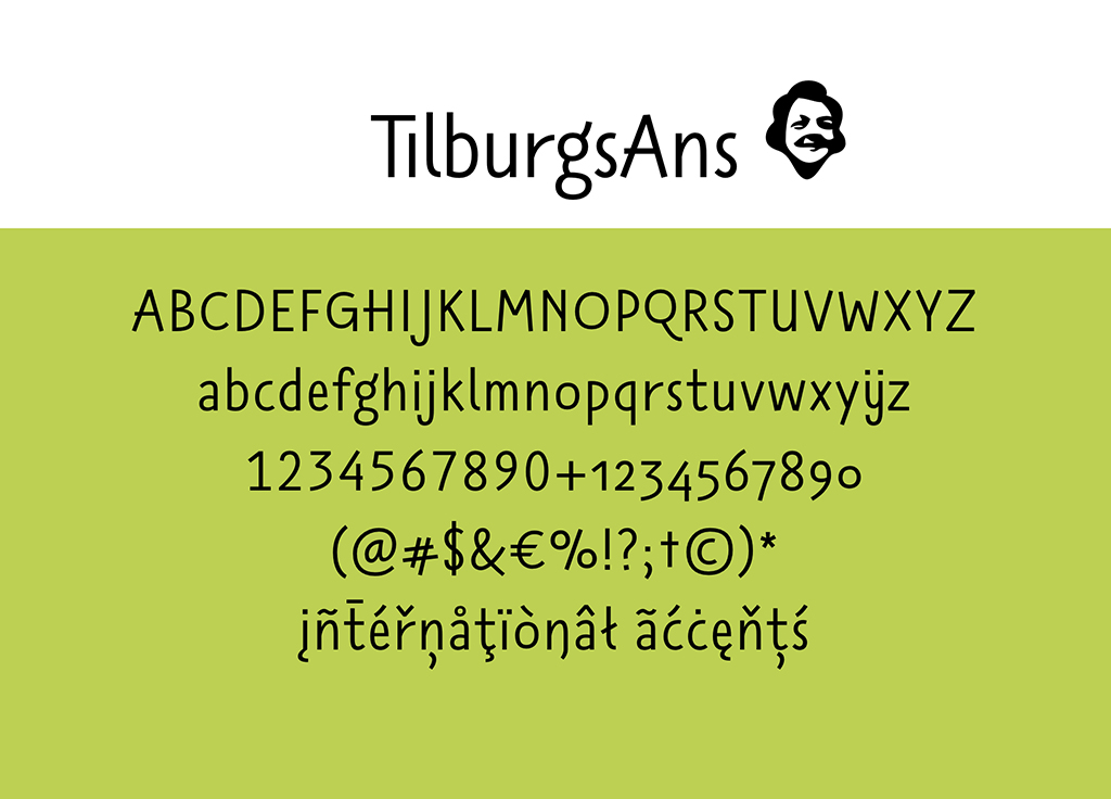
TilburgsAns
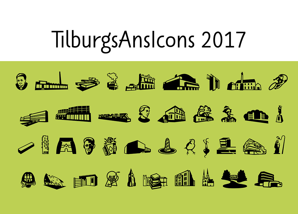
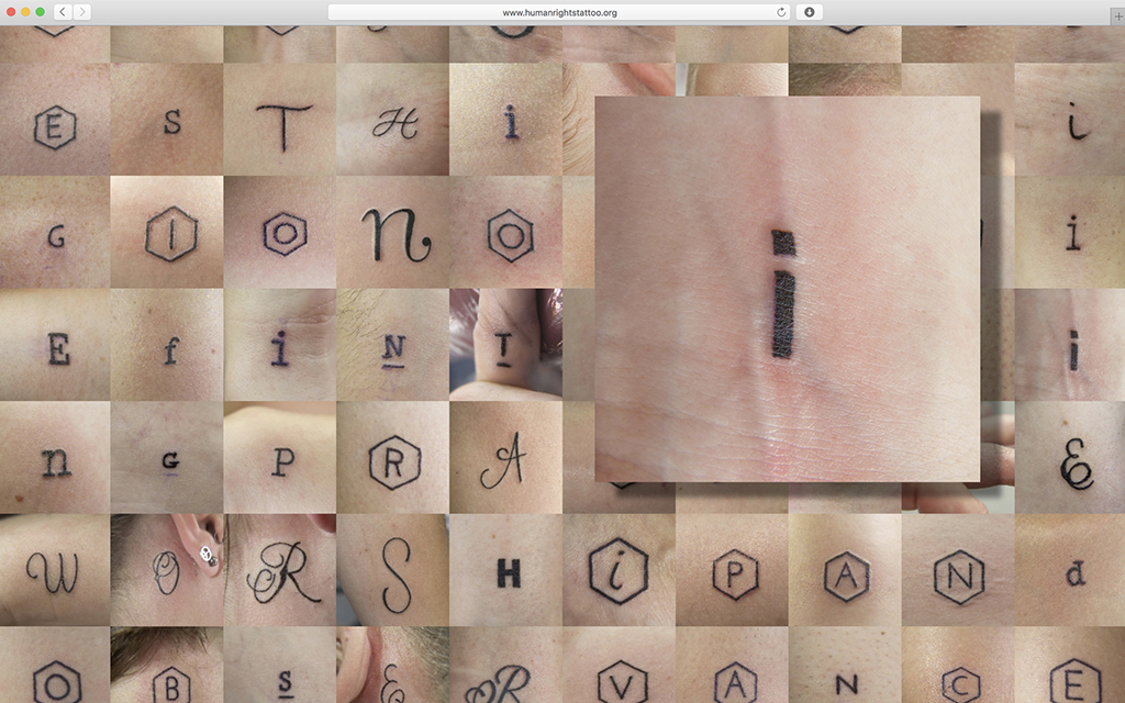
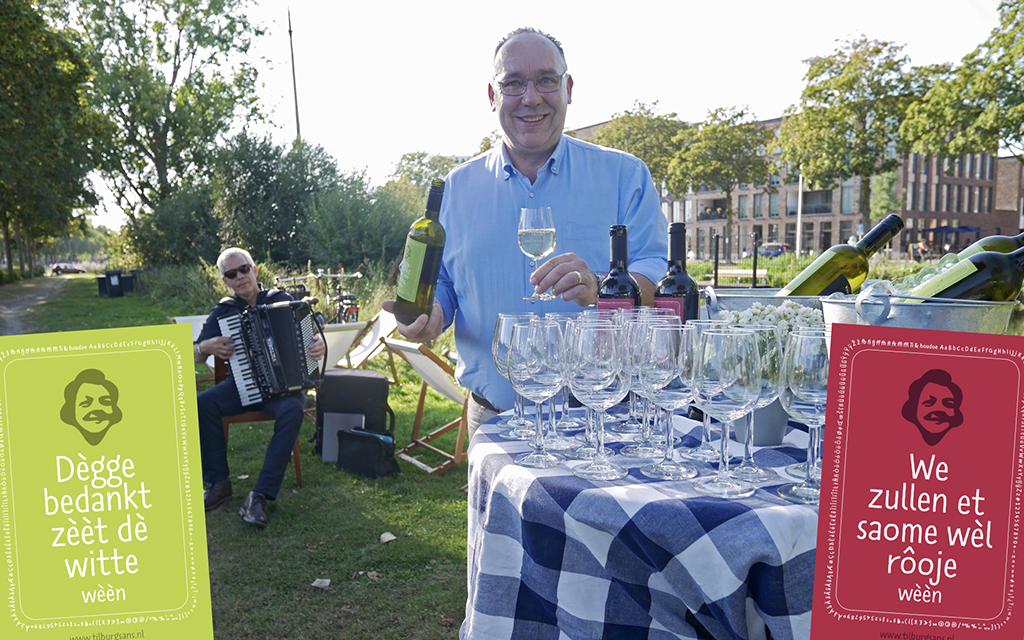
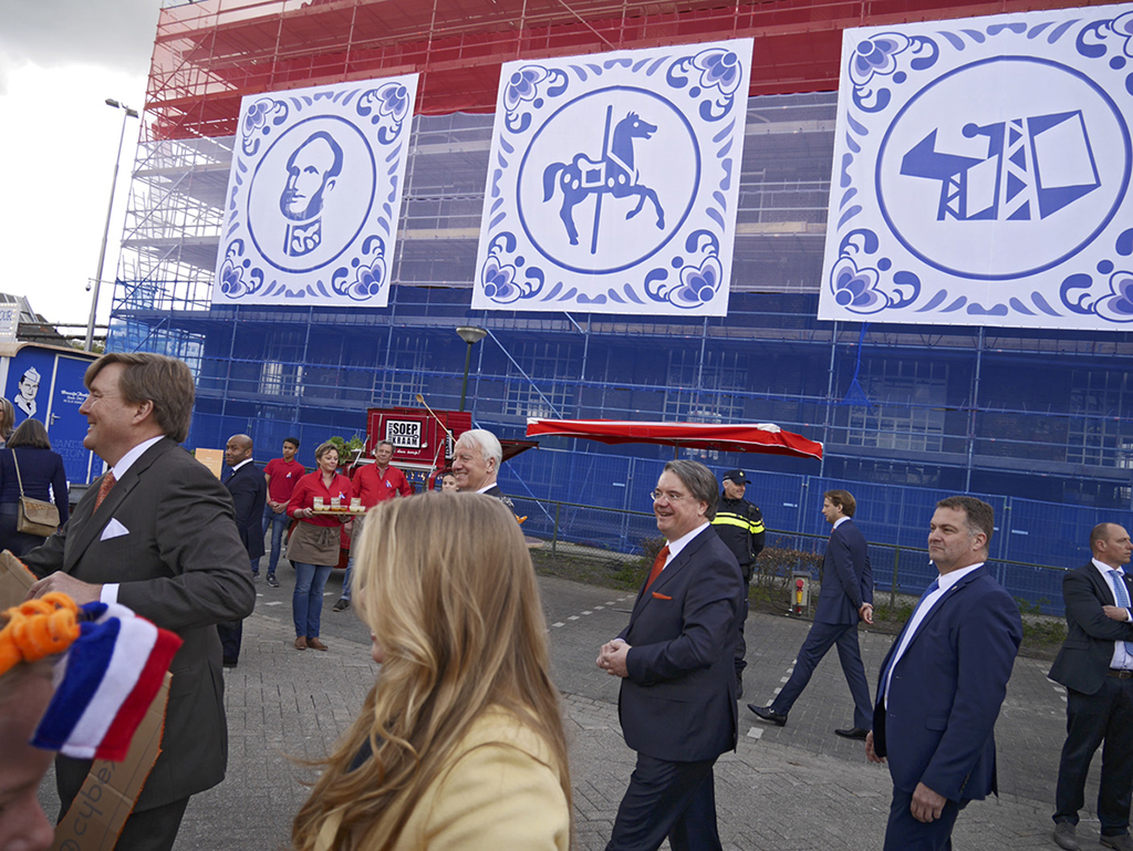
TilburgsAns is a project of designer Sander Neijnens and illustrator Ivo van Leeuwen. They created a portrait of the city of Tilburg, not in the form of a painting but as a typeface. The shapes of the letters reflect the character of the city: raw, unconventional, surprising, experimental, swinging, full of humor. TilburgsAns also contains icons of characteristic locations, events, persons and dialect words.
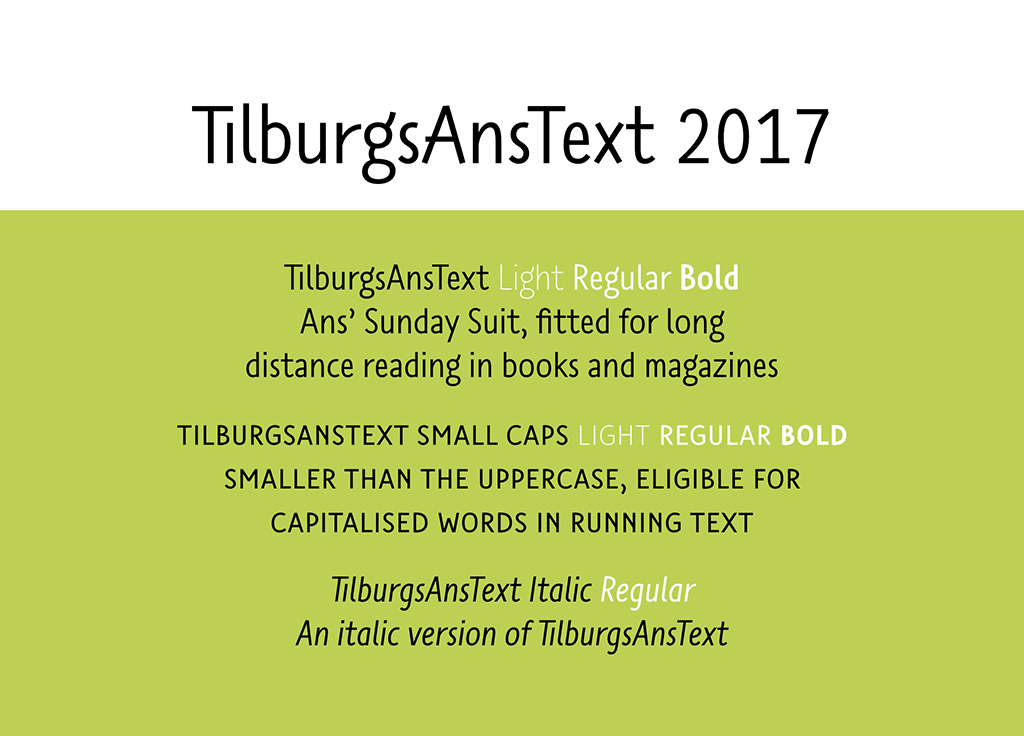
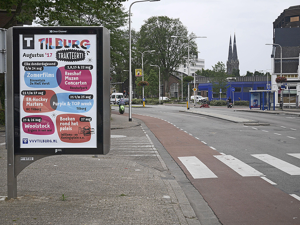
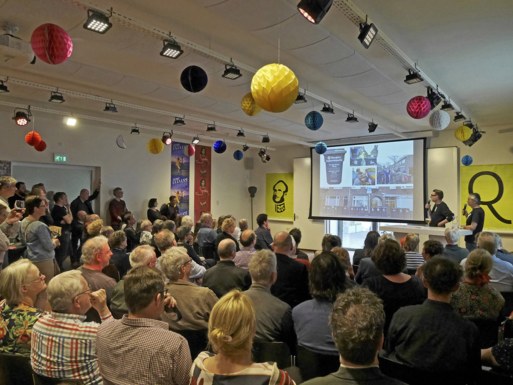
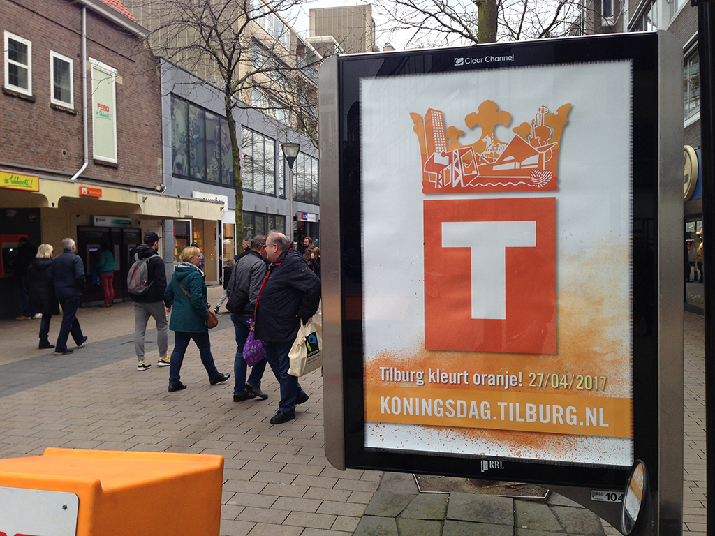
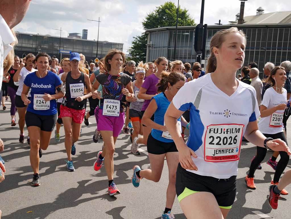
The typeface can be downloaded for free. It’s already been widely used: in websites, brochures, local papers, city plans, posters, wall decorations, etc. Striking was the application on the starting numbers of the Tilburg Ten Miles and in the logo of Koningsdag 2017 (King’s Day 2017). In May 2017 followed a presentation at the TYPO Berlin where a new text version of TilburgsAns and new icons were launched.
A special part of the project is the Letter Adoption plan. A letter, punctuation mark, or symbol can be adopted for 200 Euros. It is also possible to adopt a space for only 10 Euros. Meanwhile, more than 130 characters and 190 spaces have been adopted.