


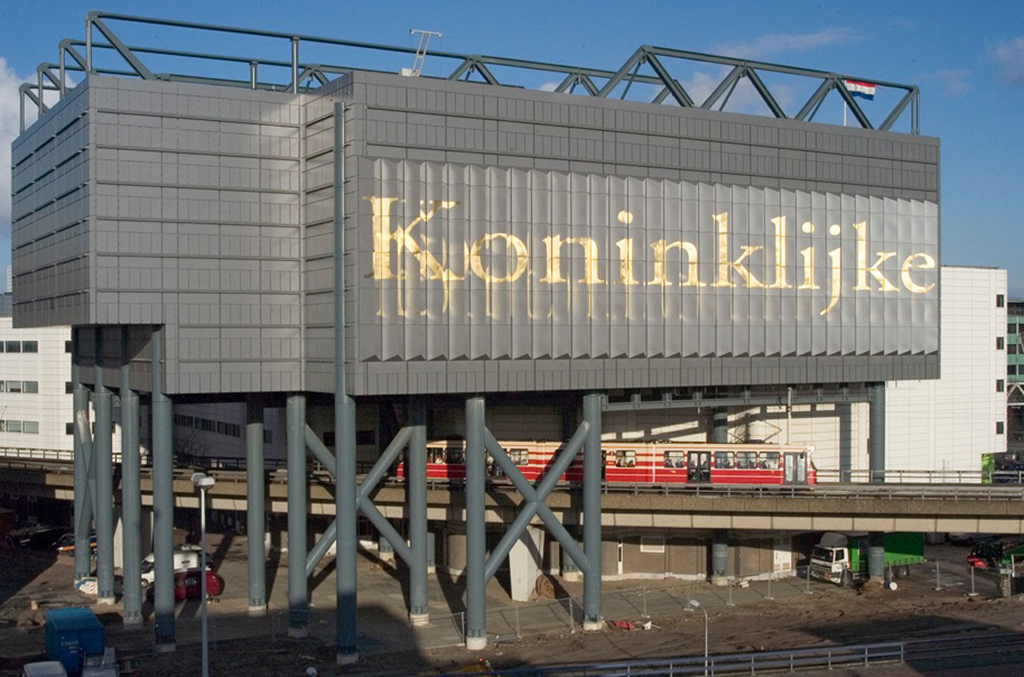
Koninklijke Bibliotheek
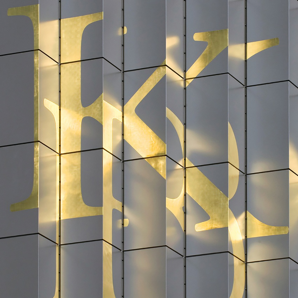
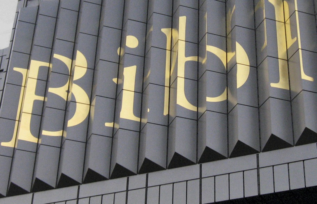
Viewed from one side, it reads ‘Royal’; from the other side, it says ‘Library’. The most exciting view is from the center front: that’s when the letters are overlapping, creating a beautiful, abstract image.
All together, the gold leaf weighs not much more than a packet of butter. Yet these huge letters have been a deciding factor for the shape of the façade panels of this construction for the Koninklijke Bibliotheek (Royal Library). This was possible because designer Karen Polder and architect Herbert van der Brugghen cooperated from the very first moment.
Logistics was a complicated task. The gold on the panels was applied at Royal Eijsbouts in Brabant. The panels were transported hanging, because otherwise the gold leaf on the corners would be damaged. The components had to be handed over in the correct order at the construction site.
Karen Polder offers
I will be raffling of the book Cautious Dynamism. The Koninklijke Bibliotheek Building 1982–2007 (NAi Publishers) among the people who respond before November 11.
Respond
Photos: Beeldstudio KB, Jos Uljee