
Interview | Graphic Matters
Loes van Esch and Simone Trum together form Team Thursday. Based in Rotterdam, they design colourful visual identities, books and spatial objects. They do so with a special interest in typography and curiosity about materials; always looking for patterns in everything and everywhere around them.
At Graphic Matters Summer School 2024, Loes was one of the three masters on behalf of Team Thursday. During a three-day masterclass, participants formed a dynamic editorial team, in which they created a typographic book together.
How did Team Thursday start?
“Simone and I were classmates at ArtEZ in Arnhem. We both knew we wanted to become independent designers after the academy, but had not seriously considered doing it it together. That started when we both participated in the Typography Workshop / ISIA Urbino Summer School in Urbino, Italy. Together with other beginning designers, we spent a summer in a small town on a mountain top. Everyone worked hard, but there was also plenty of time to get to know each other. That’s how things started to come together.”
Letters come up a lot in your practice. What does typography mean to you?
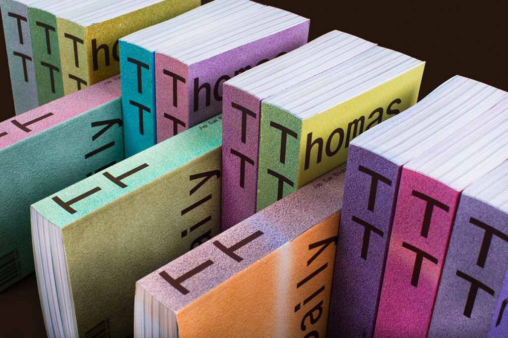
“Typography is a very important part of our work, which we pay a lot of attention to. We find it fun to create our own letters from which a new shape emerges.”
Does it always have to be legible?
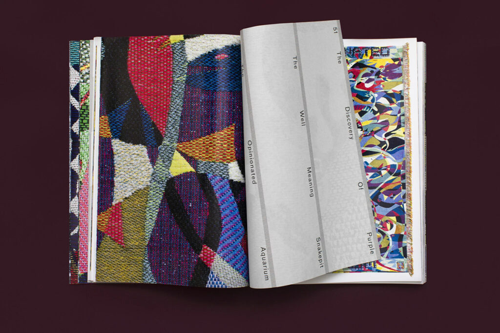
“That depends on the purpose. Sometimes it may become more of a pattern, in which case we use typography as a tool to create a shape. You keep looking for a longer time and only on second glance see that it is a letter.
We had to shake off the idea that a text should always only be functional and legible. At the academy, we didn’t work that way at all. Later, we found a kind of idiom in that. Since 2010, we have been working together, with form research playing a big role, among other things.”
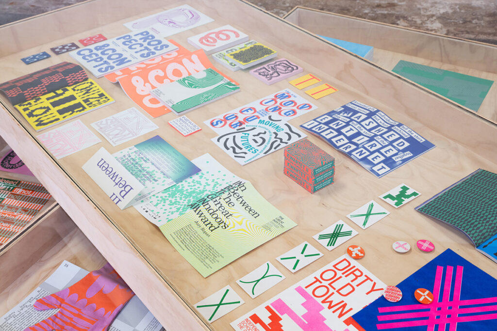
What typifies your typography?
“We like distinct typography where there is a gesture in it. When we make letters, we often use some kind of systematics or modularity. With letters, we create readable constructions, which also often contain a certain awkwardness or woodenness.
Regularly, an outcome surprises us and we discover something new. That is a great process. Forms and projects often intertwine.”

Which typeface exudes summer and why?
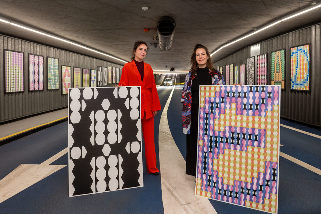
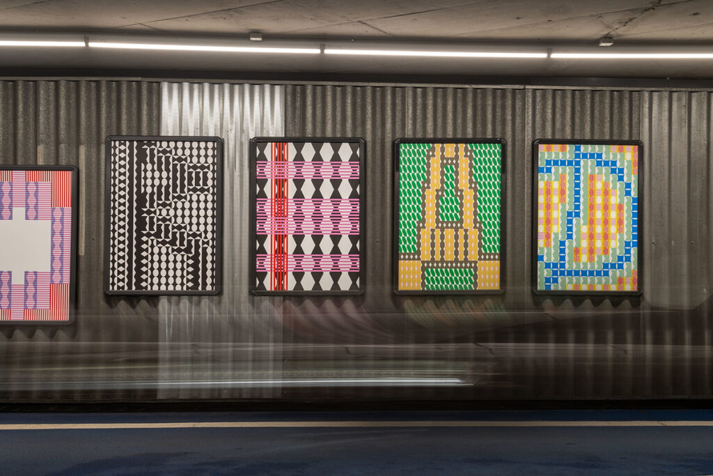
“Letters for us are often characters; figures that do things and have characteristics. A letter emerged from our participation in TYYYPOëzie (a project by Graphic Matters), which we later developed further into a set. We used this, for example, in a curtain. These letter shapes are derived from the ‘Sun dog’ phenomenon, which is an infinite mirage of the sun. I do associate those with summer.”
About Graphic Matters
Graphic Matters organises various events and projects around graphic design. With appealing and accessible exhibitions, lectures, workshops and interventions, the organisation aims to make people reflect on the power of graphic design. Summer School is an annual event where (inter)national participants attend masterclasses taught by renowned designers.


