Jean-Paul Mombers (1958, Waalwijk) is an independent graphic designer and teacher of graphic design. And mad about type. Fond of letters, typography and what you can do with them. Traditional handlettering has stolen his heart.
I am letter-crazy! If I walk down the street and see half a glove lying around; that’s a ‘V’ to me! Or a twig in the forest which looks like a ‘Y’. I pick it up and put it in my box ‘found letters’.
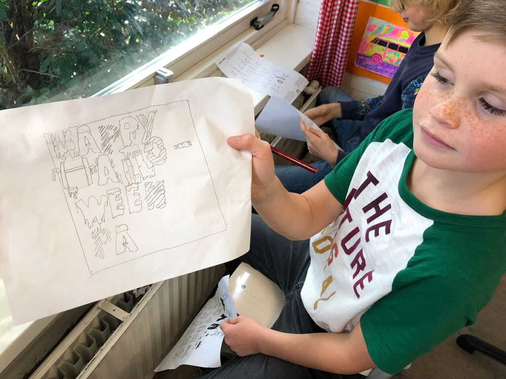
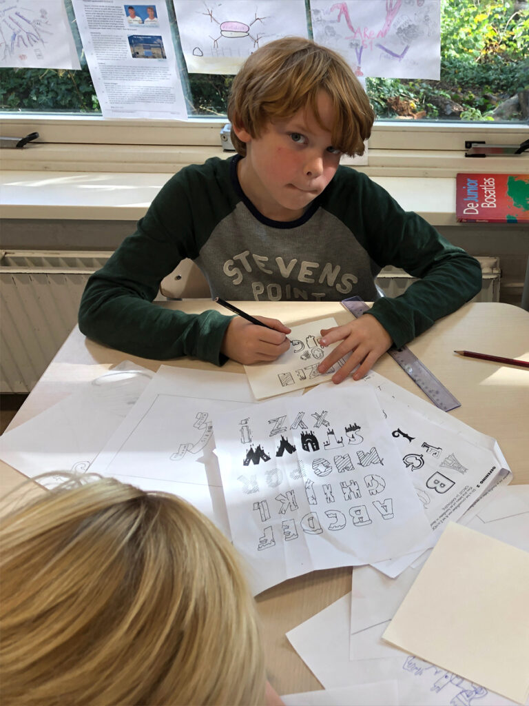
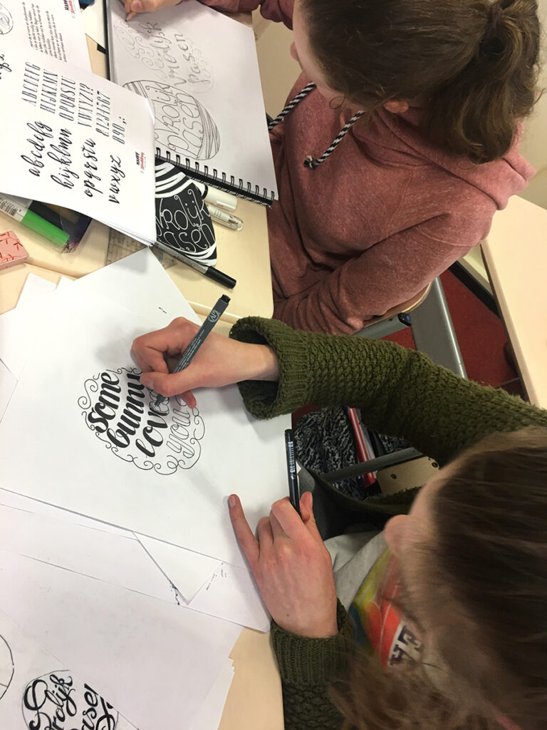
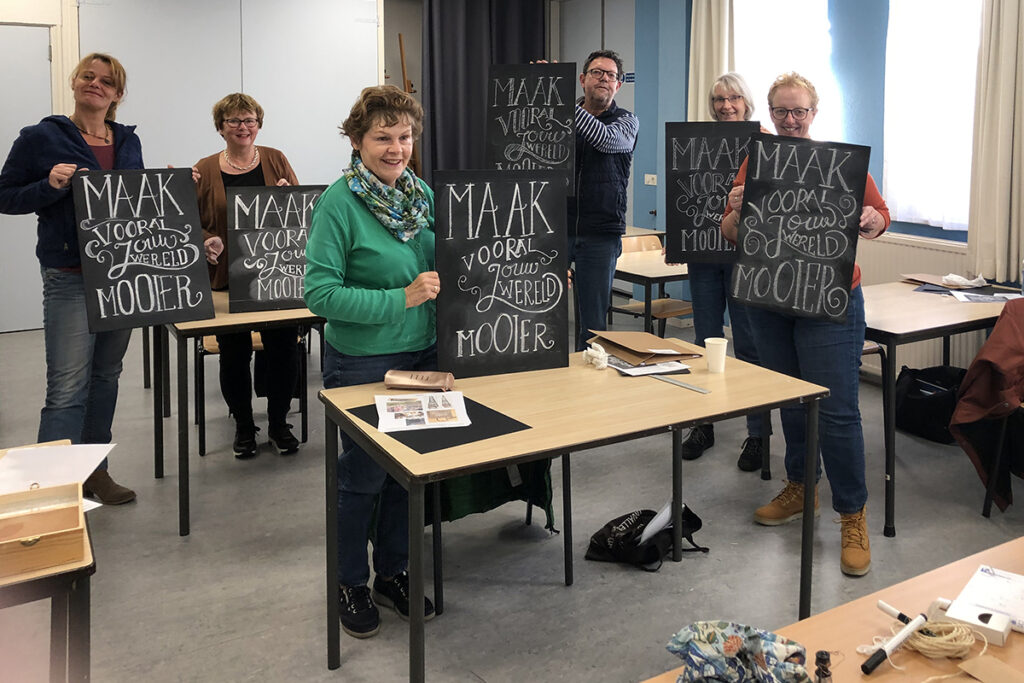
At Happy Handlettering Haarlem (HHH) you learn to draw, design letters. With a blank sheet and a 4B pencil, you start sketching. There is no erasing! With that, the ideas are lost. An ‘A’ consists of 3 lines but it’s all about ‘how do you put them down?’ Every time, the result is surprising and the creator is proud. ‘It’s not the destination, it’s the journey’. The path of creating is what counts. That makes me happy but also the creator. Everyone, young or old, has something creative in them; even if at first one thinks not!

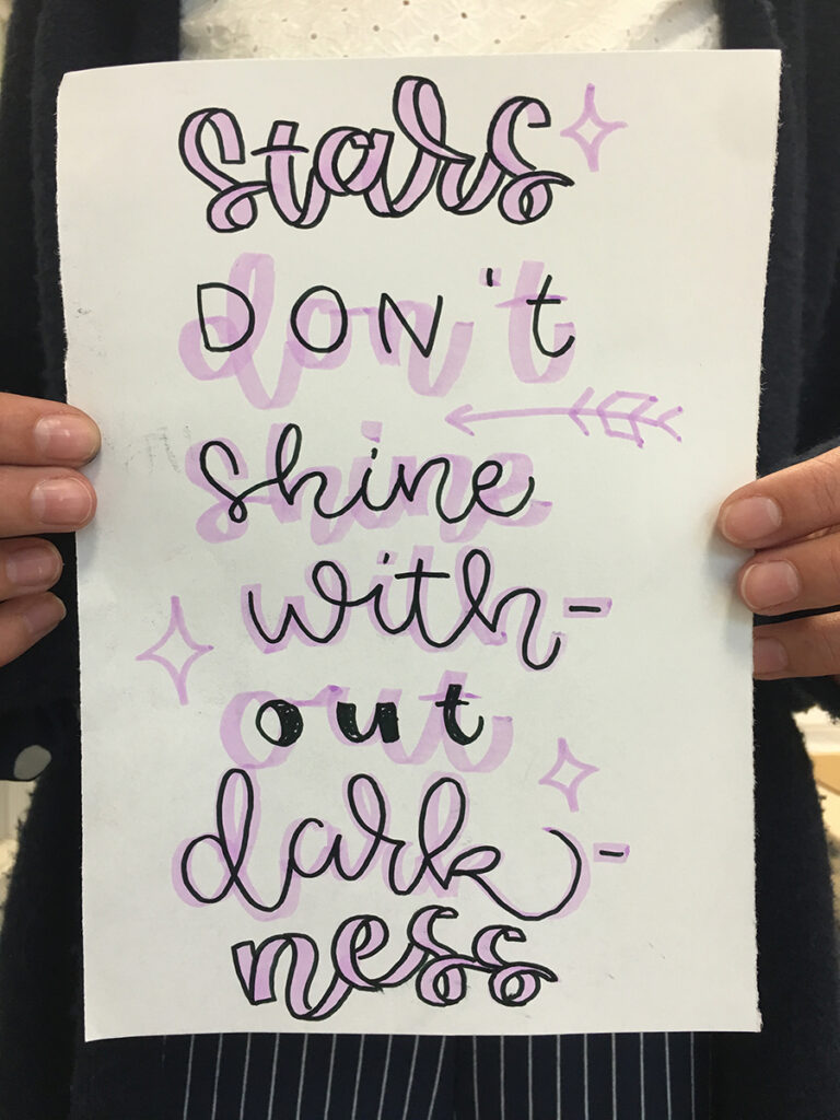
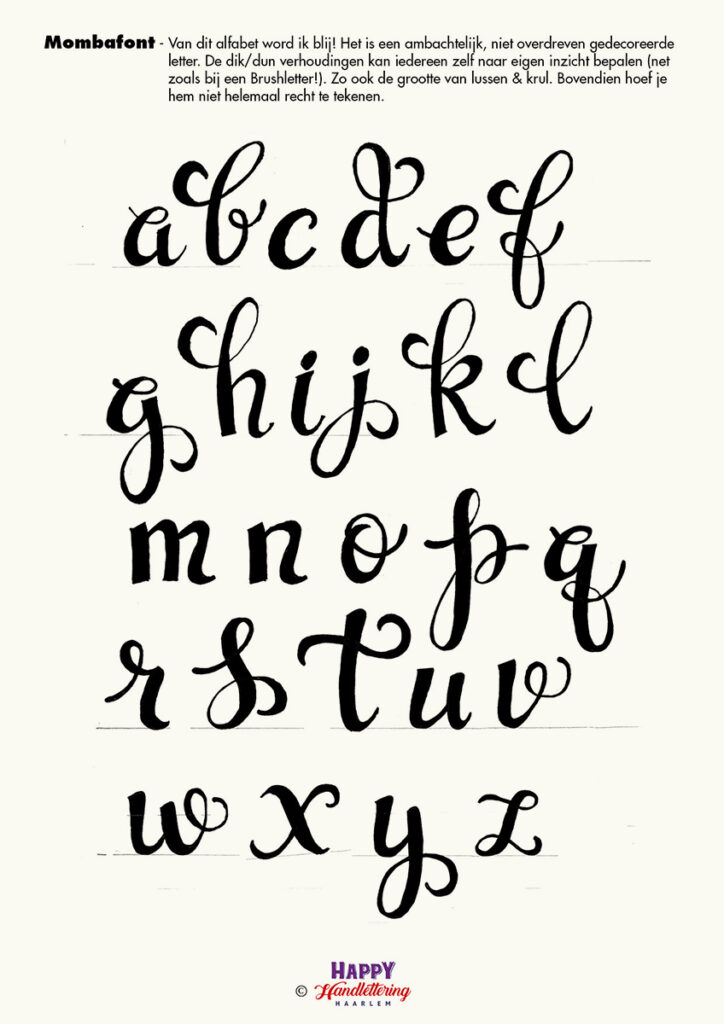
Chalkboards, quote cards, alphabet design and label design. The font Mombafont, which you draw with an ordinary pencil, has the character of a brush letter and is included in the lesson package!
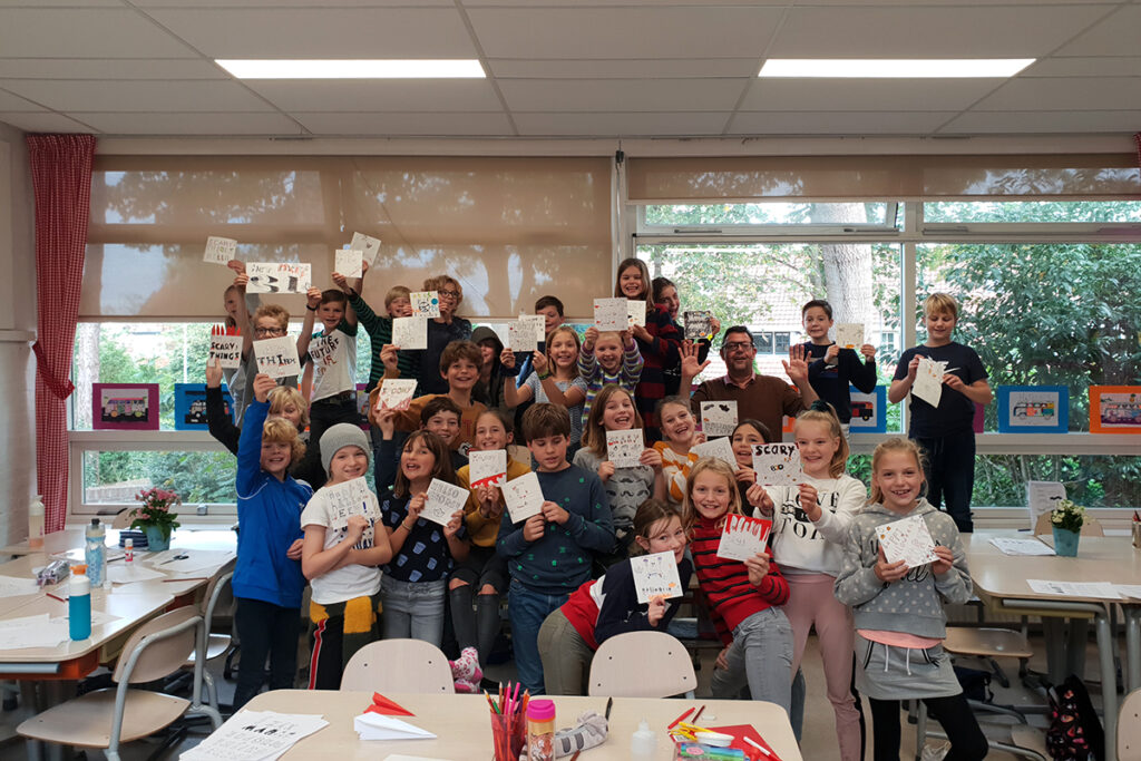
Young and old I teach handlettering. The assignments, incomprehensible but true, are worked on with enthusiasm. Working in a group or individually towards a fruitful end result. I teach handwriting on location or in my studio at Creative Brotherhood Bogota in Halfweg.

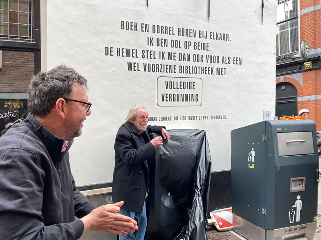
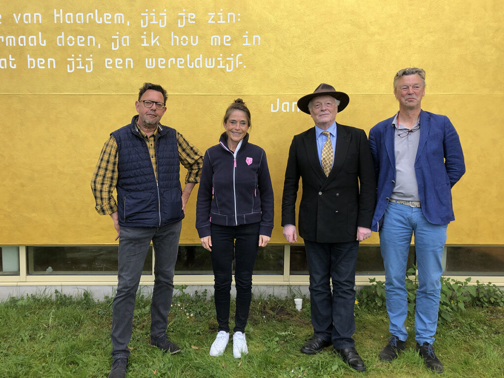
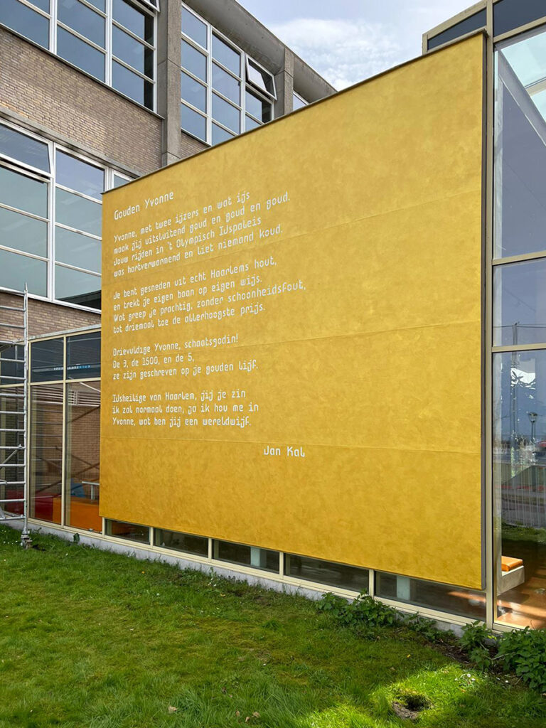
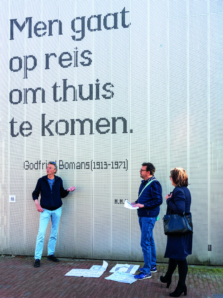
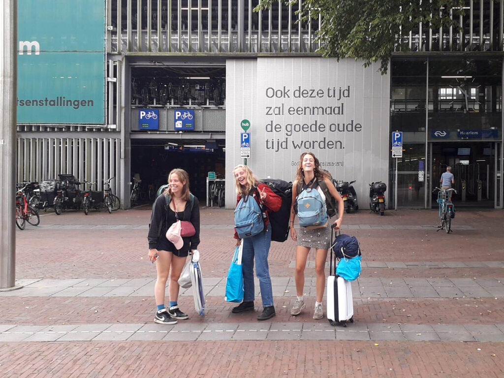
HHH also creates texts on walls in Haarlem. I give shape to supplied texts by well-known Haarlem writers such as Bomans, Dorrestein, Mulisch or Coornhert and paint them on the wall. For example, the MoBo was designed especially for the walls at Haarlem Central Station in honour of two quotes by Godfried Bomans.