
Longread | Richard Niessen
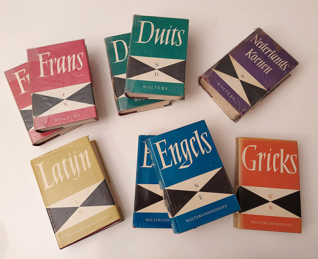
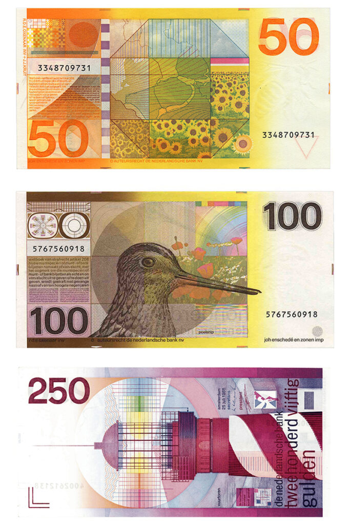
Today, the impression that the Netherlands is a paradise for visual communication is still widespread. Students from countries like Korea, Moldova, Portugal and Malaysia come to The Hague, Amsterdam or Arnhem to learn the trade. You would expect the rich design history to be a major reason for their choice, but just as the Netherlands has long since ceased to be a design Valhalla, heritage hardly plays a role: it is barely known and rarely a motivation to study here. Those who exceptionally get their hands on Ootje Oxenaar’s banknotes, Susanne Heynemann’s dictionaries or Mieke Gerritzen’s leaders find it hard to imagine that these fantastic designs were once everyday utensils.
Indeed, the Netherlands has no well-funded institution that can structurally and diligently devote itself to graphic design heritage and its promotion. As yet, organisations like the Network of Archives of Design and Digital Culture (NADD) or the Wim Crouwel Institute lack the capacity and resources to give the importance of an accessible and lively memory for visual communication the attention it deserves.
Memory as a basis for art and science
Why is preserving and bringing attention to design history actually important? According to Greek mythology, Mnemosyne, the personification of memory, was also the mother of the muses. Memories form the basis for art and science, and the collective past provides the building blocks for stories and artworks that help make sense of the world today. Those in power, by the way, are all too aware of this. One of the most poignant illustrations of this is the destruction of Sarajevo’s National Library in 1992: an attempt by the Bosnian Serb forces to erase a shared past and thus make a shared future impossible.
The way a society preserves and exploits its memory reflects its prevailing views and values. One example is the globalisation project of Alexander the Great, who, around 300 BC, annexed the Greek city-states and dislodged their inhabitants from their familiar structures. Instead, he introduced paideia, an ideal of knowledge and beauty, and invested in the Mouseion of Alexandria, an institution with an associated library that grew into the largest of antiquity. The Mouseion was where scholars lived in community of property. Research was conducted there and one could attend lectures by various philosophers and scientists. In fact, it was the ancient precursor of the university, an institution to promote knowledge and beauty. Centuries later, in 1677, Elias Ashmole laid the foundations for the modern museum with his cabinet of curiosities in Oxford: a place where objects are preserved, studied and reinterpreted as inspiration for the future.
End of history
This definition is hardly tenable any more. Budget cuts and the pressure to remain economically profitable have transformed museums into predictable exhibition machines on the one hand and forced them to focus on digitisation and re-inventory on the other. This has led to rigidity and an internal focus, taking the dynamics of the outside world out of the picture. The breeding ground of culture was no longer actively cultivated and, after all, it was no longer needed for anything: at the end of the 1980s, the battle seemed to be over: the market had won, and there was no alternative. People did not speak of the ‘end of history’ for nothing.
In 1993, De Beyerd in Breda organised the exhibition Graphic Design in the Netherlands – a century, with an accompanying publication by Kees Broos and Paul Hefting. The exhibition was received with a certain complacency – for many it seemed like old news… Influenced by market thinking and the optimism surrounding the emerging internet, the focus of organisations like the Design Institute shifted entirely to the future and the digital world. This is reflected in the archives: institutions like the Dutch Archive of Graphic Designers and the Stedelijk Museum preserve the work of icons like Wim Crouwel and Otto Treumann, but relevant work after 1993 is rare.
De Verbinding – Christiaan de Moor and Jurriaan Schrofer, 1962; Antony en Cleopatra, De Appel – Jan Bons, 1989; 50 gulden biljet, De Nederlandse Bank – Ootje Oxenaar, 1982; 10 gulden biljet, De Nederlandse Bank – Jaap Drupsteen, 1997; Range, Philips – Alexander Verberne and Ton Raateland, 1955; Nederlands muntgeld – Bruno Ninaber, 1980; Kinderzegels – Wild Plakken, 1985; I see I see what you don’t see, HNI – Rudy Guedj, 2019; Wolters Noordhof woordenboeken – Susanne Heynemann, 1965.
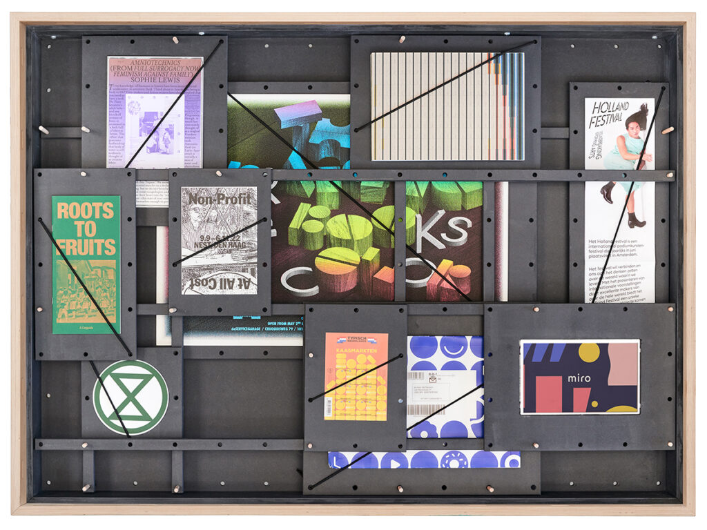
Ms Heresies – Rietlanden Women’s Office, 2020; Uranus – Karel Martens, 2022; Holland Festival – Kesselskramer, 2024; Roots to Fruits – Mirelle van Tulder, 2024; Non Profit At All Costs, Nest – Eline Mul en Faride Sedoc, 2022; The Arranging of Books by Color, de Servicegarage – Michiel Schuurman, 2012; Extinction Rebellion logo – ESP, 2011; Typisch Nederland postzegels, Postnl – Total Design, 2023; bol.com verpakkingen – Dietwee, 2019; Miro board – Verve, 2022.
Canon as a collective edifice
The term ‘canon’ comes from the Greek word for a straight ruler and was used to settle discussions about dimensions. Today, it denotes a recognised collection of influential works, often associated with a elitist highbrow culture and therefore not infrequently criticised. At a time when everything seems relative, the importance of a canon is regularly questioned. But rather than being a static list, the canon can also be seen as a dynamic and collective edifice-constantly evolving, constantly supplemented and updated. Such a shared frame of reference provides guidance and contributes to a shared identity. The consequences of our failure to nurture a rich shared memory can be seen in contemporary social relations. Therefore, it is crucial to invest in design history as a foundation for future developments.
Graphic design is a democratic art form that shapes collective memory through stamps, books, posters, signage and digital media, among others. It provides space to represent ideals that can be smuggled into the public space – and reach a broad audience in the process. By looking at graphic design heritage, not only does a visual archive become visible, but the underlying social structures and power relations throughout time can also be unravelled. Graphic design therefore deserves attention not only as a functional profession, but above all as a cultural phenomenon that is constantly evolving, strengthening our identity and connected to our society in many ways. The evidence of this impact should not be allowed to disappear from view.
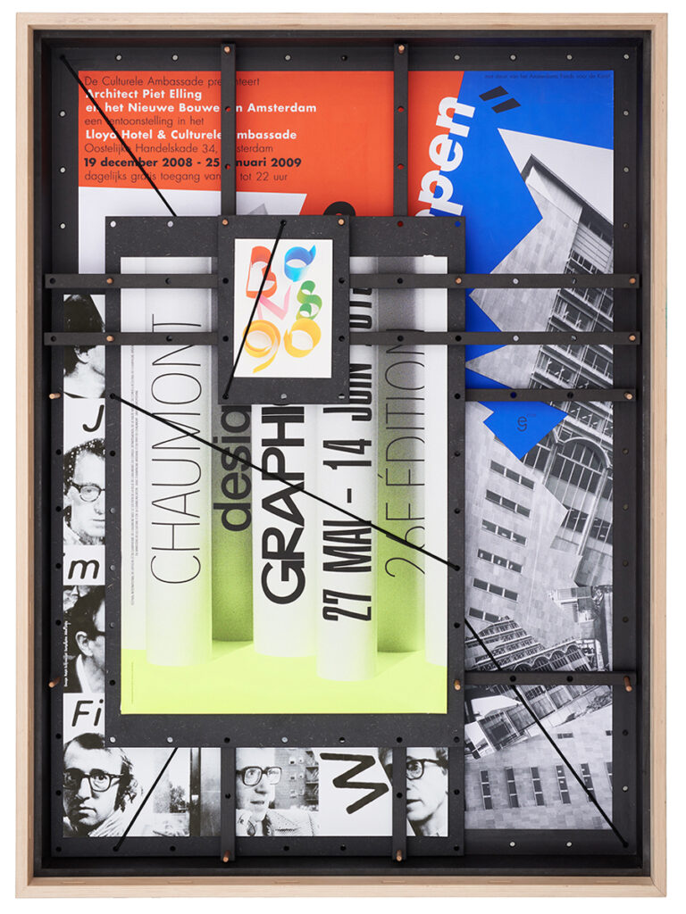
Architect Piet Elling en het Nieuwe Bouwen in Amsterdam, Lloyd Hotel – Gielijn Escher, 2009; Jan Bons 90 – Lex Reitsma, 2006; Chaumont Graphic Design Festival – Maureen Mooren, 2015; Woody Allen Filmpodium Zürich – Ralph Schraivogel,1998.
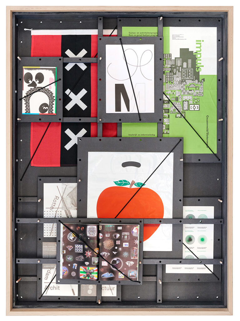
Le Signe, Chaumont – Mathias Schweizer, 2018; Amsterdam vlag – onbekend; Marres identiteit – Maureen Mooren, 2008; Impuls identiteit – Bas Oudt, 1990; De Appel identiteit – Will Holder, 2006; IABR identiteit – Richard Niessen, 2023; Sealand identiteit – Metahaven, 2004; Jan van Eyck Academy identiteit – Meeus Ontwerpt, 2013.
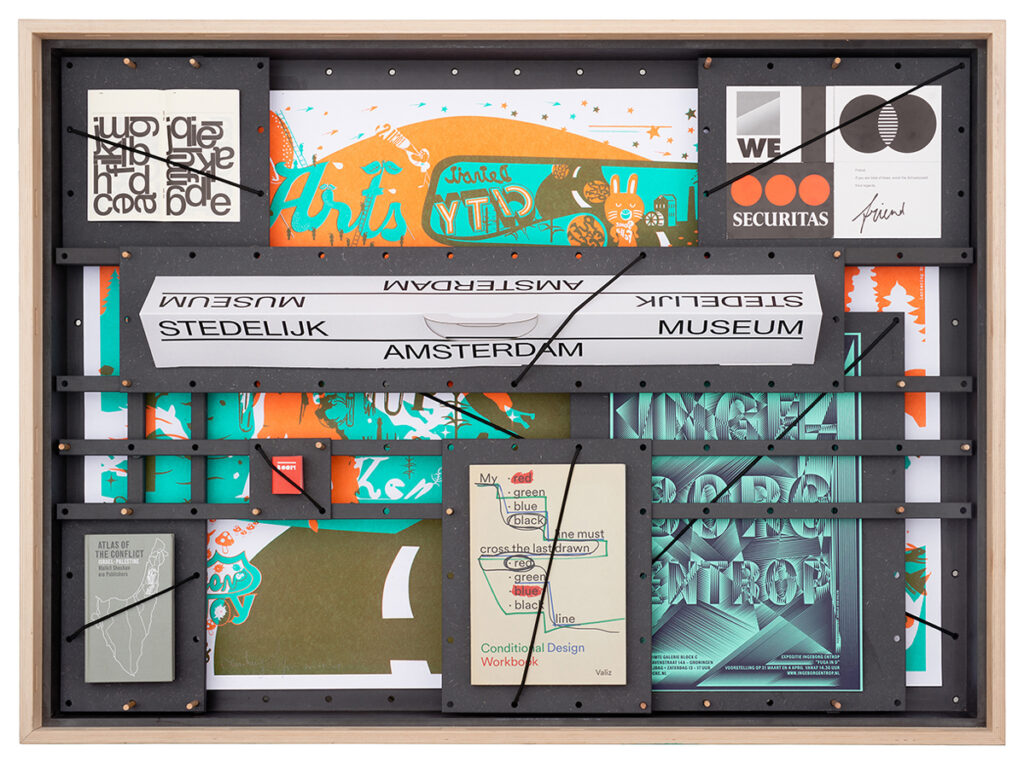
Automatically Arranged Alphabets – Experimental Jetset, 2015; Stedelijk Museum – Mevis & van Deursen, 2012; Oceans of Joy – Harmen Liemburg, 2005; Stadtstaat. A Scenario for Merging Cities – Episode 2 uitnodiging – Metahaven, 2009; Atlas of the conflict – Studio Joost Grootens, 2011; Biography in Books – Irma Boom, 2013; Conditional Design Workbook – Julia Born, 2013; Ingeborg Entrop, Block C – Hansje van Halem, 2015.


