Article by Esther Scholten
In the context of “100 Years of Best Dutch Book Design in the Netherlands”
While this article was being prepared, Esther Scholten, director of the Best Dutch Book Design Foundation and author of this text, passed away unexpectedly. In consultation with the board of the Best Dutch Book Design Foundation, it was decided to publish the article posthumously. The expert jury is grateful for the meaningful contribution Esther made to Dutch book design.
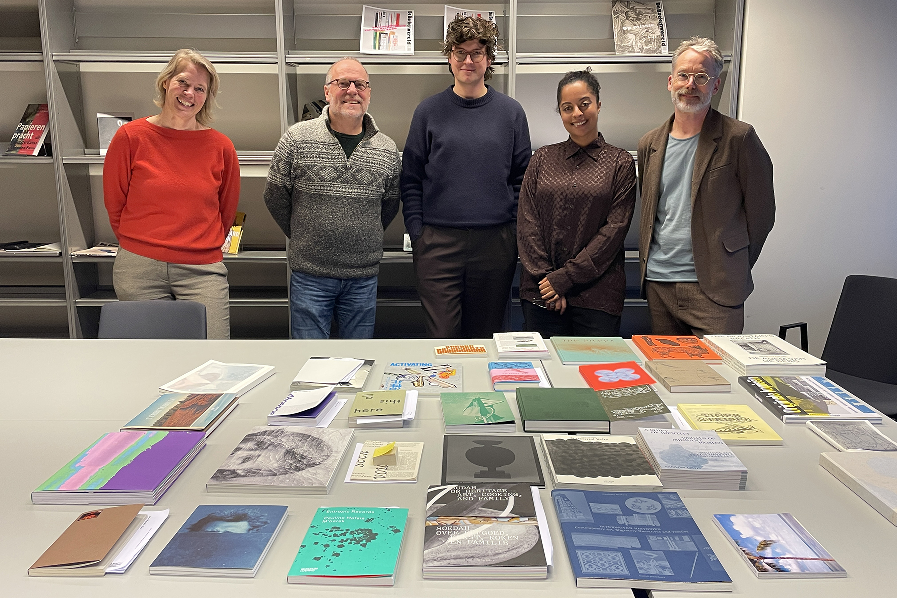
In early February of this year, the expert jury met to decide which books from 2025 would be named Best Designed Books. More than 160 bookmakers had submitted a total of 281 books, each of which was reviewed by designers Arthur Herrman and Serana Angelista, Jochem Öfner (director of the RaddraaierSSP printing company), Anniek Meinders (Head of Publications at the Van Gogh Museum), and design historian Kylièn Bergh. They had at least two days to evaluate each book individually. After this “preview,” they then spent two days behind closed doors discussing which books would make the final selection.
Kylièn Bergh wrote about the process in the jury report: “It has now been a hundred years since a jury first convened to select the Best Dutch Book Designs. The task sounds deceptively simple: sift through publications that appeared in the previous year until a selection remains of books that stand out within the Dutch field in terms of design and production. A century of experience—with the occasional interruption—might lead one to believe that there is now a formula or a well-thought-out strategy for evaluating books. Nothing could be further from the truth.” His statement provided a good starting point for the director of the annual awards to ask four of the five jury members about their experiences.
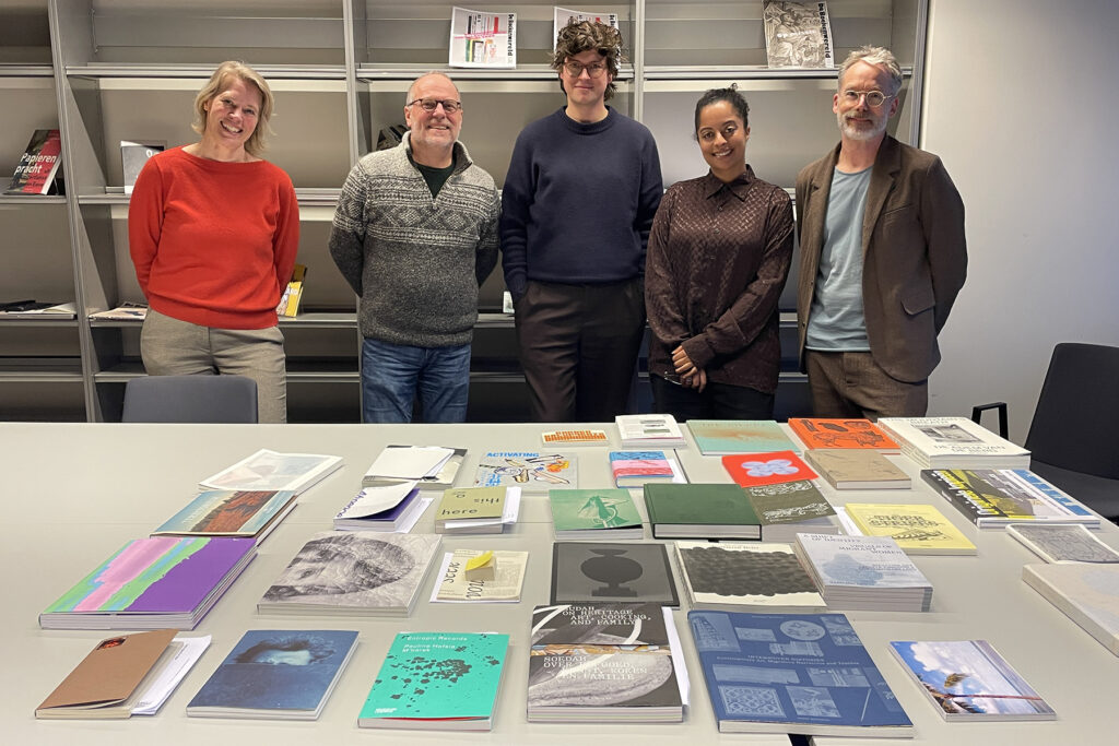
Serana Angelista: “Together, we need to be able to see past the noise to get to the heart of the matter.”
Since this was my first time on this jury, I took the time during the preliminary review to figure out the best way to evaluate all the submitted books. My top priority was to do justice to the creators by giving all the books my full attention. But how do you divide your attention when you know you have limited time? At first, I was too preoccupied with the responsibility I felt as a jury member and tried to take as many aspects into account as possible. I quickly realized that this wasn’t working and that I needed to focus on my own perspective—that of a designer and creator. At this stage, I didn’t yet need to adopt an “all-seeing” perspective.
With every book, I asked myself how it fits into the bigger picture: what is it about, what is its purpose, how was it created, how does the book connect with the reader, and what is its raison d’être? Then I assessed how the book compares to the rest of the submissions. Not necessarily in the form of a competition, “this book is better than that book”, but to get a sense of the submissions as a whole and what role that one, individual book plays within them.
I engaged with each book. It was an intimate moment in which I took in the content and its manifestation in design and production. Only when these elements clicked into place could I let go of the book and move on to the next one. At a certain point, I developed a rhythm of flipping through the pages, examining, and weighing my options. This allowed me to focus on the book in a relaxed way and draw on my own expertise and experiences. I found the right cadence and balance to do the books justice.
I found the two days of discussion to be a very enjoyable experience. There was room for everyone to approach the books from the perspective of their own discipline. The conversation took place in a relaxed atmosphere. As we talked and made selections, a collage of books emerged that kept changing as we progressed. Every argument was taken seriously and, in turn, influenced the final selection. My own favorite books also regularly gave way to others. I found it fascinating to see how someone with both knowledge and persuasive power could present arguments that made you view a book differently. And once you know something, you can no longer “unsee” it. As a jury member, you have the responsibility to capture the Zeitgeist of the previous year. Together, you have to be able to see through the noise to get to the essence. No deals were made. There was no clash of egos. We did it together.
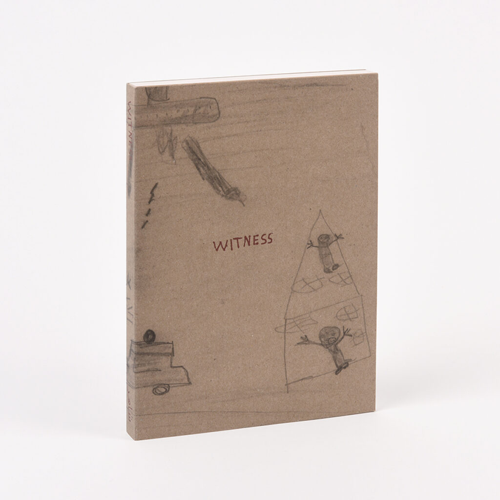
Of all the books in the selection, Witness moved me the most. It features drawings by Palestinian children in Gaza who express their traumas through art. While previewing the book, I picked it up at least five times, and each time I looked through the pages, new layers of sadness surfaced. That was possible because the book is crafted just right—very simply. The content speaks loudly because the book’s form is so understated. Witness is very powerfully designed.
Arthur Herrman: “Serving on a jury is an exercise in mental flexibility.”
This was my first time serving on a jury. Beforehand, I thought that previewing about 280 books would be intensive, but also manageable. But once I’d been sitting there for two days, trying to give each book the attention it deserved, I felt time flying by. It helped to approach it systematically. I looked at each book in two ways. First, as a reader: as open-minded as possible to see which elements of the book first caught my attention. Was it the subject matter, the design, the materials, or the technical production? Each book caught my eye in a different way. Second, I delved deeper into the book. I wanted to figure out its exact theme, the creator’s intention behind it, and how it was designed and published. For this, I also used the submission forms that explained the design concept and technical details. I paid attention to detailed design choices such as paper types and typography, but above all to the concept and how it played out in practice. These two distinct steps, an open-minded first glance followed by a desire to delve deeper, each require a different kind of concentration.
What I found interesting, both while previewing the books and during our group discussion, was the question of how to approach the “usual suspects.” Do you treat them more critically? Do you look for a distinctive style or a sense of repetition? Do you consider a particular author’s body of work and how the new work fits into it, or do you judge each book on its own merits? As we discussed it, we didn’t really arrive at a single consensus. We answered these questions differently for each book, because there are many more factors to weigh and take into account.
In practical terms, we spent most of our time sorting the books into three piles: “definitely moving forward,” “not moving forward,” and “no consensus yet.” I particularly enjoyed the opportunities we had to make a case for a book that we, as a jury member, were the only one to have selected. That led to some surprising conversations and insights.
I wish every book editor could experience a similar exercise in which you’re constantly challenged to adopt different perspectives, form an opinion, and then engage in discussion and make decisions together. Each jury member has a different position in the field and views the question of what constitutes a good book differently. That’s what makes the jury process so inspiring, it forces everyone to really try to understand the others’ perspectives and thus arrive at a well-considered decision. Serving on a jury is an exercise in mental flexibility. The best moments were when we disagreed with one another: that’s when the discussion really gets somewhere.
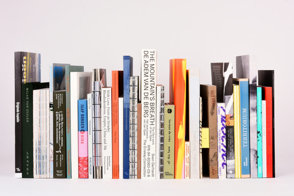
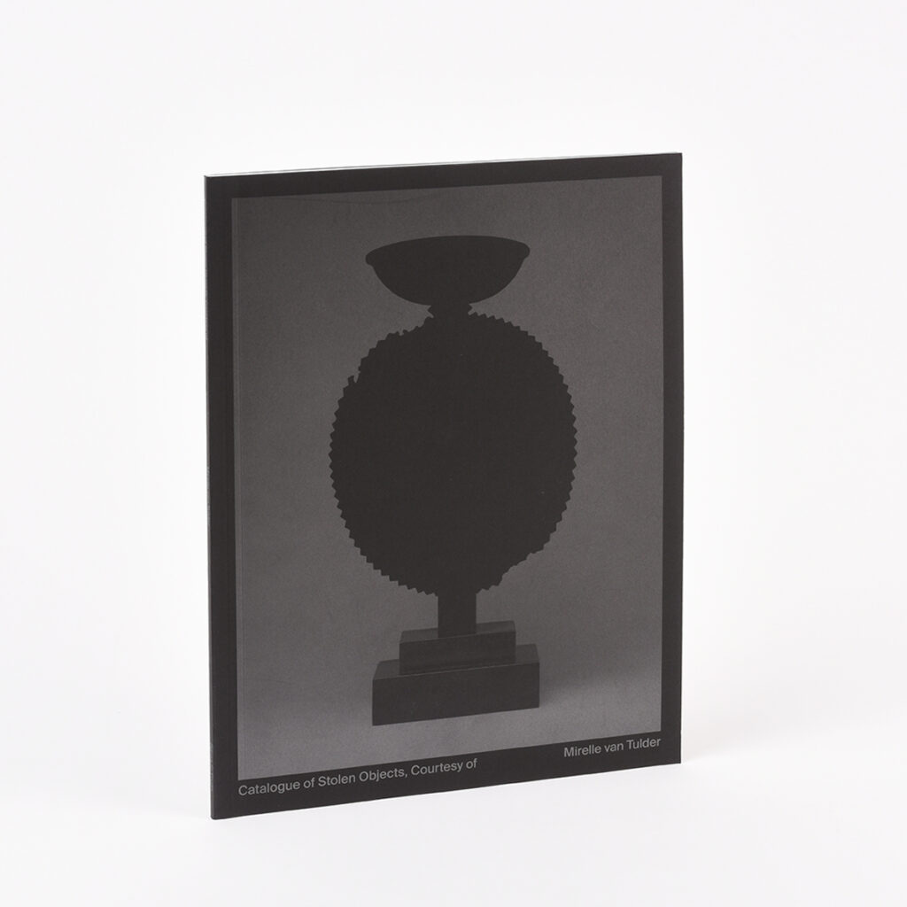
One of my favorite books was Catalogue of Stolen Objects, Courtesy of by Mirelle van Tulder. A fascinating book in all its simplicity. This book is a logical step in Van Tulder’s creative practice, in which she combines her work as a (visual) researcher and designer. She examines ethnographic catalogs and questions the impact of colonial history on this specific cultural heritage. In this book, her craftsmanship, her personal interest, and her intrinsic drive to create books all come together.
Jochem Öfner: “There needs to be room for experimentation.”
This year was my second time participating in the judging process. That made it easier to narrow down the entries during the preliminary review. At the same time, it’s like comparing apples to oranges. How can I compare a beautifully produced photo book to a postcard booklet that’s practically falling apart? It’s impossible and yet it’s actually a lot of fun to do. I paid particular attention to the technical choices and whether they truly conveyed the book’s message. I can be hugely impressed when a book is technically crafted with all the trimmings, yet it still fails to move me.
I have a certain, perhaps naïve, way of looking at things. Well-known names don’t mean much to me or really register when I’m evaluating a book. What I enjoy most is when I pick up a book and immediately think, “Wow!” Often, these are books that stand out for their pure simplicity, books made as beautifully as possible with minimal resources. That’s also where I come from: at Raddraaier, we have a long history of making beautiful books with minimal resources.
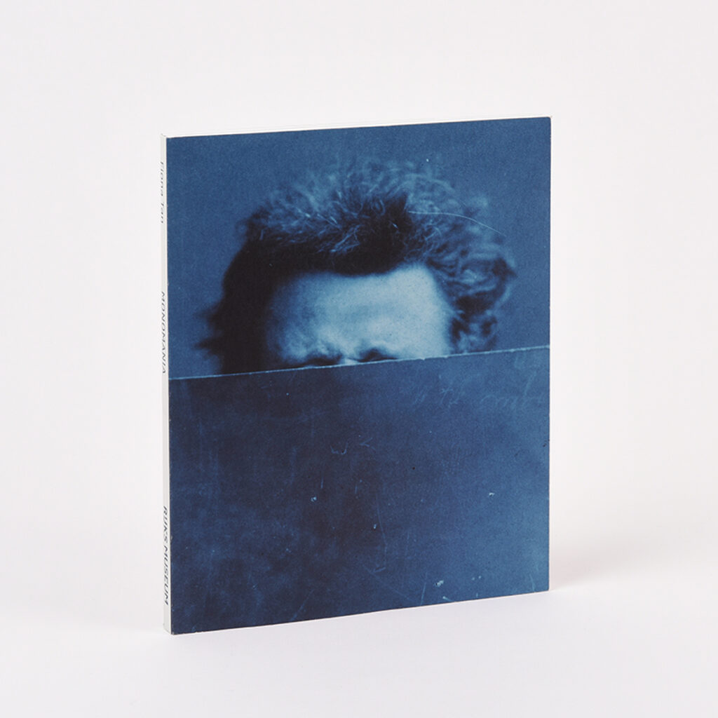
While previewing the books this time, I selected many more titles that I wanted to discuss further. Mainly because I was curious about the other jury members’ opinions and the conversation they would spark. During the discussions, I felt more confident than the first time. Of course, my opinion isn’t set in stone: even if a book is important to me, a well-reasoned argument from someone else can lead me to reconsider my position. Compared to last time, I kept the selection as a whole in mind more often. It should say something about the year of production: what have we achieved as bookmakers, and where has the development taken place? A good balance in the selection is just as important. For example, there must be room for experimentation. That’s why I can fully support the decision to select a book that, while not technically well-produced, truly belongs in The Best Dutch Book Designs, for example, because of its subject matter and the way the message is presented. Conversely, there were books that were so incredibly well executed technically that they deserved the title “Best Designed Books,” such as Fiona Tan’s book.
I found the publisher’s perspective in the discussion interesting. I’m thinking specifically of the book Catalogue of Stolen Objects, Courtesy of by Mirelle van Tulder, which we selected. It’s uniquely designed, well-crafted, and it takes a lot of guts to publish it. This book sparks discussion, which is exactly what it was made to do. That investment and boldness should certainly be taken into account, but you shouldn’t have ten of them in the final selection.
Since this was my second time serving on the jury, I noticed that the chemistry within the group is also a decisive factor. This year, it wasn’t better or worse—just different. The best part is that both juries viewed the book as a “complete work,” with the discussion consistently focusing on the various aspects of design, technique, and publishing that come together to create a good book. In that creative process, the influence of a printer and publisher is often less significant than that of the designer. I think it makes sense, then, that the jury for The Best Dutch Book Designs includes two designers.
Kylièn: “Every book was a conversation starter.”
While previewing the submissions, I was very curious about all of them. How diverse would the submissions be? What would their scope be? When making my own selection, I initially relied on my intuition. I flipped through the books as openly as possible, and whenever I found a book interesting, or, conversely, didn’t quite understand it yet, I referred to the information on the entry form. I started with the standard books, such as novels and nonfiction. I didn’t want to begin with the visual intensity of art books, because that would otherwise set the tone for all the other books.
There are so many books out there. Some you’re familiar with, others you’re not. And you see books that clearly aspire to be “the best-crafted book,” but where the skill isn’t quite there yet, or the resources are likely lacking to enlist the expertise of a good lithographer or printer.
You can only truly evaluate a book by holding it in your hands. Everything counts: the feel of the book, its weight, and the design choices (paper, format, typeface, image editing). Unfortunately, in some categories, such as novels, the same kinds of design choices are often made, which prevents the books from having their own unique character. This doesn’t have to involve grand (or expensive) gestures at all.
During the judging process, there were all kinds of books on the table that reflected bold choices, and we discussed whether those choices were interesting, good, or appropriate. The quest for authenticity sometimes comes at the expense of readability or practicality. So which do you value most? That led to many lively discussions.
This jury had a great dynamic: the initial arguments for each book were presented with restraint. No one wanted to impose their own tone, but rather to leave room for debate. I myself often looked forward to hearing the opinion of Jochem from Raddraaier Printing because of his technical and material expertise, which I lack. What we all had in common was that we considered the discussion about the book at least as valuable as the final evaluation. As we talked, the books themselves served as the basis for establishing criteria, rather than pre-established criteria serving as the starting point. Each book was a conversation starter.
In preparation for writing the jury report, I read old reports from the 1960s. It was very interesting to see how the evaluation criteria have changed over the decades. Books that were highly praised back then wouldn’t make the cut today, and vice versa. For example, I see a tendency among recent juries to question the standards of what a book should be. As a result, books that are technically mediocre are sometimes selected anyway because of their experimental nature. In the past, that would have been met with utter disbelief.
The Best Dutch Book Design award seems to have had a real impact on the quality of book production in the 1950s and 1960s. I wonder if this is still the case today. In any event, I don’t see it reflected in novels and mainstream nonfiction books. Unfortunately, the gap between that genre and so-called art books is growing wider and wider.
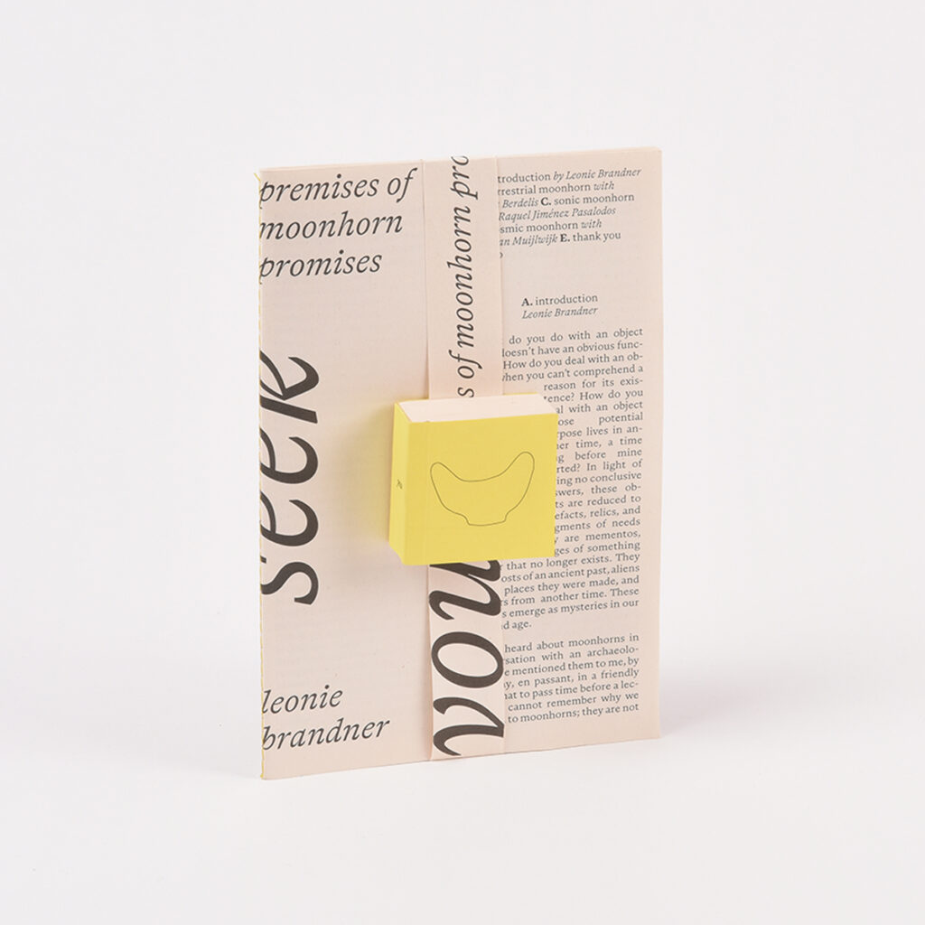
One book from the selection that really stuck with me is Seek You. Two very simply designed booklets that fit together seamlessly. They facilitate a game that the user can play by making connections on their own. Technically, it’s nothing special, but this simple little book is so inventive that it really cheered me up. It’s great that this jury dared to expand the selection and allow for this experiment.