Nominee European Design Awards 2024
Category Compagny Logo
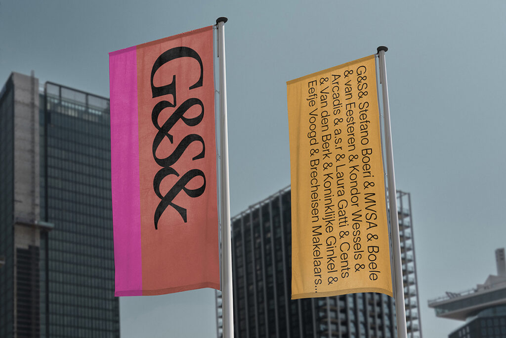
G&S& is a leading real estate developer based in Amsterdam, formed from the merger of G&S with BMB.
Collaborating closely with typographer Ramiro Espinoza, The Stone Twins crafted a new logo inspired by classical letterforms. The unique and fluid form was initially drawn with a calligraphy reed pen, and then digitised. The resulting logo aims to express the core concepts of connection and collaboration, which serve as the cornerstone of the new G&S& brand.
In contrast to the sterile, modernist logos of its competitors, the logo exudes a timeless humanist aesthetic, setting G&S& apart in the real estate sector.


