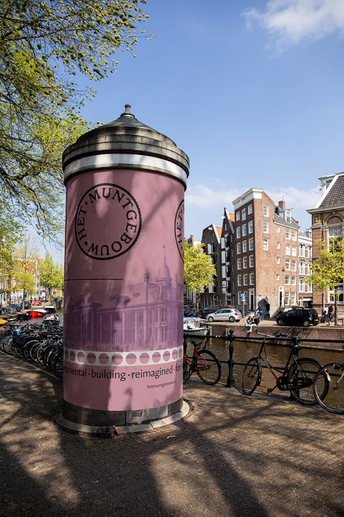
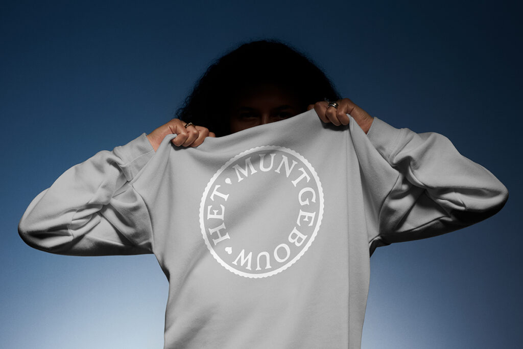
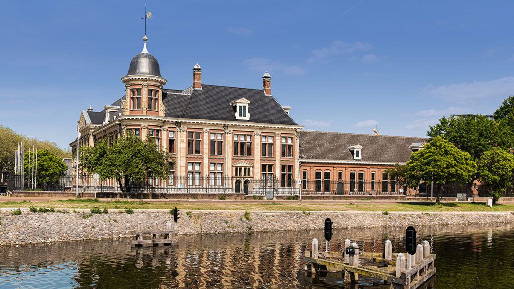
The stone Twins are proud to unveil the brand identity for Het Muntgebouw – the former Royal Dutch Mint (Koninklijke Nederlandse Munt) – now lovingly restored and transformed into a mixed-use building that blends work, leisure, and culture.
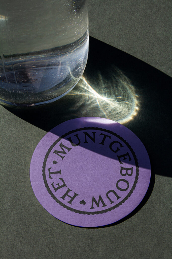
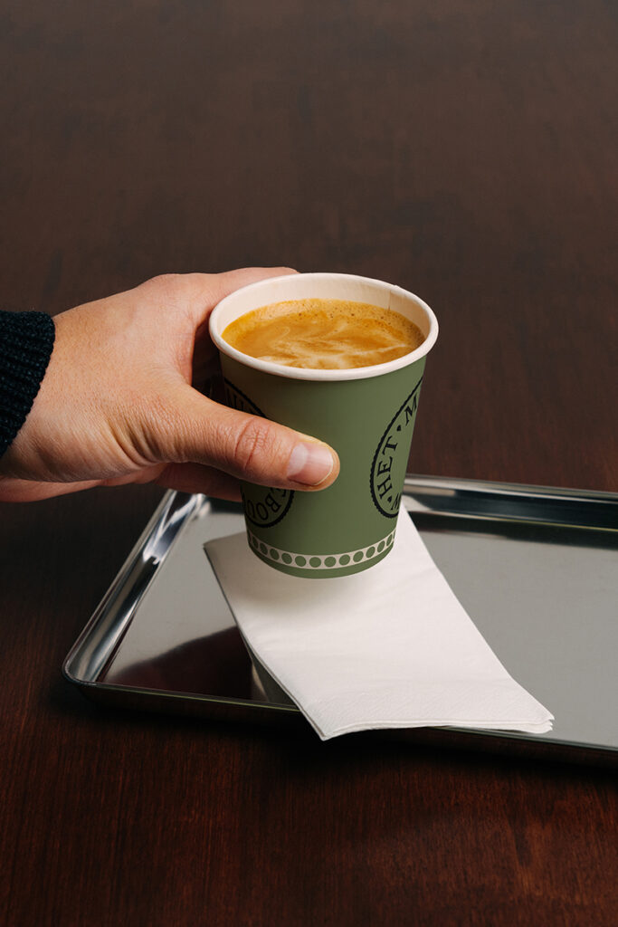
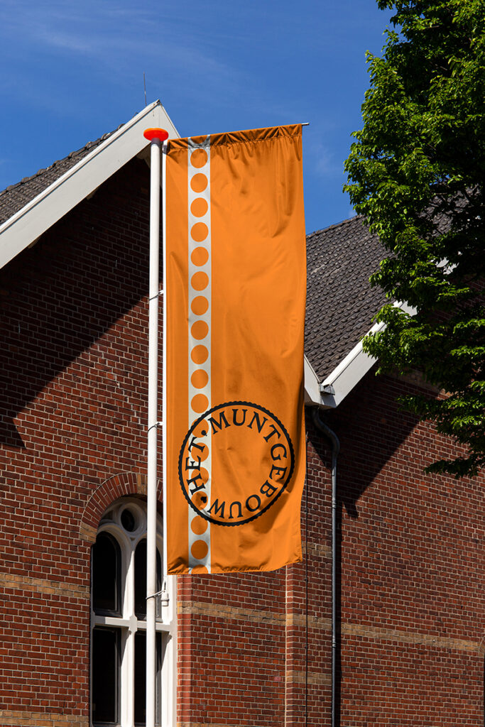
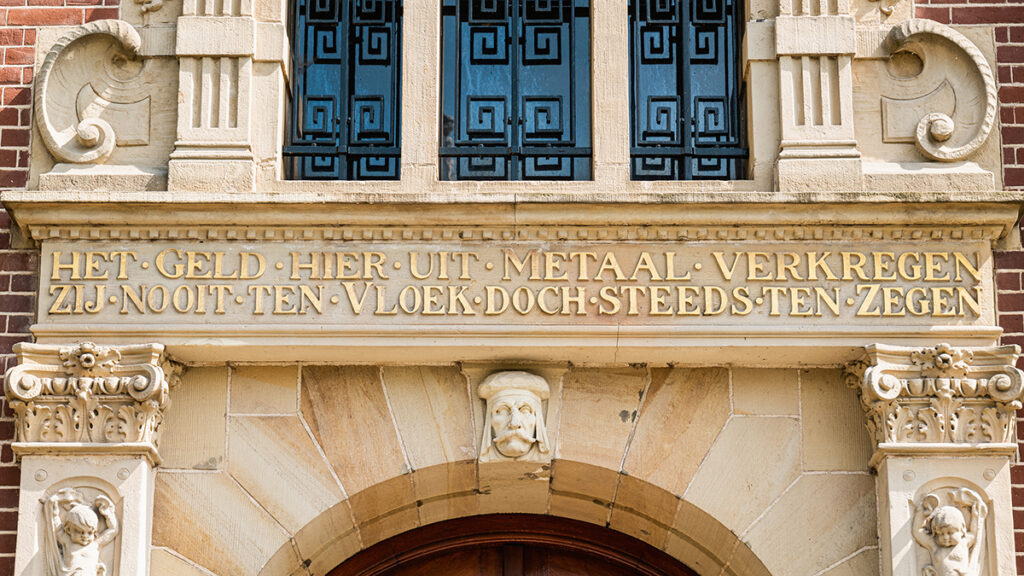
Their design approach draws from Het Muntgebouw’s rich heritage and the skilled craftsmanship behind its restoration, while embodying the building’s renewed spirit and ambition. For example, the logo features typography inspired by the Juliana Guilder coin series by Ludwig Oswald Wenckebach, minted in the millions within this monumental building. The small icons pay homage to ‘mint marks’ and can be adapted for different themes or messaging.