He said he hated clay and called himself ‘that man who makes vases’. Yet no one made such a great impression on post-war Dutch ceramics as Jan van der Vaart (1931-2000). With a visual language of geometric shapes and a small wel-chosen palette of lustrous glazes, he made thousands of vases and other vessels. Iconic designs with a timeless sensual beauty.
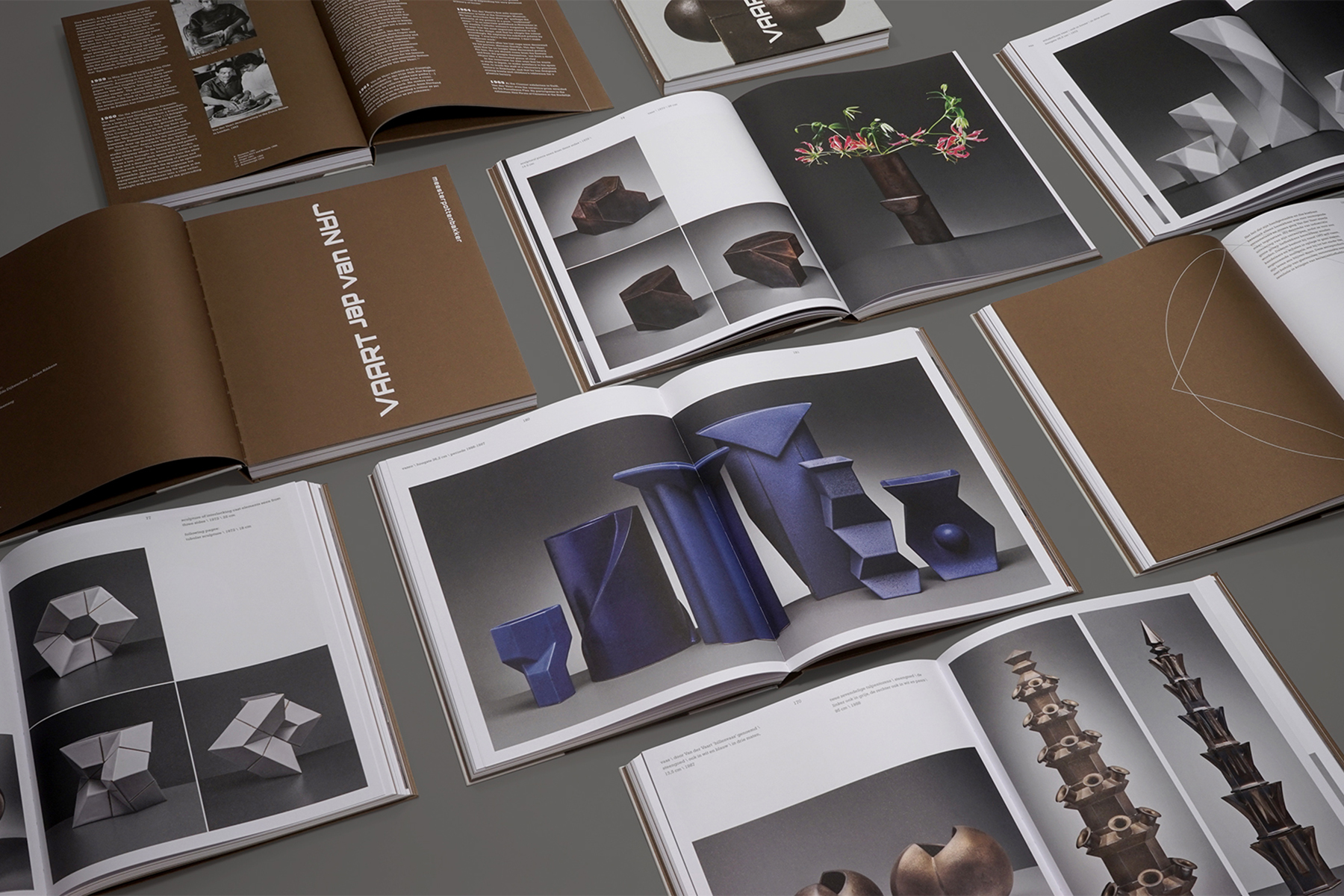
According to Jan van der Vaart, vases are meant to be used. And in his view, they should be put away in the cupboard when not needed. In line with this thought, some of the vases depicted in the book are filled with flowers.

Many of Jan van der Vaart’s works are executed in bronze glaze – his absolute favorite. He discovered this glaze by chance when a recipe that was supposed to yield black surprisingly resembled the color and sheen of a metal alloy. The text pages of this book are printed in a bronze color, creating a beautiful contrast with the fresh whiteness of the pages on which the objects are depicted. The spatiality of several objects is particularly well expressed in this book as they are photographed from multiple angles.


On the covers, a flower tower is depicted. This tower is constructed from multiple identical elements, stacked and rotated with respect to one another. This rotation and stacking served as the inspiration for the rotating typography of the title. Additionally, it formed the basis for the idea of stacking the two cutouts of the Dutch and English editions on top of each other, so that together they form a complete vase.
Another fun fact: 20 grams of bronze (ink) were used for each book.


At Kunstmuseum in The Hague, the major retrospective exhibition ‘Jan van der Vaart: for Jan and everyone’ is on display until July 5, 2026.
Publisher: Cometa* – Foundation for Art Book Publications
Authors: Jan de Bruijn, Garth Clark, Edo Dijksterhuis en Arjen Ribbens
Design: Beukers Scholma
Photography: Erik and Petra Hesmerg


