Opinion by Garech Stone
Smoke, Mirrors, Bells & Whistles – The growing gap between the appearance and the substance of creativity.
When browsing through Instagram, LinkedIn or branding blogs, I’ve noticed that everything looks fantastic. New brands, new campaigns and new logos all look amazing. Don’t they? Beautiful typography, perfectly balanced layouts, sophisticated colour palettes, stunning photography and mesmerising motion graphics. Everything is pixel-perfect.
But I wonder whether the work is actually getting better, or whether I’m simply being seduced by the case study presentations and the accompanying press releases full of waffle. Have we, as an industry, just become much better at making things look better? And what are we actually looking at?
We’re living in an extraordinary time for the creative industry. Never before have so many tools, resources and possibilities been available to so many people at such low cost. Adobe, Figma and Canva have democratised the world of visual communication. You no longer need to have been to design school to produce something that looks professionally designed.
From the menu of your local restaurant to the email newsletters of fashion brands, everything looks great! Thousands of ready-made layouts, templates, typefaces, illustrations, images and design systems are just a click away. And I haven’t even mentioned AI.
Need a Keynote presentation or a corporate brochure? There are templates for that. Perhaps a brand identity? Start with an AI-generated logo, pick from a library of curated layouts and colour palettes, tweak a few things here and there, and let AI put together a pretty competent set of brand guidelines. A website? Choose a pre-designed layout, add some copy, a few subtle gradients and some scroll-triggered animations. It can all be done in an afternoon. Even my 16-year-old son can do it. And much to my consternation, the results can be remarkably good. Sometimes, really good.
Then there are the motion graphics that have taken over the world of branding. It seems no new brand identity is complete without a logo dancing across the screen, animated type or liquid morphing shapes. All very clever, until the logo has to sit still on a baseball cap or a T-shirt.
When I started out in the design business in the mid-1990s, the mantra of logo design was: “How does it fax?” A simple test, but one that distilled so many of the qualities of a great logo: simplicity, form and the ability to work in one colour and at a small scale. I wonder how many new logos would pass the fax test today.
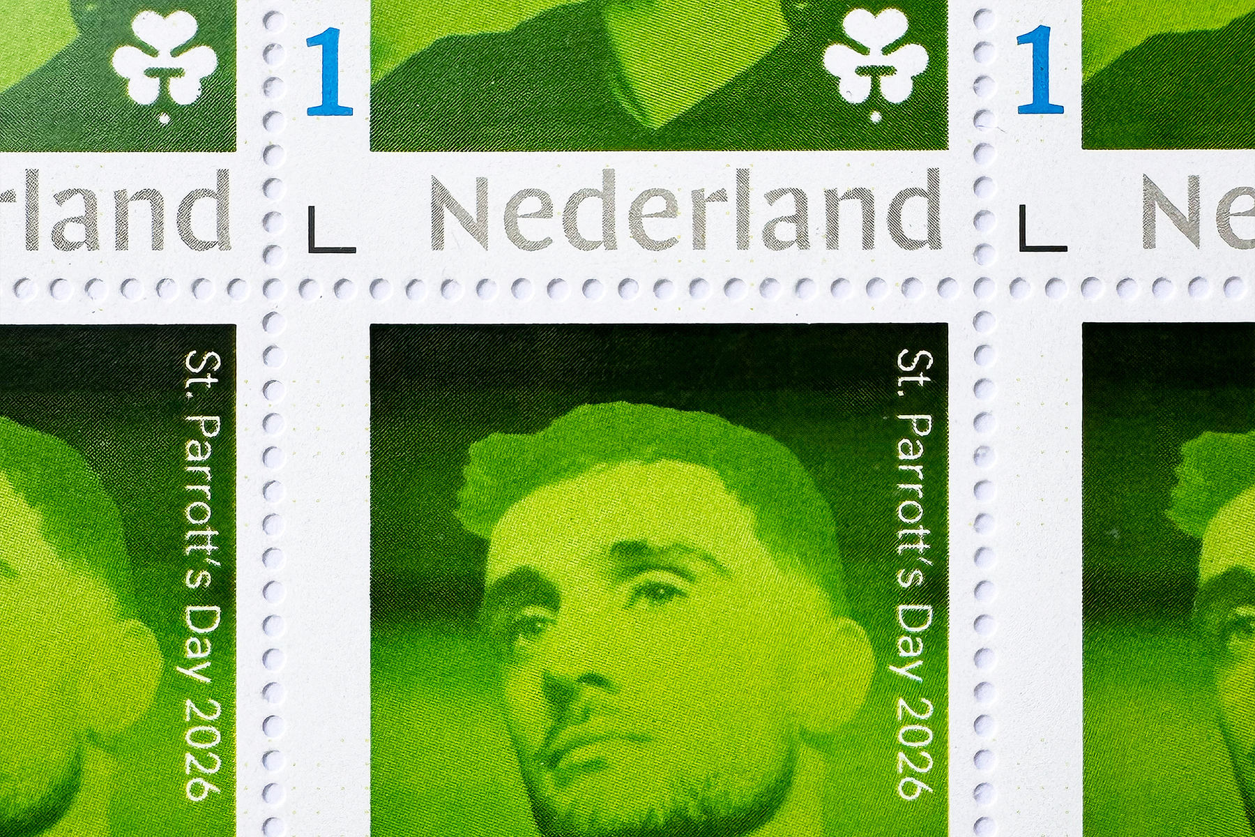
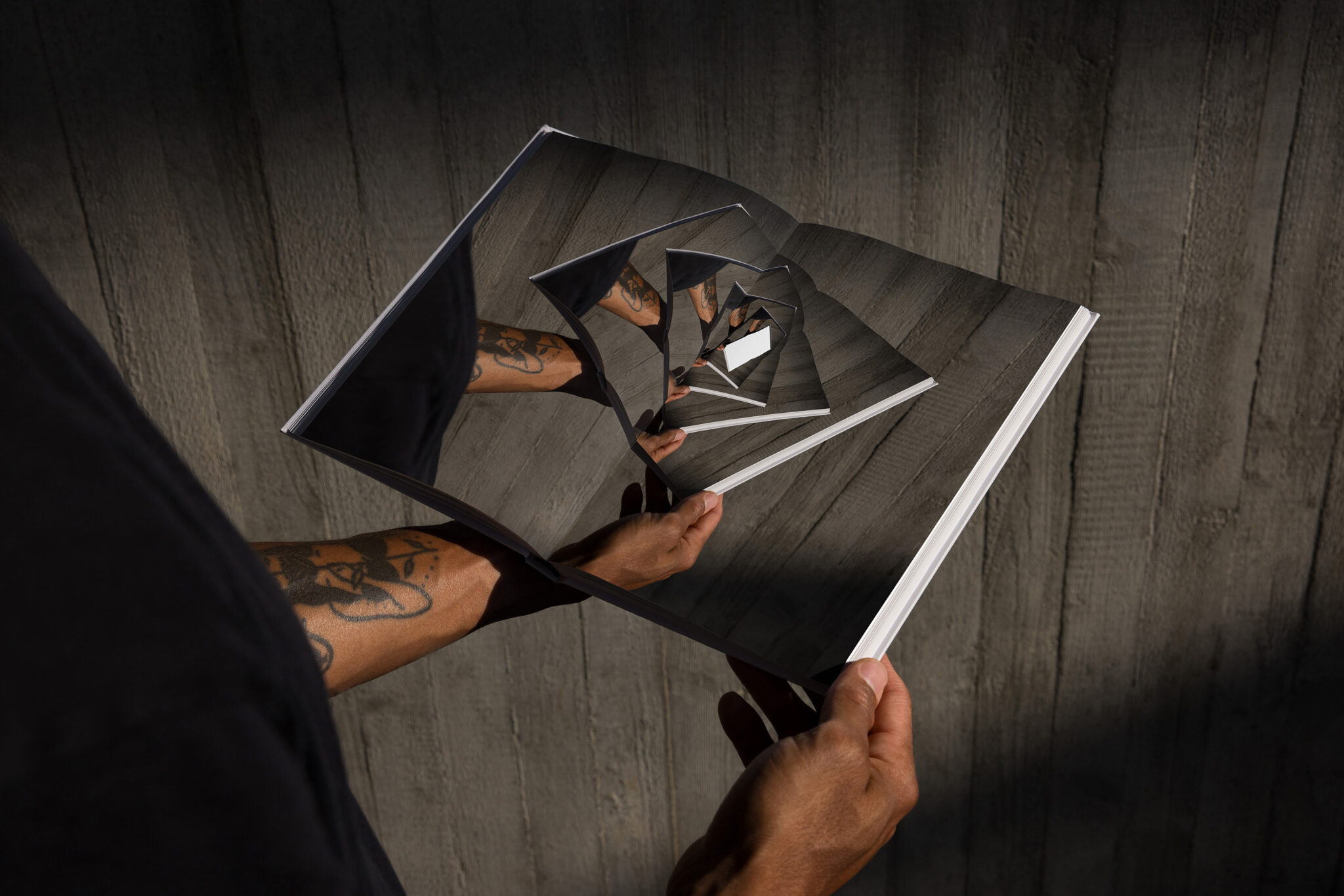
But no worries, even crappy logos can look amazing these days. Numerous mockup platforms, such as Supply Family and Mockup.Maison, now offer beautifully art-directed photographs of packaging, apparel, signage, billboards, coffee cups and all manner of branded objects onto which you can simply slap your logo.
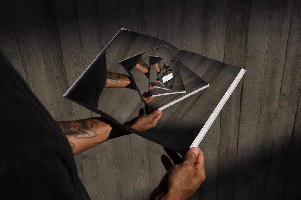
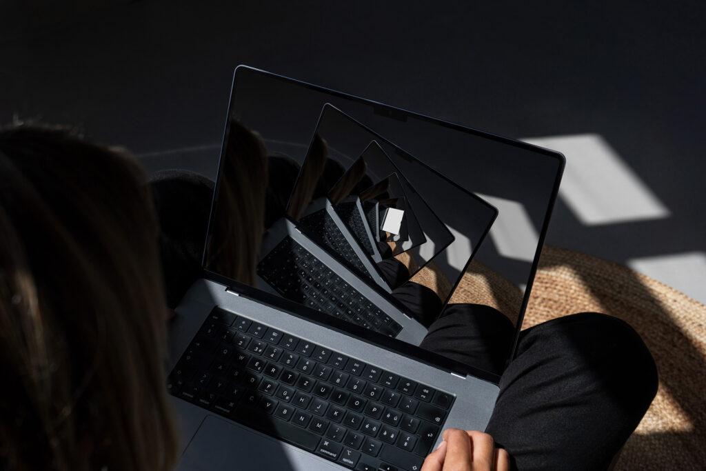
In the old days, only global brand agencies like Interbrand or Wolff Olins seemed to have the kind of stunning photographs that showed their work on vehicles, buildings and even aeroplanes. You’d see them in D&AD annuals and design journals like Creative Review and Eye. I remember seeing the ‘corporate identities’ (as they were then called) of PTT and the Politie by Studio Dumbar in the early 1990s and being blown away by the experimentation and playfulness. What really struck me was the sheer scale of the work. This wasn’t niche or esoteric design. No, the vehicles, buildings and coffee cups actually existed. They were real executions in the real world.
But not anymore. Such visuals are now ten a penny. Every second branding agency and even students looking for internships use the same mockup images to elevate their work. Sometimes the epic becomes even more epic (my studio’s work, naturally), but very often the average becomes simply ridiculous. Think of a small independent Amsterdam coffee shop’s brand identity plastered across poster sites in New York subway stations, or a Dutch real estate hoarding in the streets of London. It’s not just stupid design but stupid geography.
It’s also quite funny to see different agencies using exactly the same mockups to promote their work. It’s a world of slick generic exteriors and interiors, moustaches and tote bags. Insta perfection for insta likes.
And let’s not forget the increasingly formulaic websites of creative and branding agencies. Browse a dozen or so and you’ll encounter a familiar repertoire of visual gimmicks: sexy transitions, oversized kinetic type, fluid layouts, vibrant colour palettes and immersive visuals. Different agencies, different countries. Yet somehow, they all deliver the same experience and a similar dose of eye candy. It’s a world of branding popinjays, all beautifully dressed but not necessarily with much to say. The work is slick, polished and beautifully presented, but where is the personality? Why do new brands coming out of Amsterdam look so similar to projects coming out of Athens, or even far-flung exotic places like Lima or Longford? Where is the character, the authenticity, the heritage and the connection to local culture?
It reminds me a little of Spinal Tap, where the spectacle, the costumes, the stage sets and the whole rock-star image sometimes seem rather more important than the music itself. Everything is turned up to eleven, but you occasionally wonder whether there’s actually a decent song underneath it all. A lot of branding and design seems to be heading in the same direction. It’s all very impressive and slick, but is it any good?
When looking good has become so easy, we risk confusing presentation with creativity, and visual sophistication with originality. Have we reached a point where the shop window has become more interesting than what’s actually in the shop? Perhaps we’re all so busy admiring the display that nobody has noticed the Emperor isn’t wearing any clothes.
And what about beauty? Not just the polished, perfectly art-directed kind, but the beauty of something unexpected, imperfect or full of personality. The kind of work that makes you stop and look twice. Work that comes from genuine curiosity, conceptual thinking and an original idea, rather than simply putting together all the right ingredients.
So much design today feels predictable. It’s as though we’ve become very good at making 1 + 1 = 2. But where are the ideas that make 1 + 1 = 3?
That’s a question for another time.
.
Garech Stone (1970) is a designer, brand strategist, writer and former Head of Department at Design Academy Eindhoven. Together with his twin brother, Declan Stone, he runs The Stone Twins, an award-winning creative brand consultancy based in Amsterdam.