


Indentity for Spektr
Spektr is a film production company based in Amsterdam. They partner with leading brands, agencies and platforms. Spektr creates webseries, documentaries, TVCs and campaigns.
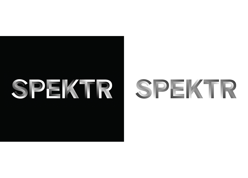
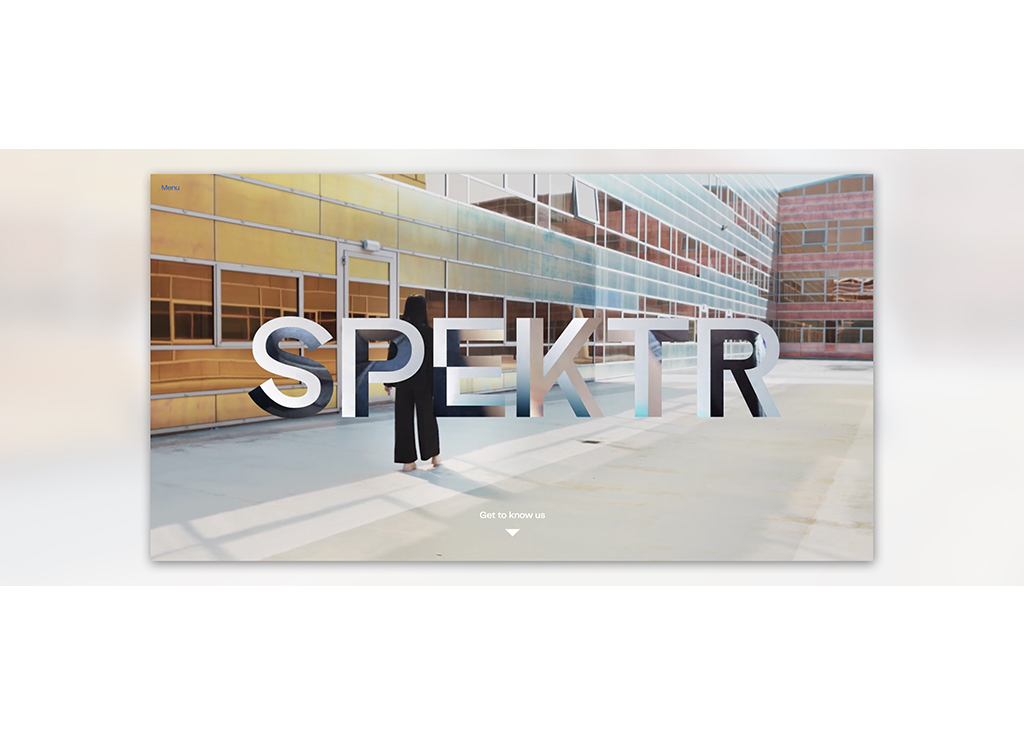
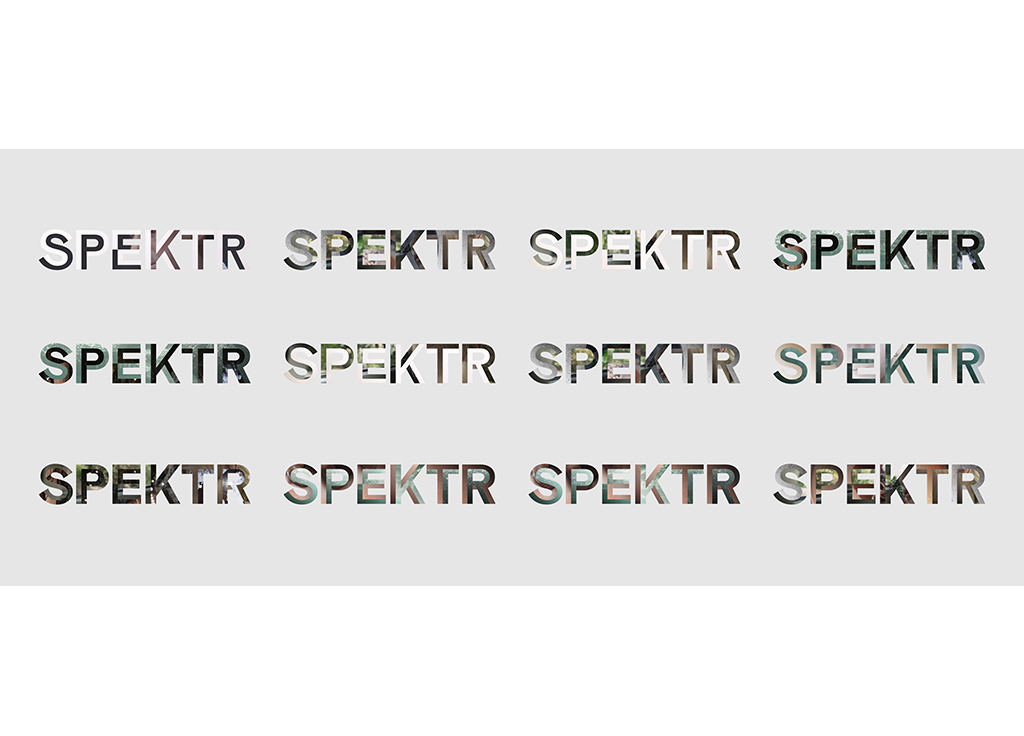
Lava: “The design challenge was: How can we expand the function of a company logo and directly reflect work of the client?”
“The original Spektr was part of the former Russian space station. Fuelled by sunlight, it basically functioned as a huge telescope pointed at the earth. Similarly, Spektr observes our world through rays of light, colours, sounds and images. As a film production company, your product is your brand. You can’t tell what you make, you have to show it. That’s why Spektr’s content functions as the main ingredient of the identity. Whatever they create, will be visible in their company logo immediately. The logo is a frame in which their portfolio is showcased. Therefore there it’s not one static logo, but a living ever-changing logo.”
“The design of the logo was inspired by the font Graebenbach. The look-and-feel refer to Russian typography from the eighties. By building it up in different parts, we emphasised the feeling of looking through a lens.”
More Lava > 15.11.2017 / 27.06.2018 / 01.09.2020