


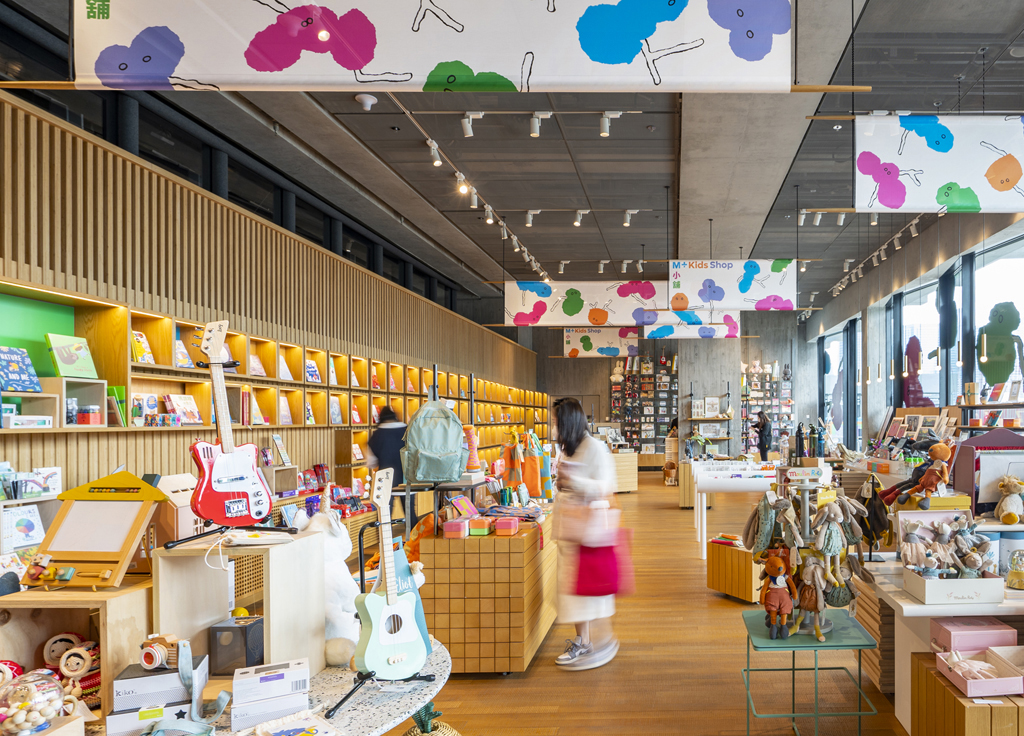
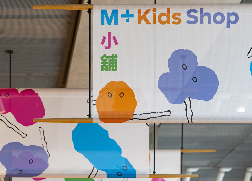
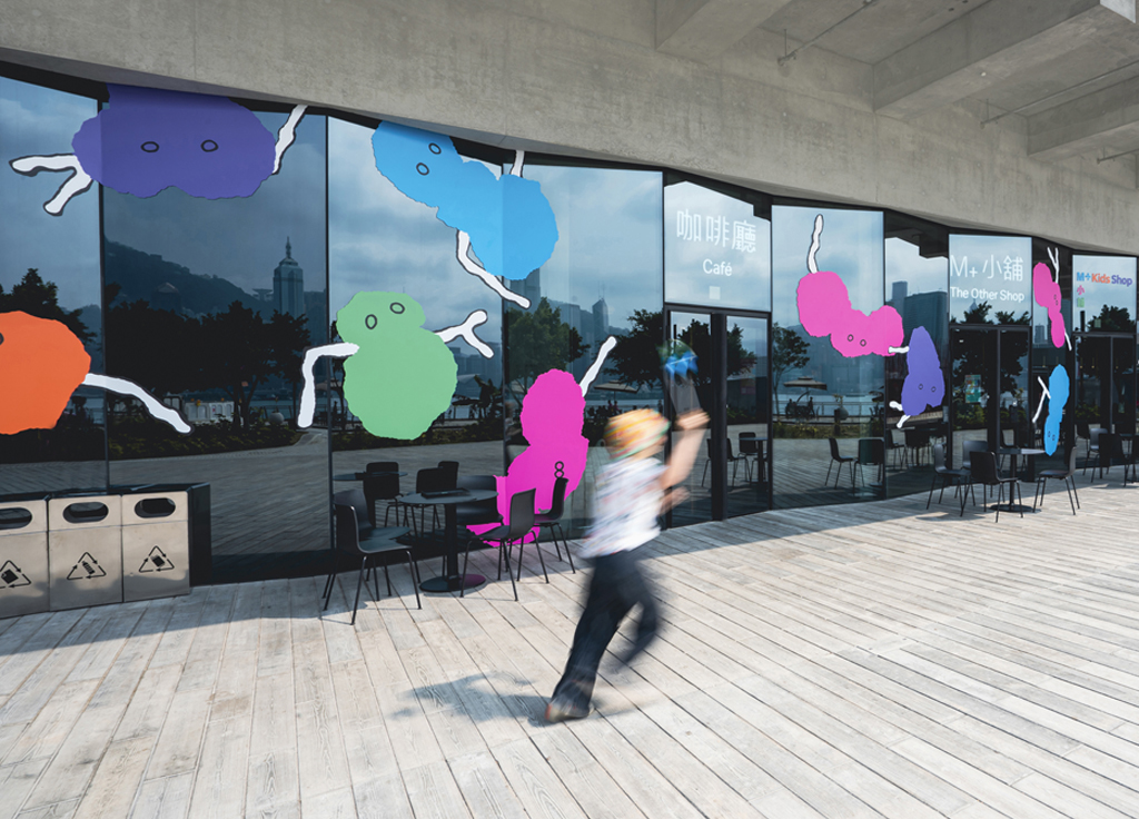
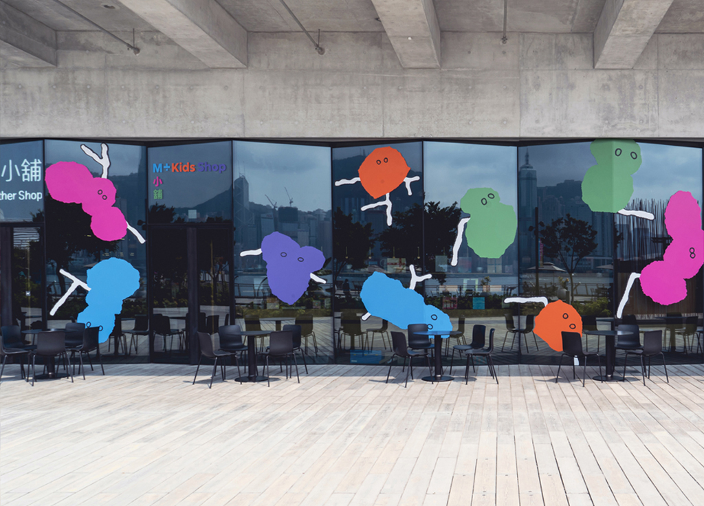
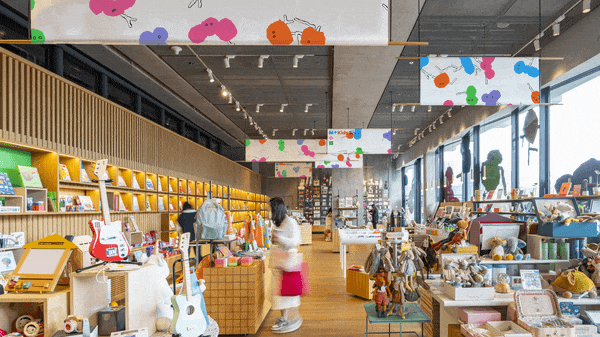
M+ Kids Shop, Hongkong
The visual identity of M+, the museum for visual culture in Hong Kong, revolves around a unique color system. It starts with a mid-tone grey, to match the subtlety of the concrete of the building. In small steps this grey color transforms in light browns, mustard, a greyish rosé. The color range ends in vibrant orange, cyan blue, pink, lilac and green. The brighter colors reflect the neon commercial communication that typifies Hong Kong’s energetic street life.
For the M+ Kid’s Shop these brightest colors come alive in 5 cuddly creatures. They have Cantonese sounding names: Lannie (Blue 藍), Charny (Orange 橙), Zoey (Lilac 紫), Louis (Green 綠), Pheoby (Pink 粉). Their form was inspired by the art movement of the 1950s known as ‘tachism.’
The M+ Kids Shop cuddly creatures are computer generated. They form and transform endlessly in a virtual space. The color blots of their bodies have everchanging eyes and antennas.
The characters were created by Thonik, who designed the Visual Identity of M+. Lavinia Meijer, world famous harpist, based in Amsterdam, has composed their musical habitat.