


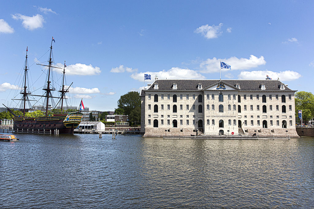
A new identity for Het Scheepvaartmuseum
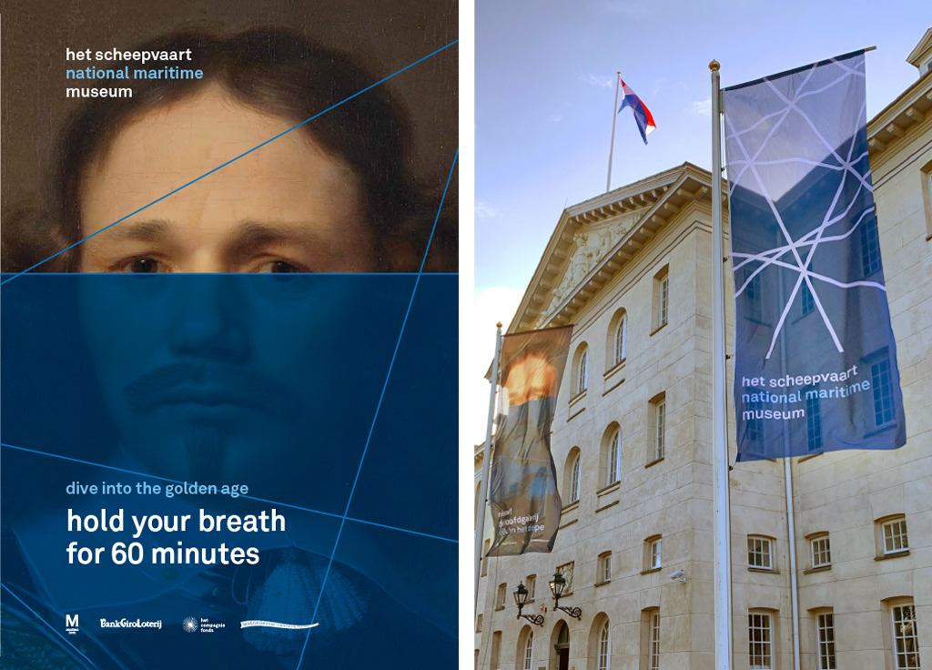
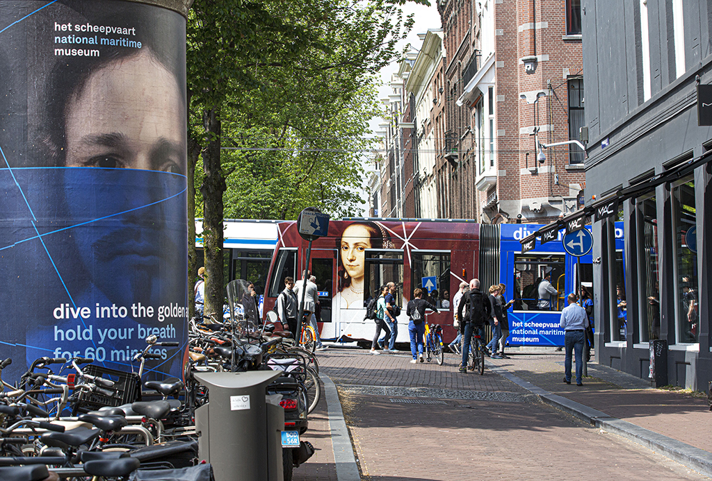
Two new presentations on masterpieces and cartography position Het Scheepvaartmuseum as an international institute of maritime knowledge. Design agency Thonik translated the museum’s re-profiling into a new house style and campaign. These are clear and of minimalist elegance, appealing to families, culture buffs, foreign tourists and business partners alike.
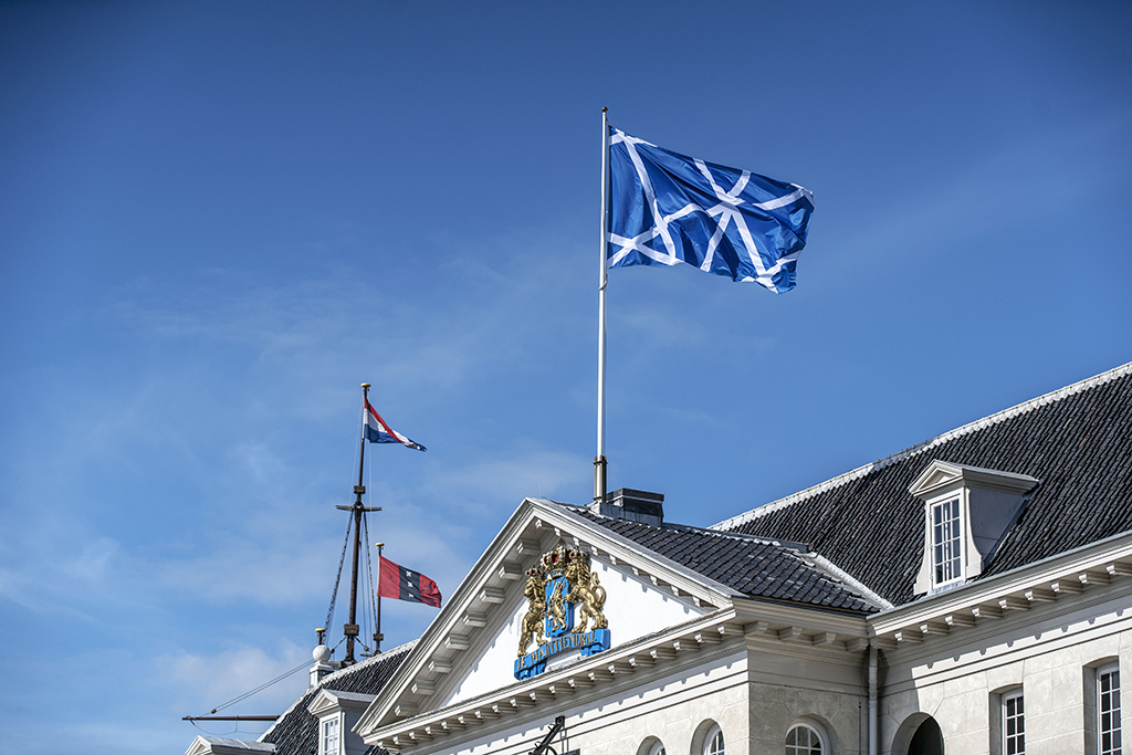
The roof of the monumental courtyard’s metal frame is based on compass lines from old nautical charts. The former constituted the starting point for Thonik’s design. In still and moving images, this linear pattern has been combined with different shades of blue, in line with museum’s new motto: ‘Water connects worlds’.
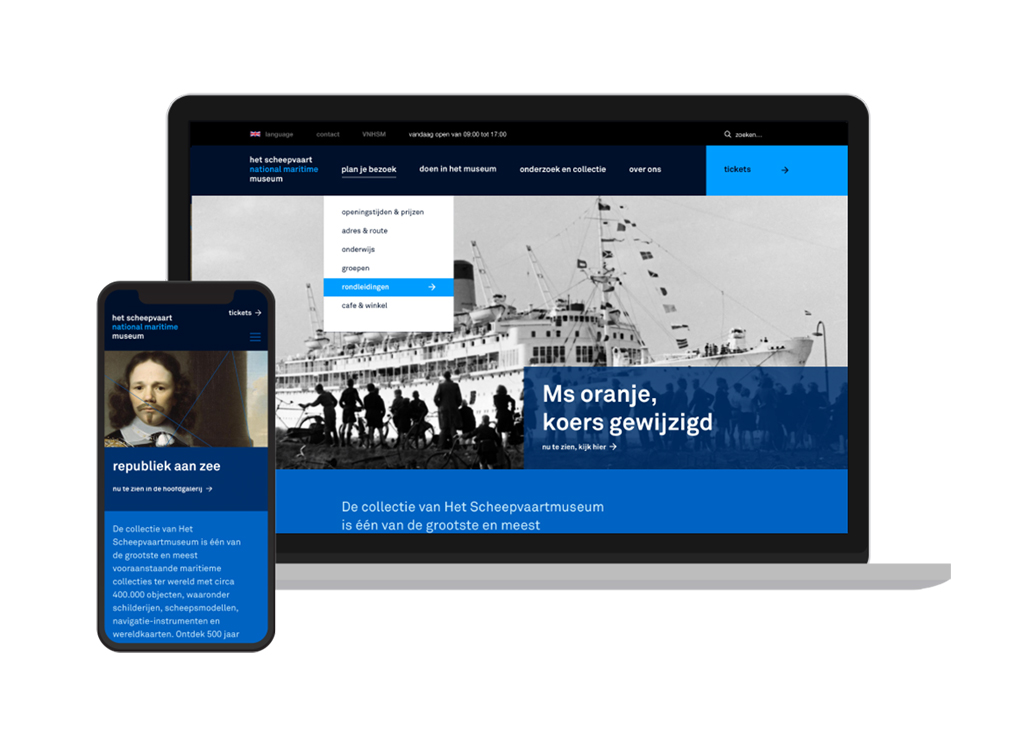
The bilingual, non-reiterative logo also expresses the new positioning: het scheepvaart / national maritime / museum. The logo represents a purely typographic integration of the museum’s identity, history and ambitions. Akkurat, the font used, strikes a perfect balance between novelty and professionalism. All communication is executed in the same font, which is typical of the Thonik approach that led to the agency’s ‘the new sobriety’ approach as early as 1994.
The new visual identity has been applied to the full range of online and offline communication: from routing, banners and menus to publications, merchandise and animations on the website, which was developed in cooperation with Momkai. Moreover, Thonik developed the posters, flyers and tram visuals for the campaign promoting Het Scheepvaartmuseum’s new course.
Photos: Maurice Boyer