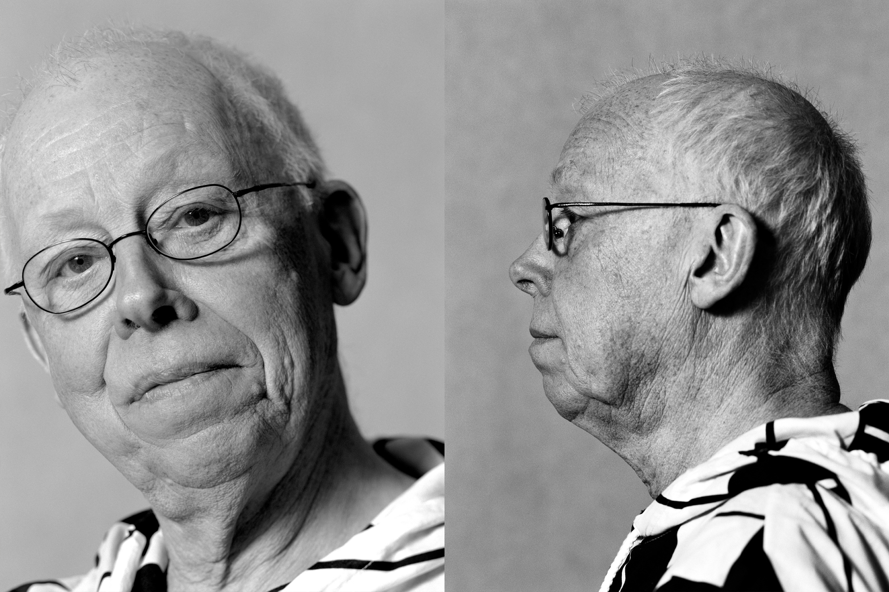
Paul Mertz passed away on April 30, 2026
A tribute by Chris Reinewald
Eloquent, humorous, articulate, generous, a critic, a promoter. A bridge between advertising, design, culture, and people. In his (advertising) copy, a master of clear language and a king of brevity. Paul Mertz (1938–2026) did it all. A tribute in his concise, dynamic style.
Two years ago, he sent out his last, lively newsletters filled with observations. Notable new words: integrated care obligation, anti-trans rhetoric. What do you want to be when you grow up? Smoke plume maker, network congestion manager, healthy patient who needs no care? (Go for it!) Language purist Mertz enjoys it, but please no unnecessary English (like Dutch Design Daily?). Using nothing but CAPITAL LETTERS is “terr-i-ble” (pronounced with a falling intonation). Mertz packages opinions in melodious, accent-free ABN (the language, not the bank). The effect of posters in public spaces: “Fleeting. Only the lonely walker with a dragging gait immerses themselves in A3 posters on the street.”
Driepinter and Vlaflip
Between 1960 and 1984, Mertz – a sharp-tongued copywriter and PR talent – evolved into an aesthete and the conscience of Dutch advertising. “Why settle for something bad, rushed, and lacking in aesthetic respect when it can be beautiful and good? Why confront the public with the bad when the better is available?” he recalls Aronson, director and mentor at the Prad advertising agency, which he himself led after 1970. Famous: the Dutch Dairy Board campaigns. The Milk Brigade, followed by the 10-year-old superhero Joris Driepinter (“Three glasses a day, that’s what it takes”). Illustrator: the Dane Ib Antoni Jensen. Narrator: Mertz. And more: to boost our dairy consumption, he gave a previously anonymous yogurt-custard dessert the name Vlaflip – and thus it entered the thick Van Dale dictionary.
As a co-founder of Sire, the Foundation for Ideological Advertising (1967), Mertz encourages the use of campaigns to raise awareness of social issues.
In line with the philosophy of art promoters Willem Sandberg, Benno Premsela, and Pierre Janssen, he organizes exhibitions at Prad. Socially conscious graphic designers also exhibit there: Anthon Beeke, Swip Stolk, Gielijn Escher, and Jan van Toorn. The underlying idea: to resolve mutual mistrust. To instill good taste in advertising professionals, and to convince principled designers that advertising is not a tainted field if “design and text are of the very highest caliber.”
Animals and Personalities
After 24 years as an advertising executive and head of the household, Mertz is changing course, both professionally and personally. With a one-man consulting firm, and Wietske Beenen as his secretary, he’s setting his sights on the nonprofit sector and the arts: “tralala-hopsasa” in Mertz-speak. What appeals to him are the short lines of communication and personal contacts with clients. Starting with the Noorder Dierenpark owned by the Rensen couple. Naturally. Mertz designs column ads with short texts. Koos Staal and Geja Duiker create the corporate identity and depict the animals as characters.
In the same way, he brings icons such as Vermeer, Rembrandt, Catherine the Great, and Diaghilev back to life as real people for their exhibitions at the Mauritshuis, the Nieuwe Kerk, and the Groninger Museum.
Museums recognize the value of marketing and PR. The multi-museum design event “Holland in Vorm” (1987) commissioned Mertz to create its publicity campaign. With equal care, he devised a simple, catchy yet respectful exhibition title. ‘Strange Things,’ an exhibition on surrealism. Ceramics exhibition: ‘541 Vases, pots, sculptures, and tableware.’ The approximate number suggests that selection is more important than rounding off a figure.
Indonesia
In 1990, Mertz, together with Lou Kreymborg, organized the first “Designers Weekend.” Design agencies held open houses – for the occasion, from Kreymborg in Amsterdam-Zuid to Bitter/Thonet in Culemborg.
He himself buys art and design pieces for his office and apartment in the Wolkenkrabber, Amsterdam’s first high-rise building. Maarten Vrolijk’s postmodern rug, for example. With his Wolkenkrabber Prize, Mertz sponsors travel grants for graduates of the Design Academy. Gradually, he offsets his retirement eligibility with advisory roles at the BNO or the moribund Vormgevingsinstituut – and more. For the Tomado book (2013), Mertz describes their practical yogurt scraper, a quintessentially Dutch symbol of reconstruction and consumerism.
Thanks to his circle of friends in the design world, he is always a welcome guest or speaker whenever a new Roots issue featuring a Dutch graphic designer is published. Paul Hefting dedicates the first issue to Mertz. He himself has written an issue featuring few but incisive words about Wim Crouwel.
Lately, Mertz has been keeping a lower profile. He spends the winter in his native Indonesia with his partner Henny, “his quiet strength.” Surrounded by the warmth of his family, Mertz no longer has to get involved in anything. Finally.
From his travelogue: “Well then. As always, we send you our warmest regards and extend our very best wishes. And thank you.”
Thank you too, Paul. You taught many people more than you realized. We’re going to miss you.
Text: Chris Reinewald
Photography: Aatjan Renders
Biography Paul Mertz: Dutch Graphic Roots


