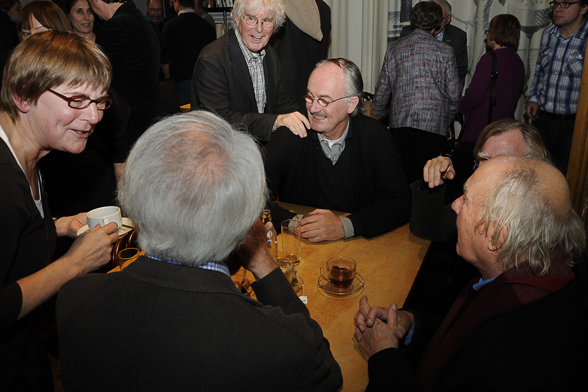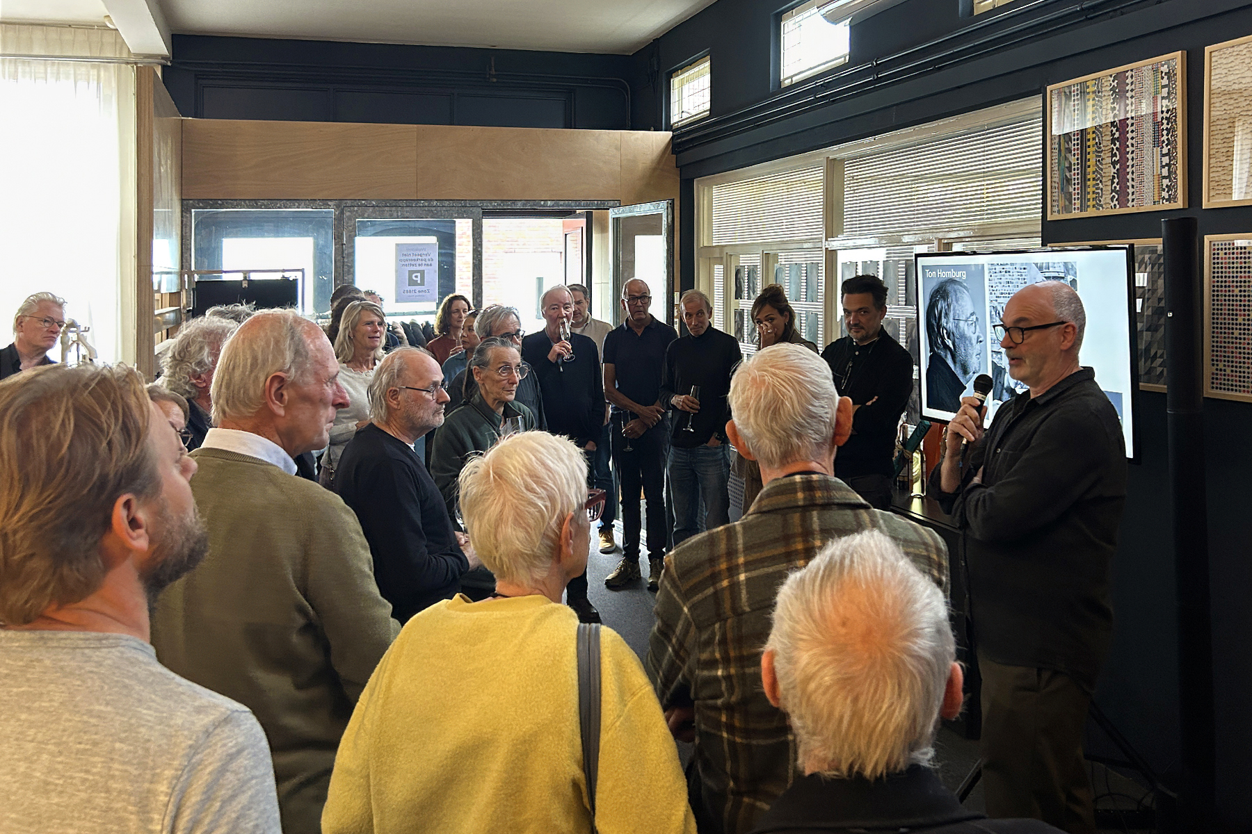
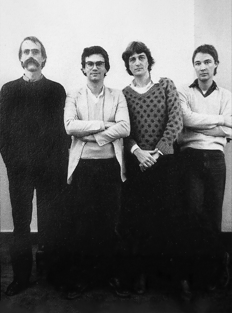
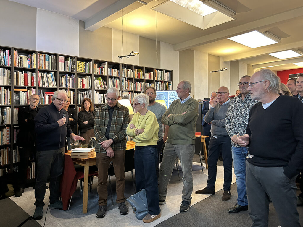
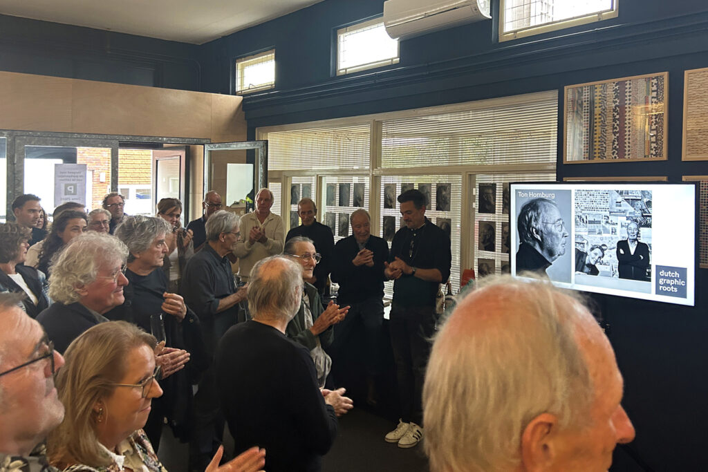
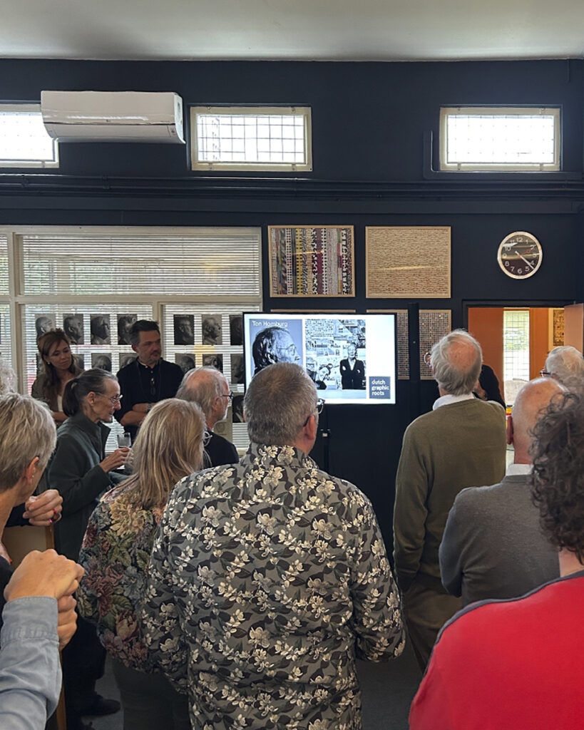
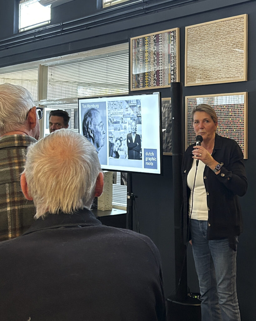
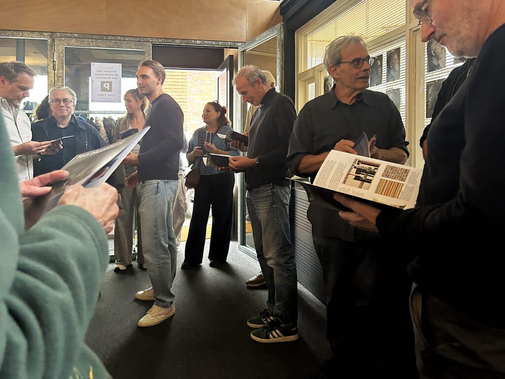
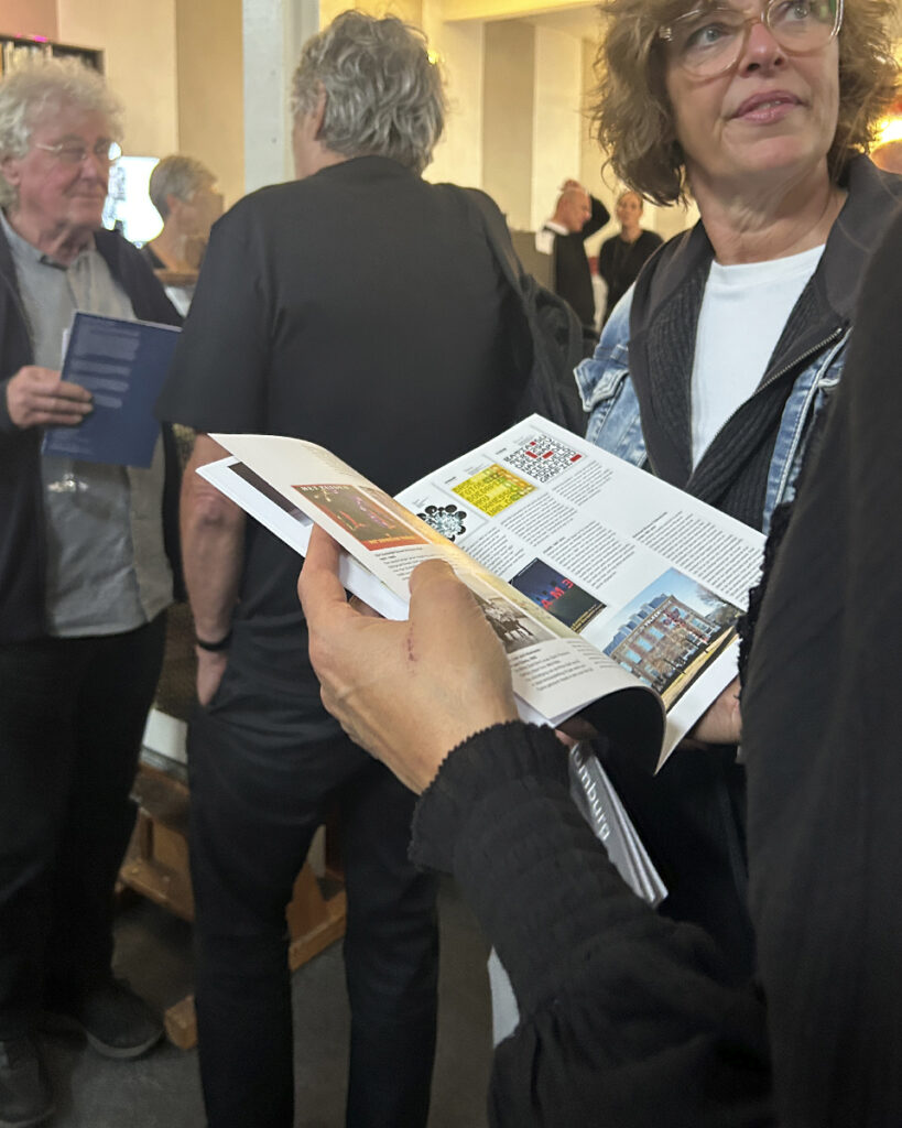
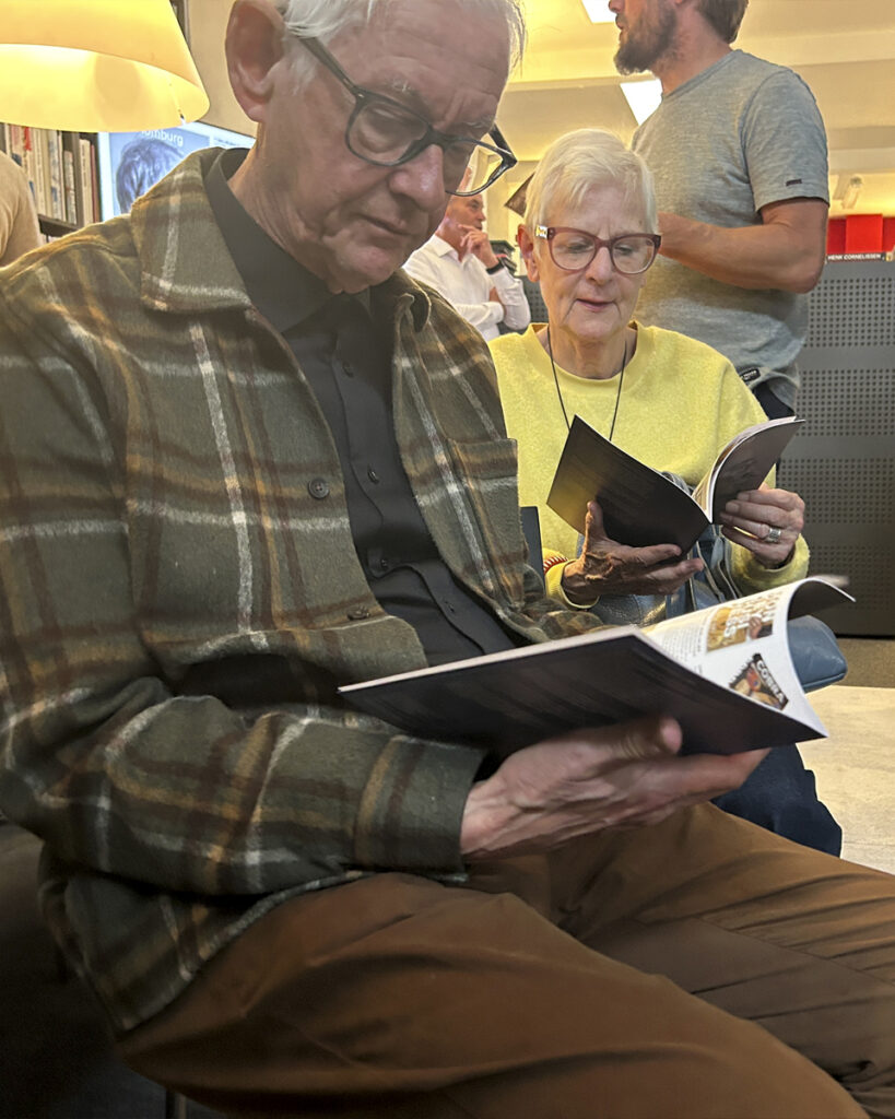
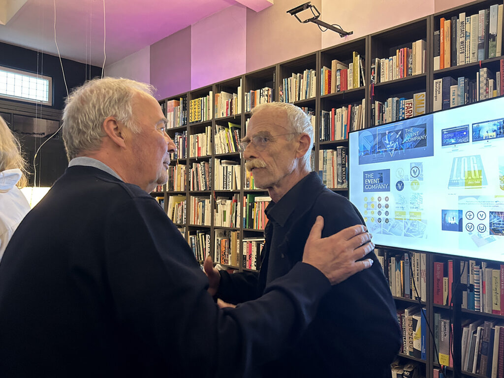
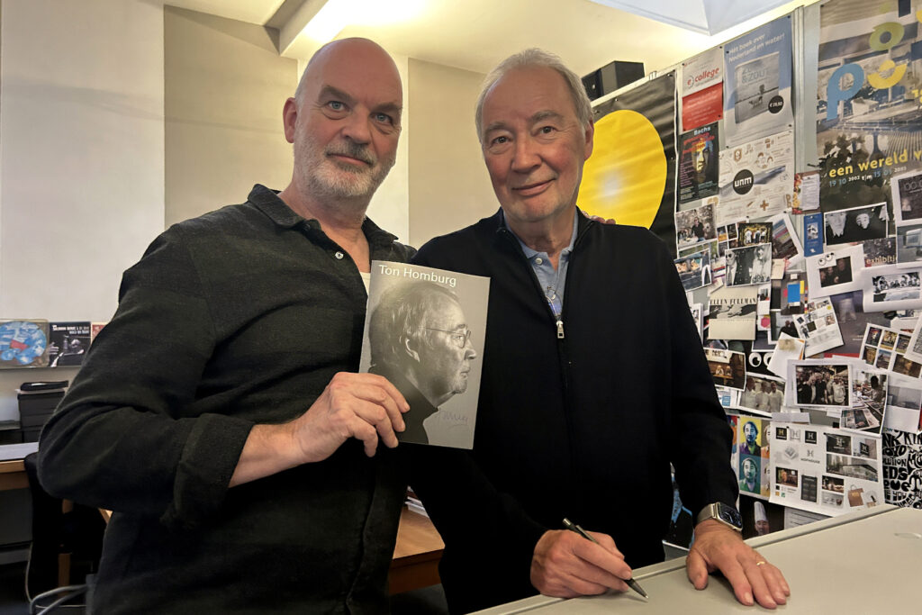
On Friday, October 9, Roots #74, a publication about Ton Homburg, written by René Pijnenburg, was presented. The event took place in Breda at the studio of OPERA Concept & Design, in the presence of many colleagues who, alongside Ton and René, had studied at the then-renowned Academy Sint Joost, an institution where, at the time, individuals such as Henk Cornelissen were among the teaching staff.
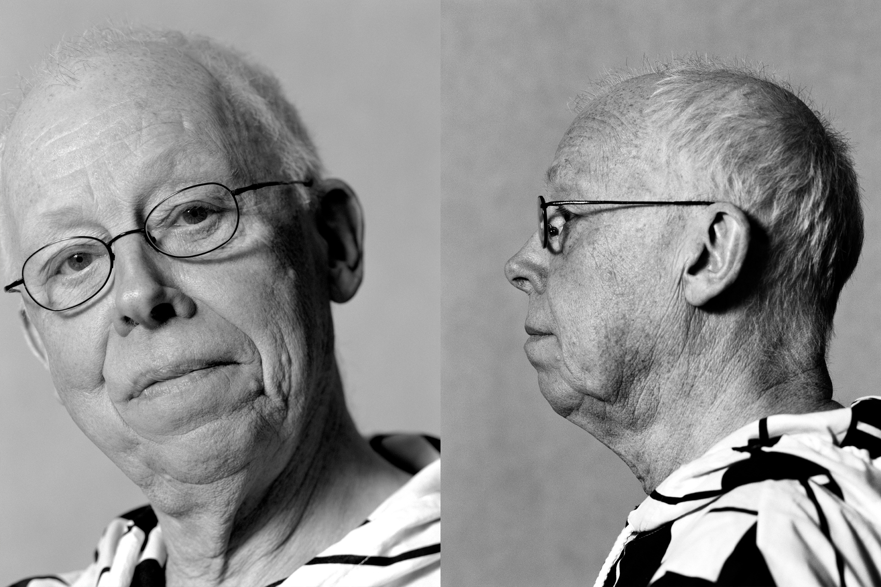
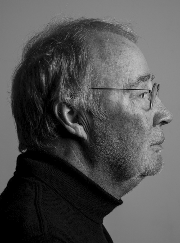
Ton Homburg (Breda, 1952) has worked as a graphic designer for almost fifty years, yet the painter in him has never disappeared. Since studying at Academie Sint Joost in Breda, he has explored how images, typography and content can reinforce one another. Inspired by artists such as Picasso, Man Ray and Kurt Schwitters, he discovered that graphic design offered him the freedom to paint with letters, images and structures.
His approach begins with curiosity. Who is the client, what motivates them, and what meaning can a collaboration create? Ton does not seek a recognisable style, but the essence of each assignment. By listening, questioning, experimenting and looking again, he brings form and content together. Clarity is the starting point; layers of meaning, subtlety and a touch of humour invite further discovery.
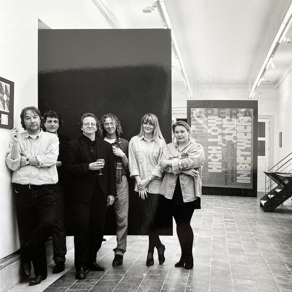
OPERA Concept & Design
After graduating, Ton worked in London at Bloomfield & Travis, including on projects for Island Records, and at Studio Dumbar in The Hague. In 1981, he founded OPERA with René Pijnenburg and Frans Bevers. The collaboration between graphic and spatial design developed into a versatile practice encompassing exhibitions, visual identities, books and cultural projects. Since 1989, Marty Schoutsen has been his partner in both work and life. Under the name OPERA Concept & Design, the studio also develops strategies, brands and communications for businesses and public institutions.
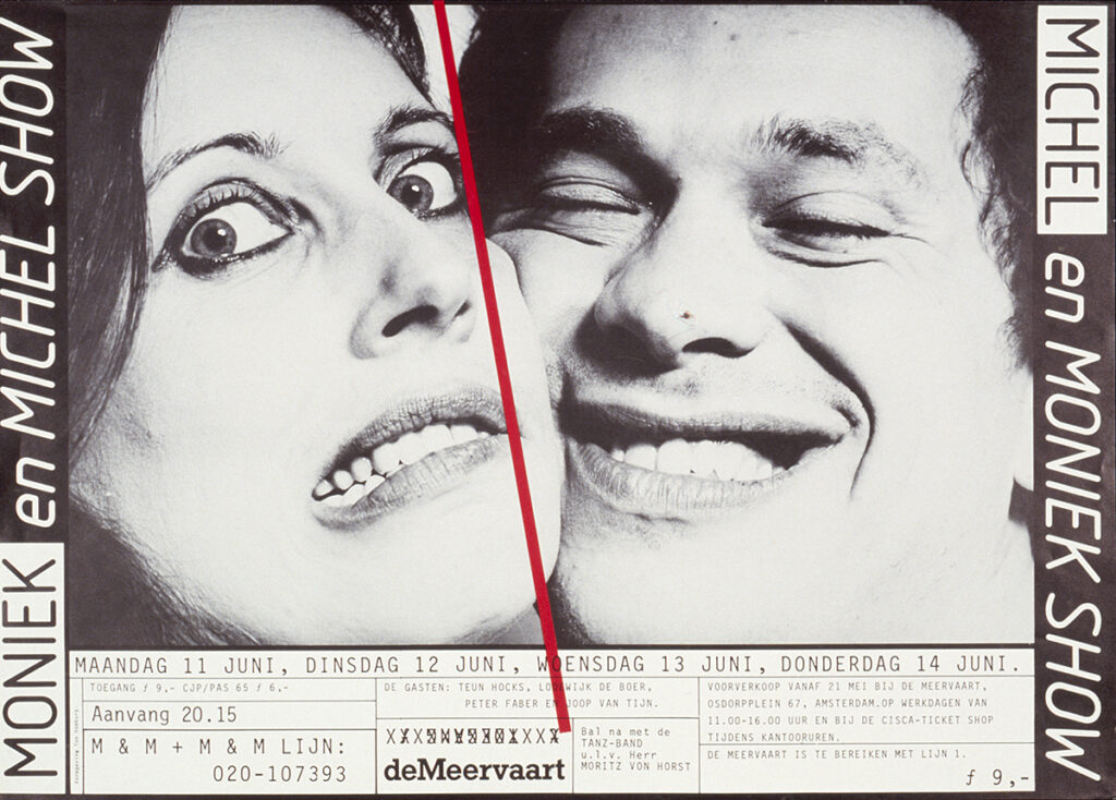
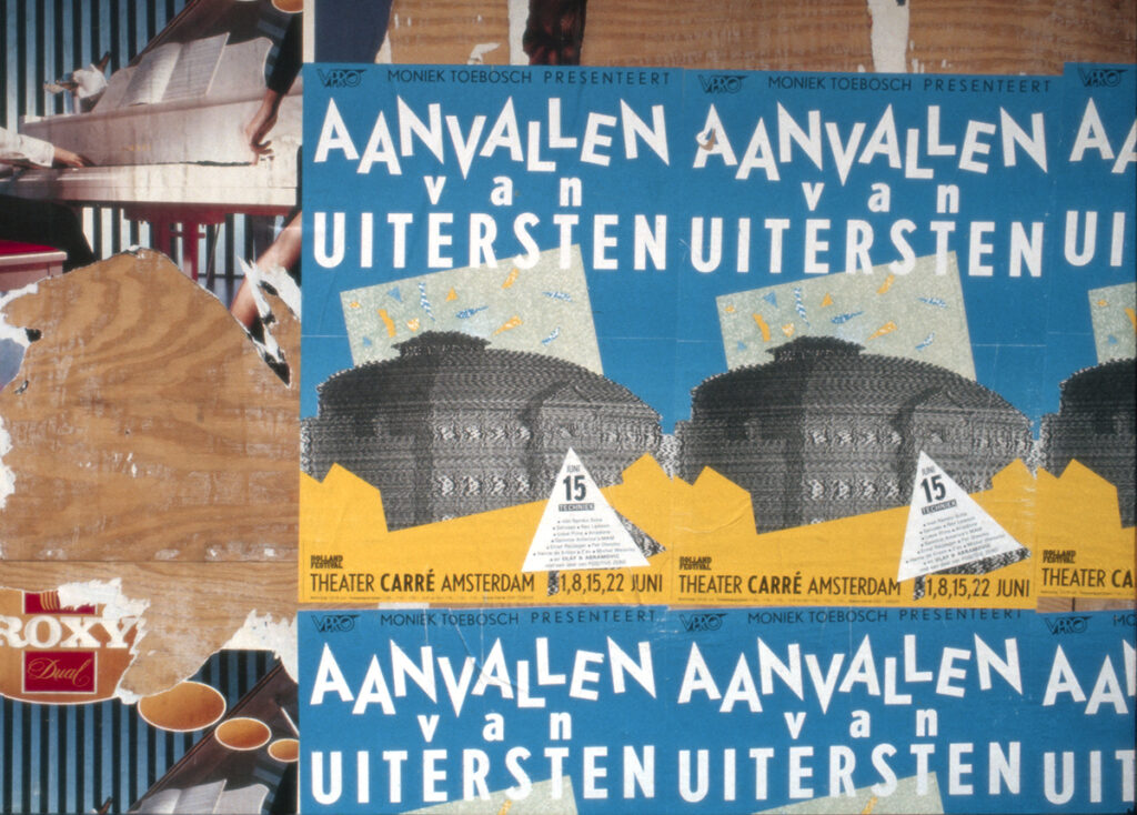
Posters for Moniek Toebosch & Michel Waisvisz, 1977–1982
Ton meets Moniek Toebosch at Sint Joost, where she studies fashion illustration and is already developing as a performer. During his internship at Cornelissen & Kruijsen, he designs her first poster in 1977 for a performance with only two attendees: the critic and the photographer. Many posters follow for Toebosch and her performance partner, musician Michel Waisvisz. The poster for Aanvallen van Uitersten (Holland Festival, 1983) visualises the destabilising nature of a series of four live television broadcasts from Theatre Carré.
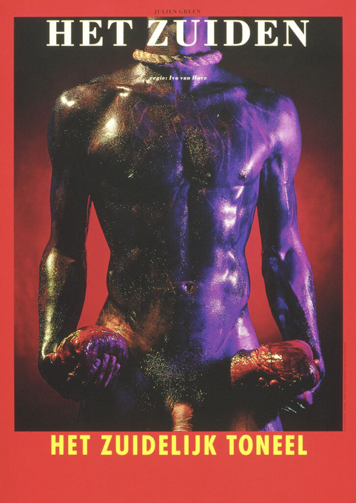
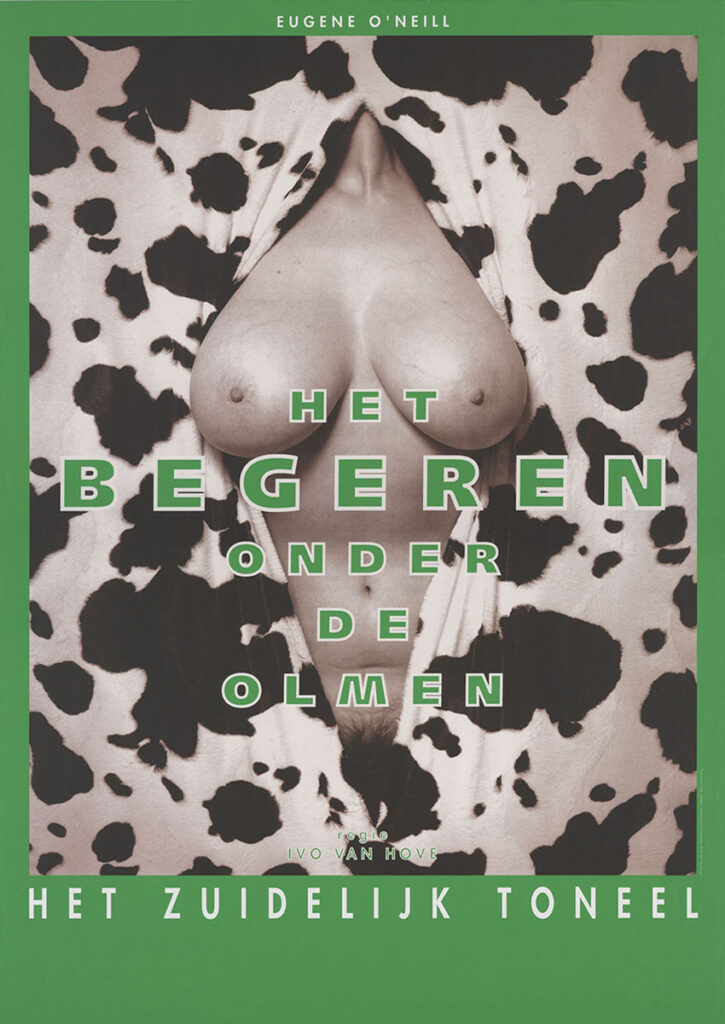
Het Zuidelijk Toneel & Erwin Olaf, 1991–1995
In the early 1990s, Ton collaborates with photographer Erwin Olaf on the communication for Het Zuidelijk Toneel. A series of posters brings the theatre far beyond the auditorium, generating both controversy and visibility. Olaf’s theatrical tableaux are positioned by Ton within a strict typographic grid, resulting in a performative form of theatre communication.
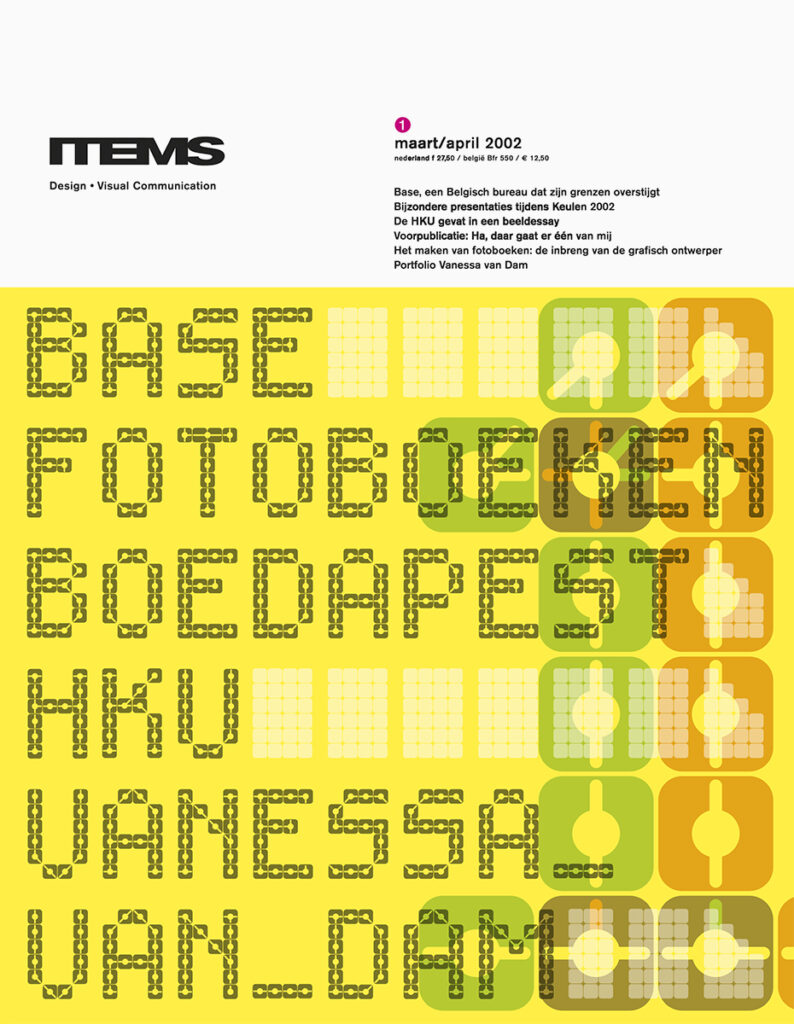
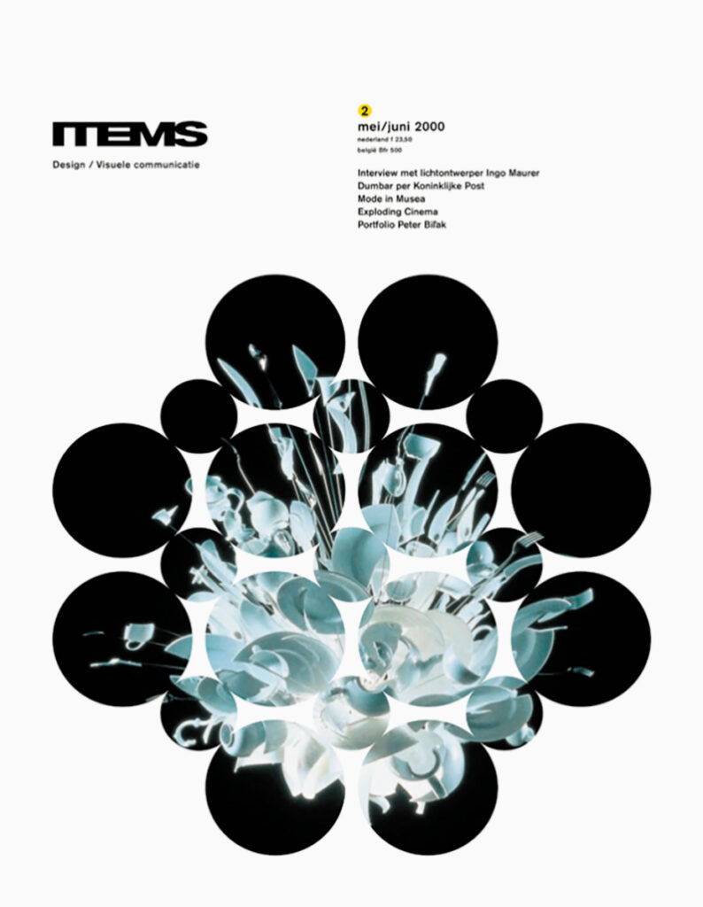
ITEMS, 1997–2003
Founded in 1982, ITEMS magazine initially focuses on industrial design and architecture. Over time, its scope broadens to encompass design in the widest sense, serving a growing professional readership. The magazine undergoes frequent redesigns in its early years. From 1997 onwards, Ton becomes responsible for the design. He introduces a playful identity featuring colour, bold typography and a wide diversity of imagery. Around 2000, he radically shifts the visual language to a more restrained editorial design, affecting every aspect of the magazine’s identity — from logo to typefaces and format. Typographic experiments and structures, already evident in the Apollohuis posters, become the cornerstone of the covers. Many covers feature newly designed typefaces and typographic structures. In 2003, Ton hands over to a new generation of designers. ITEMS continues to be published until 2012.
Het Apollohuis, 1980–2002
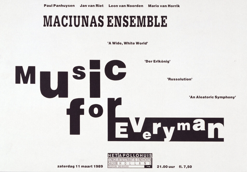
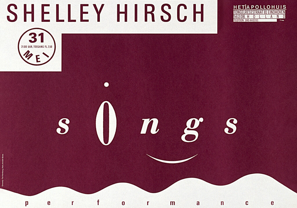
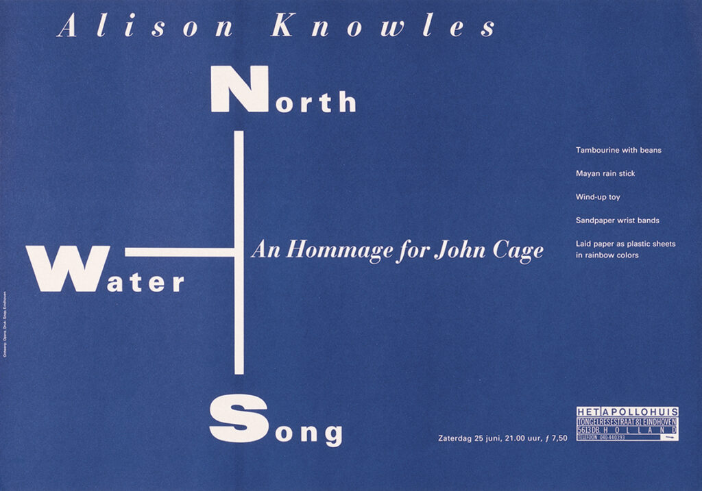
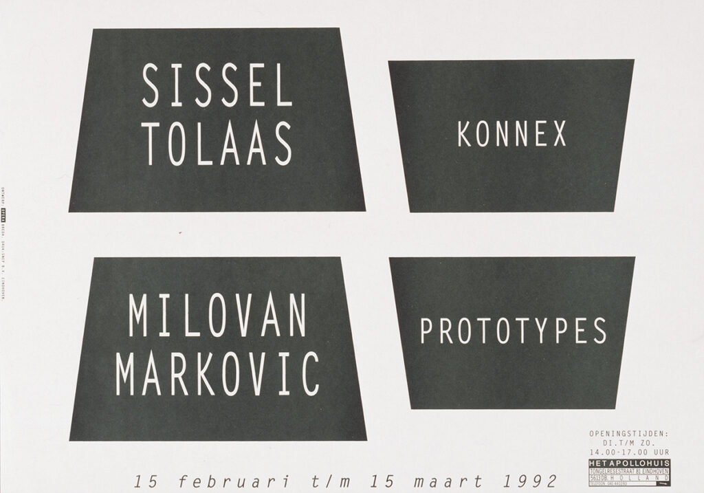
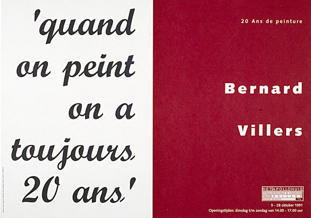
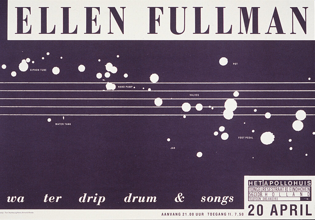
In 1980, artists Paul Panhuysen and Remko Scha establish a centre in Eindhoven where international avant-garde artists present their work. The emphasis lies on the fusion of visual art and sound. Until its closure in 2002, Het Apollohuis maintains a very active programme of exhibitions, performances, concerts and installations. Through extensive international publications over its 22-year existence, it gains widespread recognition as a platform. From the outset until the very end, Ton is responsible for all graphic design. In close collaboration with Hélène Panhuysen, books, brochures, catalogues and CD productions are realised. In particular, the mesmerising series of purely typographic posters , Ton’s intuitive and conceptual visual translations of the work of sound artists, strongly contribute to the identity and reputation of Het Apollohuis. To emphasise the ephemeral nature of the performances, the posters are printed on paper yellowing over time. His work for Het Apollohuis attracts attention both nationally and internationally. MoMA in New York acquires a large series of Apollohuis posters for its collection.
Book design
Book design gradually became one of Ton’s greatest passions. He sees a book as a journey of discovery in which text and image find their own rhythm and content unfolds gradually. He also develops graphic patterns and continues to inspire artists, museums, musicians and young designers. Collaboration, for him, means creating room for experimentation, trust and enjoyment.
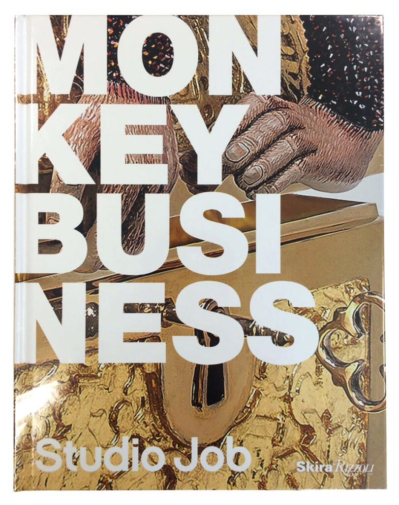
Monkey Business, published by Rizzoli New York, presents the highly expressive oeuvre of Studio Job, including furniture, sculptures, exhibitions and interiors, as well as the designers’ own home. Opera designs the publication in close collaboration with Studio Job. Their opulent, ironic and craft-driven signature forms the basis for the graphic concept.
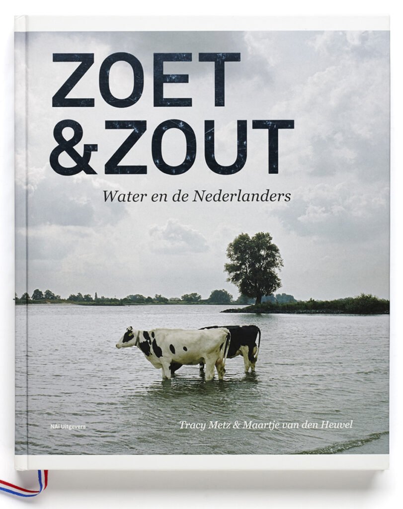
The book Zoet & Zout (Sweet & Salt) by authors Tracy Metz and Maartje van de Heuvel accompanies the exhibition of the same name at Kunsthal Rotterdam. Through text and imagery, it explores the changing relationship with water in the Netherlands, addressing the major challenges ahead and the landscape’s ongoing transformation. Published by NAi010 Publishers, the book also appears in English and is awarded Best Informational Book of the Year in 2013.
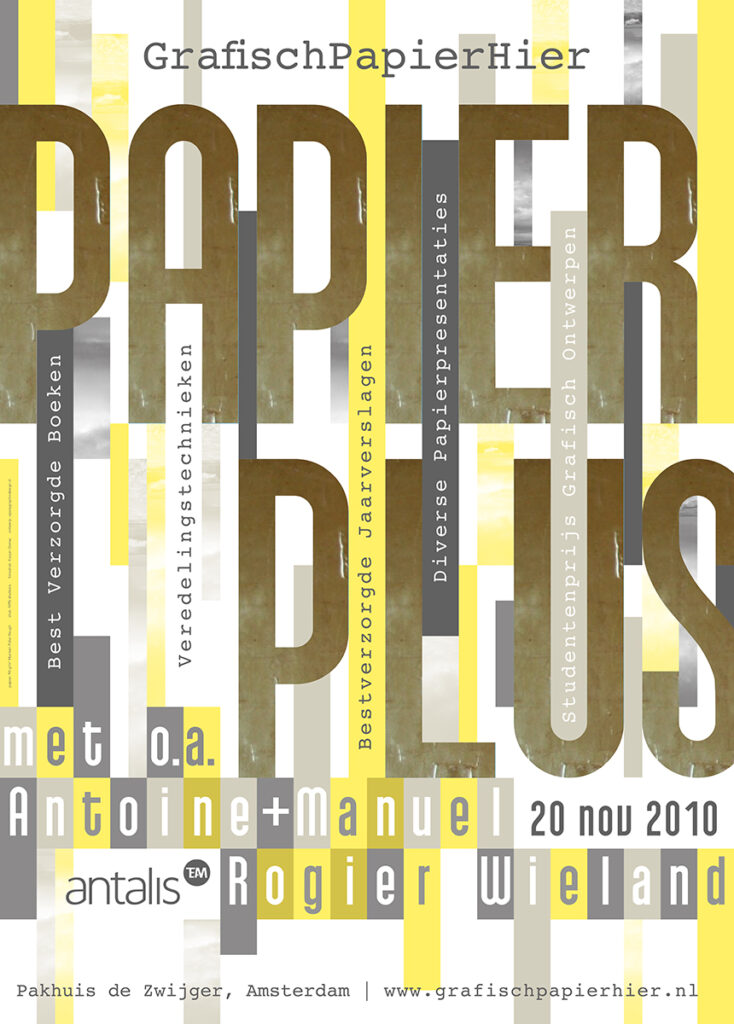
For the annual event Papier Hier, Opera develops a new concept and the name GrafischPapierHier. Over four years, Opera acts as both curator and designer, with a different theme each year. The event transforms from an informative format into a sensory experience centred on paper as a carrier of ideas. In 2010, under the theme Papier Plus, the accompanying giveaway publication is awarded a Silver European Design Award.
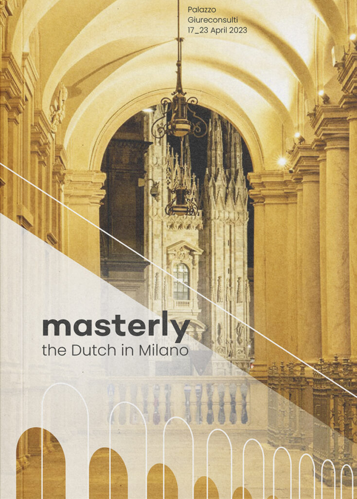
Over more then ten years, Masterly , an initiative by Nicole Uniquole, has presented Dutch designers and companies during the Salone del Mobile in Milan. Palazzo dei Giureconsulti provides the setting for a broad and innovative design field with around one hundred participating designers, artists and companies. Since 2022, Opera has developed the complete visual identity of the event. Graphic patterns, signage and publications create a strong and recognisable overall image.
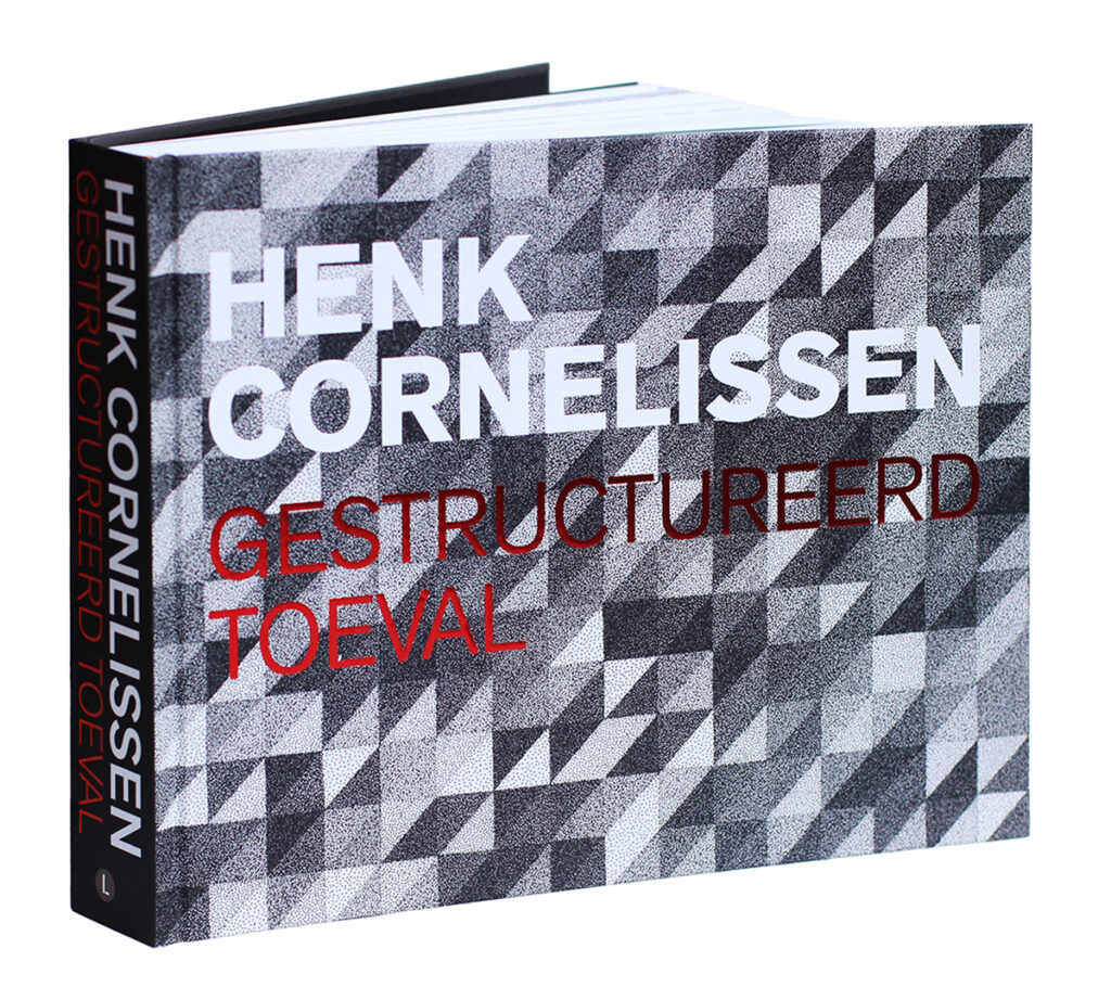
Gestructureerd Toeval (Structured Chance) encompasses Cornelissen’s entire body of work. Concept, text and image editing, and design evolve through close dialogue between the makers and the artist. Thanks to the book’s structure, to which several authors have contributed, you are not only introduced to the artist’s previously little-known and highly extensive body of work, but are also taken on a deeply personal journey through the artist’s thought and creative processes. The substantial monograph is published in May 2025 as the culmination of a long and meticulous journey.
Retirement? For Ton, it is hardly a question. Work has never felt like work, but rather like a natural way of life. Driven by curiosity and attentive to the smallest detail, he continues to explore new projects. The painter lives on in the designer—in composition, colour, rhythm, silence and unexpected discoveries. His strength lies not in a single style, but in a personal attitude that allows content to speak and always leaves something more to discover.